Park / Raindrop Riviera
-
 02-August 03
- Views 7,208
- Downloads 2,954
- Fans 4
- Comments 36
-

-
 76.67%(required: none)
 Spotlight

Cocoa 85% Poke 85% G Force 80% Jaguar 80% Liampie 80% alex 75% csw 75% Scoop 75% 5dave 70% chorkiel 70% Xeccah 70% 76.67% -
4 fans
 Fans of this park
-
 Download Park
2,954
-
 Tags
Tags
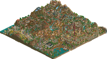
![park_3185 [MM2014 R2] Sands of Time](https://www.nedesigns.com/uploads/parks/3185/aerialt2821.png)
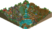
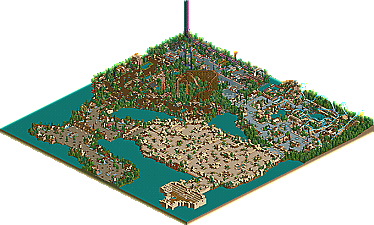
The entrance is nice. Interesting architecture style, lovely scenary incorperation, ect. Not much else to comment on. However, when I moved on to The Marketplace area of the park, I was mystified. If the entrance architecture was strangly-made, it is hard to imagine what this is. It is beautiful. Truly. Zooming out however, I got an eyeful of the same exact architecture that seemed to go on for miles. They say Euroscape was repetative........... well, in my eyes this section was just as bad. Still, I find it hard to resist. Easily my favorite area, even with the sheer repetativness in mind.
The Floorless area (Did it have a name.....? I didnt see one.....) didnt have the problem of repetativness. No, instead it had the problem of boringness and cliche'-ness (And yes, I know that those are not real words). There was just nothing to comment on. The floorless I just hated. The first 5,000 [floorlesses] were okay, but now-a-days they are just getting extremely. Then again, the floorless itself really isnt the exact problem, its more the layout. Like I have never seen those order of inversions before. And its really too bad........ I love floorlesses in general, but I would really like to see someone do something different with them.
Raex Studios and Pahlavi Rainforest get basicly the same comment as "The Floorless Area". There was just nothing interesting, nor did they really look all that great. The woodie I will give a special comment for......... I thought the overall layout looked amazing from the air, but watching the train through its exact progress, I lost much taste for it. Too many flat turns (primarily at the end).
I was starting to wonder whether I would ever see another Posix park break the surface (much less as a Spotlight). I must say however, that I am a bit dissapointed. Still, congrats on Spotlight.......... and stuff.
me and wme do strange strange things to coasters...
anyway, nice park and all, bored me to death, but definitely a good park.
*thumbs up*
I do see the negative points most of you mentioned.
It's true that there aren't enough rides. I had that thought when I was finishing Herculaneum. Therefore, Pahlavi Rainforest got quite a few rides more. But still, I couldn't really change the concept I was going for. I knew I'd only have two real coasters in the park, which bugged me a little bit. Anyway, putting another coaster in wouldn't have worked. There's no space for it on a map layout like this and I couldn't change it as I had done too much on the park already.
Arabian Market Square was by far the most difficult area I've ever done in RCT. It got me into a 2 weeks break from RCT because I was really really frustrated with it at a time. I had it about half complete and realized there was no ride in it. So I desperately put the two simulators, that underground ghost train and the slide in. They didn't help much though. I first wanted the rapids from Herculaneum in there but whenever you had a high piece of rail somehwere, the whole look of the area was screwed. Try it yourself, it looks horrible. So I went on with the same style until the bitter end. The stadium was just lazy. Shows when you look at the water which flows inside of it as it isn't at the same height with the water outside.
Another problem were all the stalls' names. None of them were named for a long time. Took me a week to get names for them all. Same for the other areas. So, the park could've been submitted 2 weeks earlier, I guess.
Anyway. Why I made it so big is simply because the maplayout was set before. And, I wanted a whole screen filled with, where you couldn't see water or the other areas' entrances or whatever. It looks just very nice when you scroll to a position where that's the fact, I think. Made me feel like I was really in a marketplace. And the atmosphere is good in it too, in my opinion. That's what I like about this area. It's actually my favourite area of the park, together with Ebbsfleet and Herculaneum. The other two are too different.
Butterfinger, you can see all of my sections' names by clicking the windows. There weren't banners at all transitions because of the banner limit.
sircursealot, I'm glad you like the park that much. I think you look at parks in a very similar way like I do. I can also understand how you managed to win the trivia contest. Like iris said, it seems like you really know your job. Thanks for the kind words, it was a good read.
By the way, I have tons of "RR in progress" SV4s left. Whoever wants some, AIM me.
Pahlavi Rainforest and Herculaneum are both incredible areas. You always make good use of the pillars and smaller theming objects and this is especially true in these two areas. The woodie is fast and twisted which I like. The B&M isn't unique enough or smooth enough in it's design to really impress me but it's still not bad. With only two coaster in the whole park though I would have rather not seen another generic B&M. Anyway, great use of trees and flowers here. Your architecture style isn't as flashy as a lot of people's but I really enjoy it. You are good at evoking a theme through repetition of motifs. These two areas are wonderful and if the rest of the park were like them I would be as enthusiastic about it as others have been.
As others have said, the colors clash in Radex Studios but even so I find it mildly appealing. The red to yellow coloration on the woah belly rides is nice but you have too many color schemes competing for attention here and they clash against each other. Perhaps that was the idea. It's not a bad area, but the buildings are on the edge of being too blocky and there just isn't much to look at. This might be better with more consistent colors and a more memorable ride. I think your style fits better with organic themes though. Not nearly as good as the two areas I mentioned above.
Webbsfleet Village is my least favorite area of the park. It looks like you're emulating Schuessler but it lacks the zen quality of his work. The blue flowers, pine trees, and castle buildings seen in so many SACF parks reminds me a lot of the entry area in IOAH but the architecture is really too bland. IOAH would be an incredibly boring park if it didn't have Schuessler's perfection of simple angles and landscaping. So this is like IOAH without the Schuessler-ness. It's really a shame too because you make such wonderful work when you aren't emulating others this closely. The other thing I don't like about this section is the layout. It's long and skinny and surrounded by water which really looks bad to me. I suppose it's different but I don't like seeing that much wasted space. I love IOAH and simplicity can be a great thing but it can also be bland. This area is closer to the latter for me.
Lastly is Arabian Market Square which I'm still not sure about. On the one hand the atmosphere is very well done and there is enough variation in the architecture to keep it moderately interesting throughout. On the other hand, I really like contrast and this section doesn't have enough of it. The path and building textures are too similar so the whole thing just blends together. I really wanted to see a patch of brown texture or a mountain somewhere or a nice big clump of green trees. Maybe those are cliche and maybe the way you've done it makes more sense but from an artistic standpoint it really needs some contrast. Maybe if the section were smaller and less rectangular I wouldn't mind the lack of contrast much. Also the lack of a major ride was obviously intentional but I like rides. In fact, I'd say the purpose of atmosphere is to enhance rides. Coasters are like major landmarks in an amusement park. When you don't have any the atmosphere seems wasted to me. I don't know that's just my own eccentricity I guess. I like that you are focusing on architecture and atmosphere. I wish more people would but the rides are the fun and interactive part of the game. I don't think you should dispense with them completely. The stadium was far too geometric looking in my opinion. Worst part of the park.
And lastly I think the park is lacking any major geography and that's a negative for me. Extreme height variations and interesting coastlines really help to give a park an identity. What you have here is a collection of themed areas surrounded by water. As good as those areas may be, I think you should find a better way to tie it all together.
So those are my complaints. I love your style of parkmaking and there are two areas of this park that definately stand out as two of the best ever in my opinion but I think your ambitions got the better of you and the other half of the park is too bland. SWA and UO and GoD all had plenty of 'Wow factor' to them. So do Atlas Infinitum and Anuradhapura. You've got some great stuff in this park but as a whole it just doesn't have quite enough pop and excitement to list amongst my top parks. I would say it's more evidence that you're one of the best parkmakers around but as a park it just comes up a little short. Still, I think a spotlight was deserved here and I'll come back to the Pahlavi Rainforest and Herculaneum sections in the future for inspiration.
Firstly i'd like to say the park layout is really great. Bring up the little map window and I doubt there's ever been a layout quite so strange as that. Yet all the areas are joined well, the pathing isn't complicated and each area is well placed. I think there is just the same amount of water and filler as in ALE. Or maybe i'm wrong. I haven't counted the squares.
Ebbesfleet Village works wonders as an entrance. It's quaint. Entrances should be quaint. And I like the 'surrounding wall'. Works wonders.
Arabian Marketplace. Controversial. Personally I like it quite a lot. However, I hate the lack of height changes, and wish there was an oasis or something in the middle. The stadium is a little strange, but I think it's fitting too. I admire the architecture in this area a lot, and the hacking of the pillars.
Herculaneum is sheer brilliance. The buildings are traditional, but not in the formulaic sense - they're of the JS ilk. The coaster is similar to Leviathan in the way it's faultless. Sure, it's nothing "outrageously new", but it's faultless, and original. The rapids are beautiful.
Raex Studios are hit and miss. The coasters and the pink-ness are great, but the white walls and lack of continuity are disappointing. I'd say this is my least favourite area, but it is still a good addition to the park.
Pahlavi Rainforest should be everyone's favourite area. The buildings and use of zig-zag paths are awesome. The tree selection is excellent. And i really like Avesta. I mean, REALLY like. The speed is kept up in such an annoying way (I always have speed troubles) and the layout is so twisted it's untrue. Like the one in EotFR but better, IMO. Awesome station set-up too. And finally, this area has the best flowers. And it has a Haunted House (kudos).
I really like this park. I like it a lot. I like it loads. But I also like Atlas Infinitum loads. It's funny that both these parks (and Kelaxis Globe) came from the same parkmaker - they're all so different yet they're great in their own ways. I like to think I appreciate all different styles of parkmaking, and Posix really puts me to the test. I can only imagine what he'll come up with next.
Great Work. I think this park is the Legends West of 2003, which is an enormous compliment.
Well Done on getting your first spotlight!
It's wonderful that a park like this was made spotlight as it does remind me of the kind of parks that really sucked me into parkmaking in the first place. Now to the breakdown.
Ebbsfleet - I liked it a lot. Nice variation on the traditional entrance plaza by not having it go straight into the park. Definitely has a nice relaxing beauty to it.
Arabian Marketplace - Personally my least favourite area of the park. The architecture is wonderful and the feel is great, but I found that when you look at the park, this area dominates the map way too much. The shape of the area is somewhat boring and it seems to stretch on just a little too far. I think I'm with Ed and Mantis in that something to break up the monotony of colour would have been wonderful. Still a great area, but maybe just a little too much of it.
Pahlavi Forest - Loved it! Best area in the park. Once again you took a theme that has been done (tropical) and made it different and your own. Nothing bad to say here.
Raex - I liked this area, but not in this park. It just stuck out to me and didn't carry on the understated beauty and detail of the rest of the park.
Herculaneum - Once again, nothing bad to say here. It is beautifully executed!
Overall, a beautiful park to experience. The hacks were wonderfully executed and never dominated the park. This park may not have had a wow factor, but I would like to see more parks that tried to execute this kind of atmosphere and beauty and not always try to go over the top. Your parkmaking skills and ability to do different styles are very evident in your body of work. Deserving of spotlight.
As long as I'm posting here again I'd like to add that I'm liking Raindrop Riviera more and more as time passes. I still agree with the criticism I had before but I think I was a little too negative. When a lot of people like a park I tend to look for things I don't like and when people seem not to like a park I look for reasons to like it. Now that I've had some time to think about it a bit, this really is a wonderful park. It isn't in my elite top 5 or so but I love it just the same.
Yayayayay!!!!!!! Umm, post a new spotlight.
but, if the light of rct should go out... it'll go out with a "bang" ^_~