Park / Egypt
-
 09-September 05
- Views 2,080
- Downloads 524
- Fans 0
- Comments 10
-
 No fans of this park
-
 Download Park
524
-
 Objects
118
-
 Tags
Tags
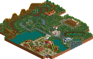
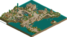
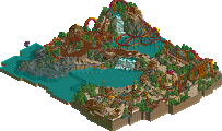
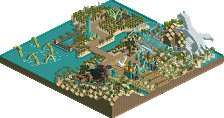
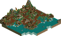
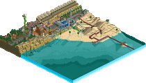


this was my entry:
DOWNLOAD
what do you think of it ?
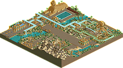
To be honest, I don't like it. Overload of 1/4 tile blocks, and no actual building buildings. And it was all the same colour.
I love your 1/4 block sculptures. Beautiful.
In all of your parks, it's an overload of the 1/4 blocks, and it's too much for me to enjoy, therefore making it messy.
Just not my style, really.
check my sig
penguinBOB, on Sep 9 2005, 03:12 PM, said:
some people don't like single with paths@ elby -> nice sign
@ trav -> I don't see why it become messy but I will look to use some less QBB in my next park
@ Geoff -> thanks
@ trav -> why sould a building need walls ? I tought there were some buildings
In many places, it's kind of lacking (the 1/4 tiles by the river don't look right, not enough tree selection, not any landscaping, not any buildings), but it's also one of the most original styles I've seen. The work you did in the second screen with the helixes is amazing, the sculptures are class, and the use of the 1/4 tile blocks is better than almost anybody's.
I'd like to see more work from you soon.