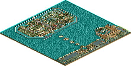
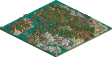
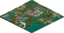
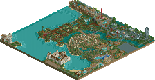
Caddie Gone Mad - Thanks, once we see how the surrounding areas are set up, we will be making som minor changes.
Turtle - I'll check with Brent0s to find out whats up with the other SS's. As for the hotel, you're one of the few that like it as it was the same hotel that I used in the NEPT that finished last in that round. Go Figure
slob - Thanks. This was the first time I used one of these elements.
ride6 - Again, it's funny how people like the hotel here but didn't care for it in the NEPT. Oh well. Thanks for the feedback.
Turtle - I'll check with Brent0s to find out whats up with the other SS's. As for the hotel, you're one of the few that like it as it was the same hotel that I used in the NEPT that finished last in that round. Go Figure
I thought it looked familiar...
I personally loved it then, but at the time everyone was excited about the whole new Foozy/John style (guys, you started a whole style!) so his hotel beat yours. Also, yours just wasn't on the same scale as rwadams entry. The others, i'm not sure about.
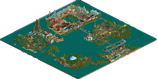
I'm happy to announce that the construction crew has begun work on the island once again and the latest RCTNW designed coaster is now in place. In keeping with the theme in RCT Flame's area, this (unnamed) lay down coaster allows the riders the chance to explore the area.
The crews are now working on a new area and should have an update in a week or so.
I can't say I really like it. The landscaping looks messy and I think that is partially contributed to the variance between the two different palm trees. I'm not quite sure, but it doesn't look nice to me. The fences everywhere also could be causing it. I'm undecided on RCT Flame's style, I suppose.
I agree with John on the landscaping. It lacks a natural-style flow, and just seems choppy. It gets annoying to look at, and leads the eye in all the wrong directions. Maybe there's too much of the white fence, which I've found to be very easy to overuse.
The coaster looks nice though, perhaps too much straight track but I'm sure it's better in the game, and that the coaster is based upon the ride experience and not the looks of the tracks.
I agree with John on the landscaping. It lacks a natural-style flow, and just seems choppy. It gets annoying to look at, and leads the eye in all the wrong directions. Maybe there's too much of the white fence, which I've found to be very easy to overuse.
Agreed. The screen has definite potential, but it needs to be tidied up a little first. As well, I can't say I like the coaster. Colours are nice, and you mentioned it was to explore the area, but it just seems really boring in that screenshot.
well I'm surprised bimbosj like's the last screen
Normally he has some comment's and know none...
Tough I have a few
It looks messy sometimes and the colors are way to bright en to much that its a little bad
Tough the blue coaster looks good ...a little mixed feelings here
Some screens look good some not that well done.
The total vieuw of the park from my side is messy but it's ok
I'm not impressed.
But keep it up
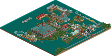
The park is just about done and thanks to Mantis for adding a water coaster to the park. I have completed the theming for it and as a result, it adds some much needed elevation to the park.
I tell what though, going behind a parkmaker like mantis to theme one of his coasters is not something i recommend for the lite hearted. Considering he just completed a great park like WOMB, this needed to be good and I think it fits the area well. Again thanks Mantis!
An Amusement park does not have themeing like that, or rollercoasters like a watercoaster or flyer.
This is RCT2. Since when does everything have to totally obide by the book? b&m haven't yet made a 9 inversion coaster. Does that mean no-one can ever build a 9 inversion coaster in RCT2? The game would be so boring if we all went by the standards that you just set.
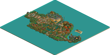
i cant say i really like the last two screens. I like the atmosphere 2 screens ago but the flyer design looks pretty bad, and this one the architecture and coaster (altho i dislike the colors) look okay, but it doesnt have the same atmosphere.
i like everything except in the last screen, the building in the top left corner, the supports are kinda weird, its a really good idea, but you should have bigger supports
Atmosphere certainly flows from one screen to the next here....I like all screens, they all are unique in their own right....I especially like that floorless you designed, nice work as usual, RCTNW!!...
AW E SOME ! Amazing that you all were able to fit that many coasters into such a small area and make the ALL look good along with the park! Grade A man, Grade A!
43 Comments
RCTNW Offline
Turtle - I'll check with Brent0s to find out whats up with the other SS's. As for the hotel, you're one of the few that like it as it was the same hotel that I used in the NEPT that finished last in that round. Go Figure
slob - Thanks. This was the first time I used one of these elements.
ride6 - Again, it's funny how people like the hotel here but didn't care for it in the NEPT. Oh well. Thanks for the feedback.
rctnw
Alpengeist Offline
Turtle Offline
I thought it looked familiar...
I personally loved it then, but at the time everyone was excited about the whole new Foozy/John style (guys, you started a whole style!) so his hotel beat yours. Also, yours just wasn't on the same scale as rwadams entry. The others, i'm not sure about.
RCTNW Offline
The crews are now working on a new area and should have an update in a week or so.
Again, thanks for the support.
rctnw
Turtleman Offline
Good work.
John Offline
Janus Offline
The coaster looks nice though, perhaps too much straight track but I'm sure it's better in the game, and that the coaster is based upon the ride experience and not the looks of the tracks.
CoasterWizard Offline
As well, I can't say I like the coaster. Colours are nice, and you mentioned it was to explore the area, but it just seems really boring in that screenshot.
Brent Offline
PBJ Offline
L O V I N G I T
the last screen is great! i like it!
justdavy Offline
Normally he has some comment's and know none...
Tough I have a few
It looks messy sometimes and the colors are way to bright en to much that its a little bad
Tough the blue coaster looks good ...a little mixed feelings here
Some screens look good some not that well done.
The total vieuw of the park from my side is messy but it's ok
I'm not impressed.
But keep it up
RCTNW Offline
The park is just about done and thanks to Mantis for adding a water coaster to the park. I have completed the theming for it and as a result, it adds some much needed elevation to the park.
I tell what though, going behind a parkmaker like mantis to theme one of his coasters is not something i recommend for the lite hearted. Considering he just completed a great park like WOMB, this needed to be good and I think it fits the area well. Again thanks Mantis!
rctnw
mantis Offline
Now give it a good name
Thanks for the opportunity.
Skylor Offline
Metropole Offline
Metro
gymkid dude Offline
shameless Offline
JKay Offline
Mike Robbins Offline
Pacific Island download
www.rct2.com Vacation Park page
Rhynos Offline