Park / Pacific Island
-
 28-August 03
- Views 7,991
- Downloads 1,026
- Fans 4
- Comments 43
-
4 fans
 Fans of this park
-
 Download Park
1,026
-
 Objects
323
-
 Tags
Tags
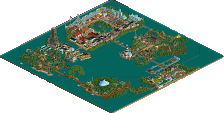
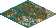
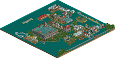
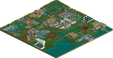
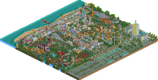
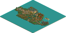
One of those unique features of Pacific Island is the addition of a cruise ship pier where cruise ships will be able to dock right on the island giving the passengers a chance to enjoy all that Pacific Island has to offer.
Teaming up with me on this project will include RCT Masters - Ice Dragon, RCT Flame & Impuls3.
Download Park (Vacation Park Page)
Screen 2: Nice job Flame! The woodie looks very interesting and I like the colours. Way too many of those damned round windows tho.
Screen 3: Just too bright and random for me. I really like colour, but the random use of it on the walls and rooves doesn't work for me at all.
2. The colors and the woodie are great, but I don't like the architecture. And too many windows.
3. Too random, too many colors, bad rooves. Looks too messy, overwindowed and overfountained.
-Raptor-
The woodie looks cool, and I quite like the buildings. I'm all for disjointed roof styles, so good work. Could do with some landscaping though....those trees appear to be placed on completely flat land. Add some contours.
The last one is cool and uncool at the same time. The colours are nice, but the checkerboard would be much better if the building colours were symmetrical rather than in series. I like the fountains. Ice Dragon sure does like his hyper twisters.
Nice work, and good 'press release', even though I don't judge on realism or whatever.
#1- Too many damn round windows
#2- Too much white, ow my eye!
#3- Yellow is gross.
Solutions you ask?
#1- have a black wall piece between windows, use the "castle" windows and/or crosses.
#2- Use those bright blues or the one brighter teal sometimes... gives color and keeps my eyes in one peice.
#3- Change out the yellow for Blood Red...
The third, well lets say it this way. There are too damned many colors, put some "plain" wall pieces in to break up the windows a bit, otherwise it looks the 2nd best of the three.... Windows can be dangerus things, remember that.
~ride6
The 2nd screen, most has already been stated, but where is the landscaping around the woodie? I can't tell if there are any slope changes in this screen at all.
3rd screen, the architecture is way too random, and once again, I see no landscaping.
I'd like to address a few points that were brought up.
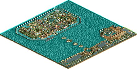
Landscaping - I'm assuming that you are referring to elevation changes or lack there of and although this is a key element in just about every park out there, PI is based on a real world, man-made island in Japan which is also flat. Keeping with that idea, I wouldn't expect much in elevation changes here.
Windows, windows, windows - When we talked about this park, the only guidance or direction was to make it airy (sp) and to experiment with ideas. Admittedly, this park is a love it or hate it type of park and that's OK. I think Flame's and Ice's bold colors and unique style on this park adds to the uniqueness of PI. Like I said, this is a love it or hate it type of park. We hope you'll love it when it's done.
Right now this park is about 50% completed so we should have more for you soon. Again thanks for proving me wrong, Maybe one day I can move out of the n00b category.
RCTNW
Well base it somewhere more interesting then
As much as I would love to show more of the RCTNW Signature Series Resort, I can't as there are a few items that need to be finished and since Impuls3 has the park, it will be a couple of weeks before I get to work on it again so here's a teaser for ya.
All I can say is this could be one of my best ones yet. I'm real happy with it and I'm looking forward to finishing it.
Again, Thanks for the feedback
rctnw
I love it!
Brent Schmidt, the man in charge for the last section to be worked on, has been overlooking the progress since work began late last week. Plans were originally drawn up for a B&M Invert, but was soon scrapped on money issues. In it's place is the fourth coaster of it's kind, an Intamin Rocket-Coaster.
Aptly named Sun-BURST, the ride will shoot you from 0-65MPH in less than 2 seconds, head straight up, into a top hat, come straight back down, and run through the rest of it's course with a couple airtime spots, and an intense turnaround.
Work around the coaster is nearly complete, with just some folliage left, as well as some other minor things.
Next on deck for Brent's section will be the invert, except also made by Intamin, at a cheaper price. Look out for that update in the upcoming week or two.
But until then, here's a sneek peek at Sun-BURST's rather mellow station.
All questions, concerns, or comments would be greatly appreciated.
Thanks, and have a great day.
-Brent0s
Very good parkmaking!
I Think, all members famous parkmaker! at 'Want U'
Construction is progressing slowly and the park is around 60 percent complete right now. Here's the latest floorless coaster (to be named later) designed by myself. This particular design runs the entire length of the "midway".
Look for the next update soon!
Thanks
RCTNW
I like what i have seen so far, although for some reason Brent's screen didn't work for me.
I particularly like the hotel screen, you are very good at them RCTNW!
The inversion really works (I've always liked that one for some reason) and good color also. I think you do need some more vegetataion and get rid of the organized trees. It looks weird.
ride6