Park / Disney's Movie Magic
-
 13-April 04
- Views 12,738
- Downloads 5,612
- Fans 4
- Comments 40
-

-
 87.50%(required: none)
 Spotlight

][ntamin22 100% no Cocoa 95% no G Force 95% no csw 90% no Liampie 90% no Kumba 85% no Poke 85% no 5dave 80% no alex 80% no Six Frags 75% no 87.50% 0.00% -
4 fans
 Fans of this park
-
 Full-Size Map
-
 Download Park
5,612
-
 Tags
Tags
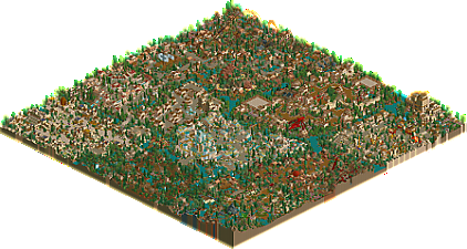
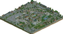
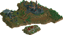
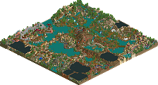
Even from my very limited knowledge about Disney, I do not think that this park resembled existing Disney parks in the slightest, nor did it have the so called "Disney feel" (which is often mistaken as Natelox style by the way).
It had the disney names but that's about it.
Secondly, as other's have said, the whole park was one big mess. It was impossible to orientate or to explore things because everything was so horribly close together and squeezed onto the map. If you wanted so many areas why did you not do a double-mapper? It probably was your purpose to have small areas but I think that really didn't work well.
Additionally to the space problem, you had everything hacked apart with a lot of rides that served no intention or idea, it seemed. I found most of the theming either extremly overdone or out of place. Like in Natelox' park.
It's probably all just because I prefer quaint and simplistic parks. This one was so hectic I couldn't stand it.
TH is still your best work in my opinion.
The only other thing I want to say is that personally I'm glad Fatha' jammed it all onto one map because I really don't like multi-map parks. I have yet to see a multi-map park which had enough great ideas to justify two maps. More typically half the cool stuff is on one map and half the cool stuff is on another map and then there's a bunch of water and trees and filler junk which spaces it all out. There isn't enough here to put on a second map, so Fatha' would have had to work on it twice as long and then it would have never gotten released. Sure it was crowded, but it actually felt like a park, not 3/4 of a park with the rest trees or water. I would have liked to see some kind of seperation around the edges of the map to disguise the flat map lines, but other than that the crowding adds to the park rather than taking away from it.
So anyway, to answer some of your complaints I don't think it matters in this case if it fits the description of a Disney park or not cause it's Disney's Movie Magic not DisneyWorld Berlin or something. And as for the crowding, you're right, it was a little crowded. I can forgive that though since I'm so tired of seeing half parks passing themselves off as full parks and 2 mappers which really should have only been 1.
They are Aster of RCT1
Still think I have a bad influence on the community, what?
I don't feel like getting into another argue with you right now. All I'm asking you for is to respect my style. No more "I hate the damned pseudo-realistic parkmakers, those lame treefiller losers!"
How about that?
And please don't go like "I don't mean any disresepct to your style, I'm just saying I find it boring and senseless when people are making the same parks over and over".
I thought that in this case when you said it doesn't work as a Disney park that there was an important distinction to make. Some parks are Disney only in name, while others are Disney in spirit. You can critisize the park for lacking the Disney spirit and you would be right in doing so, but I think with this park you should also recognize that it is a Fatha' Grinch park in spirit, not a Disney park, and that's how it was intended to be. That's all. This is a pretty good solution to the "Disney problem" I think. Not everypark with Disney in the title is meant to be a "Disney park". The name here describes the common theme, not the "style" of the park.
The rest about crowding was just a lengthy way of saying that crowding may not be pretty but it does offer a lot to look at. You may say that Nate's The Aegean is at one extreme in that it's pretty but there isn't a whole lot to explore beyond the surface while Fatha's park is too crowded but it does have a lot of details that keep it interesting. There's an ideal somewhere between the two but each have vices and virtues. I don't think it's "wimpy" to acknowledge that strengths and weaknesses often go hand in hand and when recognizing one you should also recognize the other.
It may seem like a long time ago now, but when NE was starting I was the diehard realist, praising all things mrICE and writing at length about what a travesty Mount Sinister was. Well I guess experience has taught me to be openminded about how other people use the game. Everyone has a preference, including me. I may speak louder than others, but I know that my opinion on anything is just one of many and bears no more weight than anyone else's.
I don't hate realistic parkmakers at all though I will question if it's really realism since I enjoy those kinds of theoretical discussions and I may question whether a park is really skilled or not cause I want people to find the potential in themself and push themselves to become better. Part of becoming better is trying new things and part of it is perfecting your skills through repetition. Both are valid paths so long as progress is being made.
And lastly, that last paragraph was about RCT as an art. I know some people see it this way or they wouldn't put the time and effort into it that they do. I appreciate those people a lot because I identify with them. I include you in this group Posix cause I know you're someone is is concerned about improving their parks as an artist would. But at the same time, it is a game and it's fun too. I know not everyone cares about the "Zen and Art of Parkmaking" as Blitz would call it so to those people, I suggest they simply ignore my theorizing and my criticism and keep doing what is fun to them. There's no need to be uptight about it. I'm trying to offer help to those who want it and those that don't can keep doing their thing.
Where can I get some parks of his?
you know i love you, Fatha. us black parkmakers have got to stick together.
Magical.
I loved it- pretty much all of it. Each section was a wonder on its own- full of interesting architecture, cool rides, and exciting details. I like that.
The only letdowns for me were the Hercules section- I would have *loved* to have seen you take it out and expand on the Notre Dame section, which I felt had too much potential for you to make it so small. I also didn't like Kuzco's Tower of Terror, mainly because it didn't seem to fit in and the building looked sloppy and... well, honestly, almost ugly. The ride was great though... but I think it would have fit in better in the Notre Dame section.
I personally loved all of the themes- so much to explore and recall upon! I wish Triton's castle would have been even bigger and grander- a "centerpiece" of the park.
The park was also obviously rushed... The Little Mermaid section was dubbed "Happyland"... and the section was a happy one, but you know... I just wish you could have had a little more time to mess with it.
Anyways, away with the bad. Onto my favorite parts of the park:
a) The entrance- the jungle music, all of the foliage, the wonderful little jungle cruise- all were executed perfectly, and I honestly could image myself in that area... (no doubt, sitting under the shade of a huge jungle tree, sipping some jungle juice, hummin' some jungle tunes... or maybe not.)
c) The Mulan area- the lanterns hanging across the street! Excellent! The fierce dragon sculpture- awesome! The family adventure ride- very cool and appropriate! This was my favorite section in the park.
d) Kuzco's Carnival- a very bright and cheery atmosphere! It looked kind of fun to me... I just didn't like the tower of terror... yeah, I'm in the minority...
e) The Peter Pan rapids ride was really wonderful... I loved the terrain, the mechanics... and the alligator was a nice touch...
Overall, great job, Fatha'... this was my favorite spot of the bunch!
I liked it and at the same time I didn't. I liked most of the ideas, theming, rides very much, but for me it was also a little too much of a good thing crammed on one map. I almost wish you had saved some of your ideas for your next park. As for whether it was Disney or not, I honestly have never seen a LL park that made me think Disney. It's more about the use of Disney for naming and coming up with themes, but in all honesty, LL never really looks like a Disney park. Because of this I would never judge a LL 'Disney' park on the basis of how it captured the feel of Disney.
I liked it.
Gotcha.
and the easter egg hunt pissed me off since i havnt been around long and dont know much, so i just cheated =P
Quest for Pan is an awesome ride - the lift hills are outstanding. Some of the track scenery was great as well, such as the sultan's palace. I liked the little touches like that - and the virginia reels used as scenery near ToT were a very nice idea as well.
I would write more, but I'm a little short on time... nice one fatha', this is one of the best LL parks I've taken the time to look at.
Fatha' Offline
Oh well, props for looking at the park for those who did.
How do you NOT know about mrICE?
Omg.
What a disgrace.
[/font]