Park / Disney's Movie Magic

40 Comments

  • iris%s's Photo
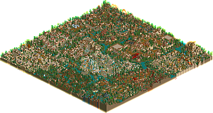
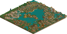
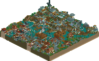
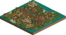
    Congratulations on the final find! You lucky people have found Disney's Movie Magic by Fatha'!. Finally unveiling his next park after his Tropico Horizons left a longstanding impression of perfection on the community, Fatha' continues his reign of dominance and perfection with his newest park, as he falls victim to the Disney curse. With a whopping ten themed areas found in the park, it'll keep you interested the entire way through. With one of a kind rides, Fatha's expected perfect architecture, and some great magical little touches everywhere (a la Disney), this park quickly shoots up into the top 3 parks on my List.

    Disney's Movie Magic Hint Re-Cap/Explanations
    Hint #7
    "There's nothing better then H....2....H"
    Location: The "...." dots on the Head2Head page.
    Reason: Self Explanatory, the dots give the exact place, H-2-H gives the page


    Hint #8
    "If you're happy and you know it, c.la.p your hands"
    Location: "1986" in the description on Chateau Lake's page
    Reason: "c.l.a.p your hands"...CLAP (Chateau Lake Amusement Park)


    Hint #9
    "The Park That Started It All"
    Location: Invisible Line Reading "You're Almost There...Last Step" on Universal's Island Xtreme page
    Reason: "park that started it all"...UIX, the park that got NE started.


    Bonus:
    "Click an Orbit"
    Location: The "big" orbit in the navigation in the upper left hand corner
    "We didn't say click the big orbit...."
    Location: SCROLL DOWN!"
  • Zephyr%s's Photo
    Woo-hoo again! An amazing spotlight round, a great easter egg hunt, and the number one spotlight to top it all off.

    The park looks great, can't wait to check it out.
  • Janus%s's Photo
    Ok, I did all the clues now :)

    Fantastic park anyway, much better than TH imo. I love that Triton's palace-thing, and the Tower of terror-thing... Write more later.
  • Metropole%s's Photo
    Wow. 3 LL spotlights, all totally amazing. Another greatly anticipated park. Congradulations!

    Metro B)
  • Lucifer%s's Photo
    "click a fucking orbit"

    You deserve a painful death for that... You realise it, don't you?


    But thanks for the AMAZING spotlights... Now to find spotlight #2... :0
  • Alec%s's Photo
    This park was way to over crowded for my needs, too much to look at. Though, very nice.
  • x-sector%s's Photo
    Fuck what can I say. I need to still look at this park its so full of so much cool stuff and details. Fatha you have out done yourself man. This is the best thing since sliced bread. its so disney aswell as much as I want to see Universals ports of call I think this kicks its arse but don't let that stop you from finishing that park and showing it to me. :)

    I'll comment on areas when I have had a whole week to look at the detail and amazing stuff in this park.
  • gir%s's Photo
    Way to pull a foo. :p This was the easiest one in my opinion though, because of that. Somehow I skipped over two, I went from 4 to 8 and now I'm lost and I still have one to go :( lol Now I can't decide which Tower of Terror I like better... nate's or Fatha's ;)

    Well done, this is an amazing park. :D
  • sfgadv02%s's Photo
    W0ah, almost got full by that one. :p

    I think this park is the best out of all 3. I love this park. :)
  • Fatha'%s's Photo
    First and foremost I would like to apologize for the sloppiness of the park. Some little pockets are neglected and that was due to fierce time contraints put on me. I tried to make the important things work (IE rides, music, gardens, foilage, etc etc). I did miss some things unfortunately though.

    Secondly, I would like to say that I now understand why everybody does Disney parks. They are incredible fun to build, because you are forced to put attention to detail and what turns out you really like it. In the future you probably will see more Disney parks from me (After Ports of Call gets finished eventually), and I have got some good ideas I can think of for Disney parks.

    Thirdly, I hope that each one of you enjoy the park and get something out of it. Some areas are a bit wacky for me, but it all turned out great in the end. Enjoy the park and live the magic. Thanx.
  • John%s's Photo
    See, Disney r0x0rz.

    I'm reinstalling LL just for this, Fatha'. It better be good. ;) :p
  • Kumba%s's Photo

    There's only 1000 (+1) orbits... not that hard ;)

    :fuck you: i clicked all of them......twice, took me an hour to get it :'( but i thought the iris/2pac one was EZ.

    anyways amazing park fatha' i loved the POC pirate area, the broken ship is really cool, my fav section was the one with the stall-out mine train, it did not seem disney like but it was still really cool with great landscapeing. the rapids were awsome, nice job with all the details like the gator. and that peter pan stage show was awsome barrels insted of seats what an idea! ;)

    10/10

    My Fav park ever. thx. :)
  • Tech Artist%s's Photo
    I've been waiting a while for this park to be released and now it is as a Spotlight.

    I like how you went and built your own Disney park and not some of the more tradtional ones you see here, everything to me felt Disney even it is in Rct 1. My favorite was them Alladin's Magic Carpets, nice job with those.

    I'd have to say this is my favorite Spolight out of this round.
    Nice job Fatha'! :D
  • Coaster Ed%s's Photo
    This was certainly the most traditional of the 3 spotlights, every inch a Fatha' Grinch park, but surprisingly I found myself enjoying it more than the other two. I'd seen the park in progress some time ago and, to be honest, I wasn't particularly impressed. Everyone knows Grinch is great at rides of all types and the great rides were there. Nothing terribly original, but all very well designed. And the buildings just looked rather blocky and uninteresting to me. Now that it's finished though, it all adds up to a beautiful park. I don't know how Grinch does it actually. He makes a lot of theming and architecture choices that I would never make and it always seems to come together perfectly when it's done. You've got an instinct no doubt that you've developed over years of making parks. You're like the Alfred Hitchcock of parkmaking. You work with the same tools and themes so often that you are totally confident with them. I haven't looked through it a lot yet but I appreciate all of the little details everywhere.

    It occured to me that few people have seen the original 'patented flying carpet ride' in Ports of Call that iris was referring to. You really should release that park sometime, finished or not. Ride's like Scaravans and Flying Carpet and Storm Riders need to be seen! :D

    I guess what I really liked about the park is that it doesn't follow any typical models like the four corners or the central like type parks. It isn't a collection of islands either and it doesn't really on typical Fatha' rides (though in retrospect, you've always mixed up your ride types). I'll look at it more because I can't think of specifics to comment on but it was really a nice park. Congrats Grinch on another job well done.
  • thorpedo%s's Photo
    Its very cramped...but nonetheless another untouchable top 5 park by Grinch. Nice job....I especially like the Aladdin (MAGIC CARPET RIDES!!), Lilo & Stitch and Pirates of the Caribbean areas..the coaster in the POC area was amazing...definetely one of my favorites.

    Perfect theming choices as always...your architecture is again flawless...but I still think its rather cramped. Oh well.
  • natelox%s's Photo
    Another Fatha' park! We don't see these too often. And it's a Disney, Fatha' park. "The Jungle" is a very nice themed area. "Mogley's Jungle Cruise" is very well placed and very well done. The theming, landscaping and architecture is all very jungly and very well done. "Agrabah" is very cool and probably my most favorite themed area of the park. It has that classic fatha' feel with a disney twist. The carpet ride is very cool and the architecture and coverd stalls make me flip. "Sultan's Palace" is one of the coolest buildings I've seen in a long time. Fatha' created that Arabian roof style like no one before him. The roman area was pretty good. The coaster roofing was overdone and the area is very, very small, but "Marathon" makes the whole thing worth while. "Notre Dame" was well done, but looked too much like my park ;) the Pirates of The Caribean area was okay. The colours had all been used before and failed to grab my attention. "Curse of the Black Pearl" was the stand out ride, but didn't hold true to the Disney name. That and naming part of the boat "La Madelaine - Wooden Shit" didn't help the family atmosphere. The Mulan area was done well, but the overuse of coaster roofing didn't gain it a high grade. The dragon sculpture was beautiful. The Kuzco themed area was the second best themed area in the park. It held true to Fatha and Disney. The tower of Terror was very well done. I love the overhanging part of the building. The ride itself could have been done better though. Oh, and the que, that empty swimming pool makes me drool. "Hawaii" did not impress me. It was very undisney from the begining. RRP SWA inspired architecture is getting old. The Peter Pan themed area is okay. The ride, "Quest for Pan" had some great theming but the rest of the area looks like it was the last area done. And the final area, "Atlantica" was awsome. The park icon resides here, and boy does it look good. Very, very well done. "Journey to the Surface" is really cool too. All in all, the park was pretty good. However there was one, major downfall. The park was overcrowded. Very overcrowded. The paths were very narrow and encroched upon by themeing and architecture. This really hurt the atmosphere and Disney feel. It also hurt the parks layout which was very chaotic. Another thing that hurt the Disney feel were the lack of Disney rides. I mean, you had a few, but so many Disney rides are indoors. This will rank on my list, where I'm not sure yet but I'm thinking somewhere in the teens. The park, as all parks do, has the chance to grow on me.
  • Fatha'%s's Photo
    While I respect and thank you for your opinion, ill have to explain some things ;)

    The roman area was pretty good. The coaster roofing was overdone and the area is very, very small, but "Marathon" makes the whole thing worth while. "Notre Dame" was well done, but looked too much like my park

    I agree to some extent, but the coaster tracking gives the area its roman flavor. Without the tracking, it would look just like Notre Dame. Also, I did get inspiration from your Aegean, just a little ;)


    the Pirates of The Caribean area was okay. The colours had all been used before and failed to grab my attention. "Curse of the Black Pearl" I will explain later.  That and naming part of the boat "La Madelaine - Wooden Shit" didn't help the family atmosphere. The Mulan area was done well, but the overuse of coaster roofing didn't gain it a high grade.


    Again i agree to some extent, but I believe the method I used to make the pirate area would give the best results. I dont see how The Curse of the Black Pearl doesnt hold to the Disney name, I mean its from the movie. And can it with the La Madelaine shit! Your comments on Mulan I dont agree with, seeing as the coaster track, again, gives the area its chinese feel. I mean, its the best way to go about making an Asian area.


    The Kuzco themed area was the second best themed area in the park. It held true to Fatha and Disney. The tower of Terror was very well done. I love the overhanging part of the building. The ride itself could have been done better though. Oh, and the que, that empty swimming pool makes me drool.

    Thanx, glad someone notices the theming. As for the ride itself, i again think that it achieved its purpose (It went throughout the building and through theming [hidden under pathway], and it dropped while being able to be seen). I myself couldn't ask much more of the ride, and I think it proved to be a good one. But, to each his own.


    All in all, the park was pretty good. However there was one, major downfall. The park was overcrowded. Very overcrowded. The paths were very narrow and encroched upon by themeing and architecture. This really hurt the atmosphere and Disney feel. It also hurt the parks layout which was very chaotic.


    Well, I can explain the overcrowding. When looking at the overhead view, I believe the overcrowding you speak of is the encroachment of the sections upon one another. The pathing inside the themed areas is wide open imo. For instance, Mulan, PotC, Aladdin, Kuzcotopia, Atlantica, and Hawaii all had very, very open pathway. The only areas that have encroached pathways have them for a reason. The roman and Notre Dame area have slim pathways due to the European feel I looked to achieve (Overcrowding). The jungle area has little path due to the Erwindale effect i used (covering the pathway with foilage and such to achieve the jungle feel). Another reason I packed in so many sections was to both achieve the disney feel and give people a lot to look at. When I say achieving the Disney feel, I look at Magic Kingdom. The park has about 6-7 different areas, not 4 (the typical RCT amount... you know build em around a lake kind). The park has a lot to look at, and i wanted this park to be the same. With the high amount of areas, it has something for everybody to enjoy, which I hold high in value. I think I built this park from a peeps perspective only, which is why I disregarded spacing between areas.


    Another thing that hurt the Disney feel were the lack of Disney rides.  I mean, you had a few, but so many Disney rides are indoors.


    Well now I really have to disagree. I think that there were lots of Disney rides, both indoors and outdoors (believe it or not, not all Disney rides are enclosed in arenas). Even still there are 8 enclosed rides (if you want to count the ToT), and that rivals your 8-9 in Disney's Forgotten Kingdom. The indoor rides are there, the problem you may see with them is their size is minute compare to your indoor rides (prolly 2 or 3 times smaller, excluding ToT). They are there, they just dont stand out (which i intended, and which I think is a good thing). Other Disney-esque rides include the water rides (Quest for Pan [think Kali River Rapids in AK], Maiden Voyage [think Splash Mountain], and Journey to the Surface), the flatrides (Disney does have them, trust me), and the attractions and shows (IE the castle, 'La Madelaine,' and Sultan's Palace). The only standout ride I can think of that Disney would not make is the floorless. I created that to appeal to the coaster loving crowd of NE, so that Disney flaw I will accept. But even still, Disney does make intense roller coasters that arent enclosed (a la California Screamin'). So again, I respect your opinion but I have to disagree.

    Anyways, sorry if im sounding like a hardass but I felt the need to do some explainin. Thanx for looking at the park, and its good to hear opinions coming from you (the Disney parkmaker).
  • sloB%s's Photo
    I have to say, when I saw the over view, I thought it looked way too crowded.
    When I opened it though...well, the park is amazing. I loved it Fatha'.

    Kuzco Tower of terror is better than Natelox's TT I think. It draws on what Nate did
    but adds a so much. And also, it had the Fatha' beauty.

    I still think Curse of the Black Pearl needed to be another color ;)
  • natelox%s's Photo

    Kuzco Tower of terror is better than Natelox's TT I think. It draws on what Nate did
    but adds a so much. And also, it had the Fatha' beauty.

    I think Fatha's building was much, much more beautiful. I also like the fact that the ride was a lot longer than mine. And his que was ifininetly better. In my opinion though, I liked my ride-system more because it was more of an elevator. The final design in DFK was not what I originally planned. I tried a different idea that didn't work, but Adix got MA to make it work. I didn't change it because it would have required tearing the whole building down (perhaps that would have been a good thing) and changing it didn't fit the timeline I set for it. I'll add the new system in a future park, and get Fatha to design the building ;)
  • Ride6%s's Photo
    To me the park almost seemed to crowded and too dark to be a true Fatha' masterpiece. But alas it is. I'm amazed at how the themed areas blend together so well. It almost seems impossable how well they are pulled off. I really enjoyed a large number of the rides and quite a bit of theming.

    This is only my first impression but I believe this is a top 5 worthy park and easily the best monster this spotlight round. Nate's was too...... Something, I don't know and City of Dreams is too out there to be a hit with me everyday. This will be a park that I will always take pleasure in exploring, I can tell.

    ride6

    ps- Your TOT building is better than Nate's, by a longshot. I didn't examine the Q or the ride itself enough to say on those, yet...