Park / Dark Victory Amusement Park
-
 17-July 10
- Views 4,243
- Downloads 1,068
- Fans 1
- Comments 13
-

-
 50.77%(required: 50%)
 Bronze

Sey 75% SSSammy 70% Kumba 65% chapelz 60% 5dave 55% RCTNW 55% geewhzz 50% nin 50% RCTCA 50% turbin3 50% ][ntamin22 50% CedarPoint6 45% Liampie 35% posix 25% Six Frags 20% 50.77% -
1 fan
 Fans of this park
-
 Full-Size Map
-
 Download Park
1,068
-
 Objects
413
-
 Tags
Tags
inVersed Offline
I think I would have been much happier if I won my first accolade 6 years ago or whenever I first joined the community, but better late than never.
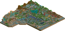
I've updated some notes on the park's construction process and some of my thoughts on how it all turned out if you want to click on my creator's notes page, or whatever. It's really not that interesting, but just some more explanation on some theming choices and that sort of thing.
Thanks so much for all the hard work on the release prep. It all looks so fancy and great.
It came down to the wire, but Sey's vote generously pushed me above the threshold into Bronze territory. So glad you enjoyed it!
If anybody has any specific questions, I'm happy to answer them.
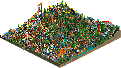
InVersed, I'm sorry you think it's a step down from Dental Valley. I have to say that I don't necessarily agree - Dental Valley had a lot of flashy, impressive "stuff". It's just sort of there. And the detail is a little overwhelming. I think my general composition has improved a lot, even though I'll admit I'm not too happy with the way some things sort of crowd together in this. I think in general, I definitely tried more subtlety this time around, and I'm not sure if I succeeded at that.
well done postit. nice park you have here.
I didn't really like the park, honestly... I thought it was very messy, and the theme was unclear to me so that didn't really help. The park isn't bad, there's just barely anything I like. When I look at your previous parks in your profile, it looks like this is a huge step down (aesthetics). I hope your next park is more traditional, or at least with a better concept/aesthetics balance.
Congratulations on the accolade though! Good to see you building.
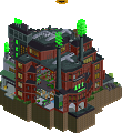
Splitvision, I thought the building that housed the Joker wild mouse was pretty imposing but maybe not. Glad you liked it.
Thanks for the feedback, Liampie. I think you'll like my more traditional park that I've been working on forever.
Phatage, it means a lot to me that you liked the coasters. I actually thought to myself during construction that I wanted the park to be like Busch Gardens Sydney only in the sense that I wanted the scale of it all to make sense. It wouldn't make sense if I was a peep visiting the park and the Arrow coaster was 1000 ft longer of track, had a batwing and double corkscrew, and was 50 ft higher, given the small size of land of the park and the general scale of the entrance area. I really hoped that such considerations are shown in the final product.
Thanks Sammy and J K.
Dotrobot, glad you liked Maroni's and Holiday.