Park / Woodfall Park
-
 21-July 10
- Views 12,802
- Downloads 2,328
- Fans 2
- Comments 27
-
-
 69.23%(required: 60%)
 Silver

RCTCA 85% CedarPoint6 75% Kumba 75% Liampie 75% SSSammy 75% inVersed 70% nin 70% turbin3 70% 5dave 65% chapelz 65% geewhzz 65% posix 65% RCTNW 65% Six Frags 65% Sey 60% 69.23% -
2 fans
 Fans of this park
-
 Full-Size Map
-
 Download Park
2,328
-
 Objects
481
-
 Tags
Tags
![park_2420 [H2H6] R4 - Reservoir Dogs - Atlantis Resort](https://www.nedesigns.com/uploads/parks/2420/aerialt2160.png)


Checking it out now.
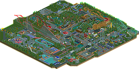
Honestly I was a little dissapointed, the architecture idnt hold up very well and those boring texturless tarps everywhere were pretty gross. The overall layout was also strange and made the park hard to take in. But ofcourse there were alot of good things, I think whitewater landing was the most impressive thing in the park. I liked the layouts, none of the were very flashy or fancy but they all worked well, The mine train was really cool. The mega-lite was neat and you managed to pace it awesomely, but it was a bit strange of a selction. I think the water park was the best part about this, the "clean" style of yours translated well into it. This will definatly be a park I come back to for inspiration.
I am anticipating a new park from you though, with some refinment you could be a really good realistic parkmaker. I think you should maybe go for a design or a small park with a unique theme.
Congrats on a great park dude.
If the park were anywhere other than south central Iowa, the premise of the park would have made much more sense and would have been more believable/enjoyable for me. Despite my issue with the storyline (which really only bugs me because I'm familiar with the area), overall it was definitely a fun park to look around. Congrats on the accolade!
Congrats!
'Cena', on 21 Jul 2010 - 08:28 AM, said:
Screw the gold. In my opinion this is a spotlight candidate! Haven't had this much fun looking through a park in ages. It was so much fun for me for three reasons: it reminded me of Dorney Park, it reminded me of Cedar Point, and it reminded me of what I intended Duffy's Lake to look like before I foolishly threw in the towel on that.
There was just so much in the park that seemed so simple, yet so thought out. For instance, the locker area in the waterpark. It's really just some blocks lined up in rows, but the way it looks with the Steel Mamba brake run running directly behind it reminds me a lot of how the lockers at Dorney are set up with Talon's station and final brake/transfer behind them. Also, I think you really nailed the "Cedar Fair" architectural style. I laughed to myself while looking through the park, because almost every single building is the same, just with a different facade. I liked how, in that respect, you kind of satirized Cedar Fair, but not in an over-the-top manner.
As for the coasters, I thought they were great. War Bird was probably my favorite. I loved the whole side midway area leading up to it, and the queue just felt so Raptor-esque to me. Steel Mamba was a close second, as I thought you just nailed so many of the typical Morgan traits: the long break run, the drawn out ending, the helix turnaround, the white trains with varying stripes, etc. I loved that. I also thought you did the shuttle loop and the mega lite very well.
For other rides, I'd say you really nailed the water stuff. I think you nailed White Water Landing on the head, which is something I failed to do with my earlier attempt. The rapids was short but believable, and the log flume was pretty standard fair. The water park was also a lot better than I would have expected from the overview. I really liked how you did Aquablast, and the racing slide still looks just as good as it did when you showed it a while back.
For negatives, I can only point out a few things. The foliage was really overbearing around the Antique Cars ride. So much so that guests would probably not even be able to tell what they were waiting in line for haha. I also thought the Mega-Lite was a bit out of place. I would have preferred to see the woody there, as it would have been more believable for me. That's one thing I really liked about JDP's recent park, the Dinn/GCI duo. It's a nice combination between old and new which can really give the park some character I think. Also, I think Vortex could have been a signature attraction for the park. Instead it looks like a cross between Corkscrew and Drachen Fire. I think you should have either gone big or gone small on this. The middle ground made it appear less thought out.
But yeah, that's all I got for now. I know I'm probably in the minority in thinking this is Spotlight caliber, I think others might at least agree that this is worth more than a silver! Come on. This is a full-scale park with all the necessary parts. How much more gold-worthy can you get? Anyway, awesome job Sam. I've been watching you progress with each park you build, and it's so nice to see you get the accolade you deserve. Congrats!
tdub96 Offline
Great job on the waterpark as well.
The GCI was good but the out-and-back part is something you normally wouldnt see on a coaster like that. The megalite was decent, but it seemed a little stretched out as i thought the usual ML layout was more compact. Woulda been nice to see another big woodie in the park, i also agree with Z on this one.
Very good park, thought it was better than silver, but either way, congrats on the superb realistic effort. Well done.
-Taylor
However, I was disappointed. Some areas were way too bare*, the waterpark was dead and some stuff lacked refinement**.
*You advertised a screen of the hypercoaster, with some foliage in the background. You deleted the foliage. Why? It could've made quite a difference... The mega-lite looked bad for the same reason. I didn't like that area at all, sorry. In some other areas you actually overdid the foliage though!
**The hyper's tunnel, some of the queues, some buildings and some minor layout flaws for example.
But there were sparks of brilliance too. Although you didn't win Gold, I'm sure you're not far from a spotlight. You're good at architecture, details (although most details has been done before I think), rides, foliage, concept and finishing. You just need more refinement and unique elements.
I'm not a huge fan of hardcore realism, except for when it's executed REALLY well. This park falls into that category, I had a good time exploring this! Thanks and congratulations, and I'm looking forward to your next park a lot!
enough negatives, now i'm going to explain why i gave the score i did. it's not very often i take parks for face value. i like to look a little deeper when i veiw a park. there was a lot of passion and hard work put into this park, and it's obvious you enjoyed doing it. whether you did a SHIT tonne of research or just aqquired the knowledge by osmosis, i don't know. i do know, however, that you know your stuff. it just wreaked of enjoyment. and that's what makes a good builder. being able to see what you want to achieve in a park and execute it in such a way that every idea you had is visible.
But what I like most about this park is not necessarily the finished product but the fact that it shows how much you've improved over 18 months. Its kind of cool to see somebody improve while building a park that it itself is improving over its ~80 year existence. The parts didn't necessarily line up; what I mean is that the parts of the park still left from the 1930's weren't built by you 18 months ago and vice versa, although the mega-lite was probably one of the more recent things to be built considering that you actually had the woodie there and demolished it, which is pretty cool itself, but that would be really hard to plan.
As for its status as a silver, I both believe it was deserving of it as well as is good for your maturation as a parkmaker. As for the park itself, there were very little, if any, elevation changes of even 5', and even in the midwest its hard to find that big of a plot of land that's 100% flat. The park's layout did little to transcend the grid-nature of RCT, something that also detracts from its realism. There are other things as well, but I personally would like to see you focus more on these things in the future.
Also Intimidator 205 gave me a laugh
The thing that bothered me the most has to be foliage tbh, it was way too bare in spaces for my taste and I think that really brought the park down a level in my eyes...
But really congrats on the accolade man really good one
- As others stated, there was no elevation changes thus making the map entirly too flat. Even if you would have place the occasional hill in some of the open areas would have helped this visually
- The water park was lifeless. I know the rides may not have been functional but seeing the peeps in there would have been better than none at all
- The pathing seemed uninspired and far to straight for too long. Could also have been varied in texture.
I did like the little attractions all over the place along with some of the layouts for the coasters. It really shows how muh you have improved.
Like I said, it was just a couple of things that kept it from a gold in my eyes however I'm confident that your next project will be one to enjoy.
James