Park / Europa Park World Showcase
-
 08-July 10
- Views 35,318
- Downloads 4,736
- Fans 10
- Comments 72
-

-
 88.00%(required: 80%)
 Spotlight

Kumba 100% yes Ozone 95% yes Sey 95% yes 5dave 90% yes CedarPoint6 90% yes geewhzz 90% yes inVersed 90% yes Liampie 90% yes posix 90% yes turbin3 90% yes Evil WME 85% yes K0NG 85% yes SSSammy 85% no ][ntamin22 85% yes chapelz 80% no robbie92 80% yes Roomie 80% yes 88.00% 88.24% -
10 fans
 Fans of this park
-
 Full-Size Map
-
 Download Park
4,736
-
 Objects
648
-
 Tags
Tags
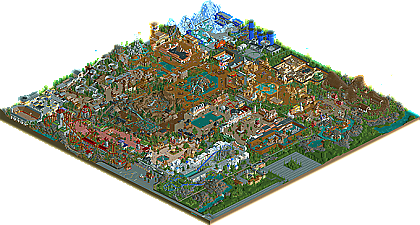

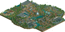
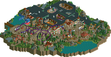
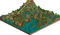
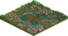
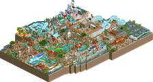
But as said in the rel prep, personal opinion should be avoided. However Kumba adapted that and has produced a decent write-up that has the right sort of opinion that persuades the reader to download the park.
As for the park itself, I love all the details found around the park. it's not in your face kind of details but rather details that pull the park together in a balanced and well thought out concept. There are not many parks that draw me back for inspiration however this will be one that I will visit from time to time for ideas and to help spark the motivation to keep building.
Again, well done.
James
^
^
@Six Frags ^
Yeah sure you can send it to me.
I definitely agree with Phatage in this regard. Looking through the topic in the AD, the park appeared to have more of a fluid and united sense to it than it turned out to have. Not necessarily a major problem, because that happens to probably 90 percent of all parks in RCT (for whatever reason). Probably my one major gripe that I thought detracted from the experience would be that there were some areas with excessively large/wide paths that could have been slimmed down for more landscaping or buildings. Other than that I loved all of the different atmospheres and definitely enjoyed the park overall.
Congrats on the Spotlight!
That said, I hesitate before placing this above a RoB or Isole Calabria because of the notions Phatage and John touched upon with respect to the park being considered as a series of vignettes rather than a unified whole. I thought more spacing between the areas, particularly "dead space" via trees or a stretch of less "busy" tiles would be very effective. I thought the size, while incredible, may have actually hurt the park a bit as I felt (a) it was kind of too much to take in, and (b) it restricted the full development and realization of your ideas. I wondered what my experience would be like if I were a guest there--what would be my sense of the park as a whole. I imagined that when I would walk back to my car I would say something like, "Well China was good, I hated Mexico though, etc." I also thought that an entrance that had more of a central hub type feel would be an essential piece to be compared with a RoB. I know you attempted that but I felt like the scale was not large enough. If you spaced out the area more the display of flags could be more pronounced, and you could add multicultural shops that could bridge national lines. These are just some of the many things that could improve the entrance area. In general, providing much more of "neutral" feel to the park. The entrance as it is now seems like you are letting guests in the midst of the chaos. Disney parks, Islands of adventure, and even Rivers of Babylon are more effective of achieving the"hub" entrance style . Finally, I know the theme tying everything together in this park is a celebration of European nations, but I feel that a more nuanced twist on it (such as the notion of a "crumbling" ancient city in RoB, rather than "an" ancient city) would make the park seem like a more original and cohesive piece, and less of a clashing of entirely independent sections.
I know my criticisms may seem kind of abstract, but when you are at this level of quality, I feel this is the best way to address the "deeper" issues behind such parks. Congrats again on the spotlight. I really enjoyed the park and will definitely view it multiple times.
I loved the coaster in Antarctica. I didn't really like the launched mine train. Some of the architecture sort of blended together. It seemed that all the buildings had the same basic 2x2 "fancy-fied" format. This may explain a lot of why people felt that the park was a series of minis, rather than a cohesive park - at least I was pretty much uninterested in the buildings because after I had been to a couple of areas, they all seemed the same, but with different colors and textures. I also thought the Greek area took a lot of inspiration from Toon's old Greek thing.
Anyway, it was a pretty amazing park. I liked many of the rides. Some areas were bare but I completely understand how that happened. Well done and congrats.
Wow, Hans. I've always been sort of ambivalent about your work, to be honest, it was nice and interesting but not "special" to me..
That has all changed. This, I think, is my favorite park ever. Sure there are things that could be 'better', for each person, but that's why this is YOUR park.
I'll start at the beginning.
Entrance area - Very simple, exactly what is needed, nothing more. Lovely touches, gives off a REALLY nice atmosphere with the Disney style railway through it.
Germany - Very nice fountain, and large areas of path, which is important for an entrance hub, excellent. Nice foliage (this applies throughout the park).
China - Brave using that path, but i've always loved it, and think it's perfect for a Chinese area. A strange mix of foliage and flower colours, but it comes together really nicely. I've never really been a fan of massive custom supports, but this doesn't look awful. The coaster seems exciting, and I love the raised station viewable from the main path, allowing good sized tunnels underneath. As has been said, the Sushi bar (although strictly Japanese I think?) is one of the nicest details i've seen. Nice atmosphere and rugged landscape throughout gives this area a TOTALLY different feel from the surrounding areas right next door, really hard to achieve.
Spain - I love the bull fight, pity we can't get peeps watching shows, would give this area more vibrancy. I didn't really like how grey everything was, it made it feel slightly dead and too clean.
Greece - Great coaster! It's not often we see realistic double lift hill coasters, and this one is excellent. It's strange the contrast between the Spanish section and this one; while technically the same colours (nearly) and textures, this one feels much more active and involved, probably due to more foliage and a coaster in it. Staff entrance was really nice too.
France - This didn't feel especially French to me, but it was a really nice place to be. I think this and the German area could have been moulded into one, either or, it wouldn't have really mattered. Love the clean water feature and statues, really nice use of open space.
Austria - Some really great atmosphere here, again. Nice mine train, great dragon, and a very good log flume. Although, I didn't understand all the little coloured things next to the dragon? Feel like i'm missing something.
Switzerland - One of my favorite areas. An EXCELLENT bobsled, I haven't seen a good one of those in years. Absolutely years. Felt perfect, to me, and the excellent architecture really set it off. The steel mouse coaster is nice, although maybe a different colour would have made it stand out more? Who knows... Nice to see different types being used though, good finish to the area.
Peru - Here we go. This, is fantastic. One of my favourite areas. Lovely splash boats ride, with merges to help get your point across. Looks fantastic. And the first glimpse of one of my favourite parts of the whole park, the transport system! Love the monorails. The other half of the area, the more colourful part, is really interesting, but feels very different from the ruins half, I thought they were different areas. But you definitely get away with it, there is a coherence in the atmosphere that works. Love the little shops, and colours everywhere.
Holland - With the cheese, windmill, and architecture, unmistakably Holland! And I guess you would know... Good placement of the Pirates ride, very Disneyland Paris, which I love, been meaning to make a recreation of that floating past the restaurant feel for a while now! Also the train through the ride is nice, giving both sets of riders something interesting to see. The theming throughout is very nice, especially on the dark ride.
Papua New Guinea - Nice water ride, something a little different, and a respite in the middle of a few areas. Nice little huts, and gives a nice portrayal of the place. The show there is fantastic, and although the architecture is so different to the surrounding areas, it works really well.
Russia - Euromir was excellent, another really brave ride choice, as there's not MUCH you can do to theme it... but the blocky massive buildings look great here, and the radar dishes are very nice. The rest of the area didn't do much for me, but I didn't care, as Mir was so good.
Antarctica - SO BRAVE! A full area of just ice? No way. And yet it works, really well. You manage to make it look plausible in a theme park as well, amazing. I'd question having a water ride in such icy conditions, but hey, to each their own! The coaster is brilliant, love the start, and it flows really well. Very nice.
Mexico - Nice influx of colour here, awesome middle building with the mexican flag windows. Really nice rapids too, with a great little storage area for spare trains. I'll get onto that in a bit, though. The coaster was brilliant for me, exactly the right size. Too big, and it would have completely dominated the whole park, but too small, and there's no reason for people to come all the way to the back of the park. This was just right, big enough to dominate the area and look imposing, but small enough to be confined to just that space. It's hard to explain, but it felt right.
Finally, onto my favourite area - Egypt! - What a dark ride. Best one ever. I don't even know how you made the spinning mouse cars spin like that. And the massive snake and spider don't look stupid, even though they're massive! Really nice job. The surrounding area is brilliant, too, lovely atmosphere, probably the best in the park, and I love the empty plaza with the two monorails flying over it. You did well to avoid the cliches for Egypt and instead work a theme into a massive park like this. Which leads me onto...
I don't understand why some people are saying the park didn't flow. I actually thought that the park flowed better than most as a cohesive whole. The atmosphere was pretty consistent, and the theming throughout was perfect. By which I mean, you took nuances of each theme and went a little with each one, but not so far as to differentiate it from the park in which it was set. For example, Peru has an excellent hillside ruin for the splash boats, and it would have been easy to continue this theme through the entire area... but then I don't think it would have felt like part of the same park. Instead, the rest of the area is pretty lovely, and leads on to the next place.
The small touches like the flags and consistent theming touches helped a lot too. The foliage was excellent throughout, and gave it a good feel, especially the foliage outside and inbetween each area. This was the first park i've seen of this scale where everything feels as if it has its own place, and isn't rammed in, and so looks planned properly. I couldn't tell in which order you made the areas, as I saw no evidence of anything being sacrificed to make the park work. And that takes a hell of a lot of planning and skill.
Finally, well done for making my favourite park ever. I think I like other pieces of RCT more than this, but as a realistic park, this takes the biscuit.
Hello friend, longtime no speak.
Taylor
EDIT: For some reason i cant open the HTML park guide. It opens up an internet page, loads a little, then stops. I would like to see that. Also, the readme document, when i opened it was all a bunch of symbols and numbers. haha, i dont need to see them, but i just thought it was a lil weird.
I think I'm responsible for about 10 of those because my rct2 is broken atm and I've only had the chance to see this park through the overview haha.
I'm so amazed at how you captured each theme so perfectly! I can really see where three years of work paid off- the amount of detail and design is incredible. I am really looking forward to seeing it in game (in a week when my new copy of rct2 comes in!) I'm loving the park so far, and I'm sure it'll be even better in game!
gee- Glad someone noticed! It's probably the one thing that cost me the most time.. It basically started with Puysegur Point where I tried out a whole new system for peepability. Most of you probably don't remember, but up until then no park used path blocks with invisible path on top to get peeps to the place they wanted and don't wander off (after that park, magnus created those other path pieces that are basically the same only with the sides deleted which most parkmakers seemed to be using more (which I still don't understand
Jem- Wow, thanks! Really means a lot coming from you and I'm glad you enjoyed it so much!
I agree with you about the flow between the sections.. It's one of the things I really thought about, and tried my best to kind of let the sections blend into each other.. For example the mountain between Peru and Antarctica; The highlands of the Machu Picchu on one side which has this snow on top of the mountain which blends into the icy Antarctic section.. Another example is the woods of Austria which blends into the jungle of Papua New Guinea..
I'm glad you noticed the Disneyland influences, because the real Europa Park is full of 'borrowed' attractions, ideas and theming.. I tried to get this a bit further with kind of mimicking Troy in Toverland with El Toro. I could imagine if Europa Park wanted to open a new GCI coaster they would probably look at how Toverland had done it and try to do it better. I would like to know if any Europa Park fans notice all the attractions and ideas of the real Europa Park I've used in this park.. There are quite a lot!
About the China section; It was one of the original sections before the big rebuild and I decided to not rebuild that section and instead try to get some more details in. That's why those bulky supports are still in.. Besides, I didn't have free object slots to get inverted Toon supports in and I kind of like the idea to see a progress of building in a park (as could be read in the readme)..
On Egypt/Challenge of Ra; the spinning coaster type already could spin when you placed a 'spin section'.. Only problem was that it needed a chain to keep going forward and after a breakdown the cars wouldn't move at certain chains on straight track. When I changed the chain from straight track pieces to chain on turns (using 8 cars 1.32) it worked! So quite some trial and error and when the cars go through turns they don't flow well and kinda falter, but that's the only downside.. Also used a dummy track to get the maximum number of cars..
Thanks again for all the replies!
SF
-First of all, that invert is a lot better in-game than it looked from the screens. The custom supports looked awkward to me when you were advertising this, but somehow came together a lot better as a whole in-game. As a matter of fact, I really did enjoy that invert, and I thought the custom station was a nice touch.
-The watercoaster was great, and was very easily my favorite ride in the park. It was so cool to watch with the Gladiator theme playing in the background, and that underground drop was fantastic.
-The Mack launcher was okay. I thought it was a bit too drawn out and was paced too unsteadily to be a believable launched roller coaster like Blue Fire. It did, however, look really nice, and the station was pretty damn cool. Oh, and that first inversion was awesome.
-I've seen a few comments regarding the GCI being too "spread out." I actually thought it was spot on, as people seem to be drawn into making these pint-sized GCI's lately that really aren't interesting to watch. This was a welcome break in the trend.
-The French area easily was the most aesthetically appealing to me. Having been in France at the time I first viewed this, I think you hit a lot of the "stereotypical French" stuff right on the mark.
-The architecture around the log flume, bobsled, and powered mine train was incredible. Some of the best I've ever seen for sure.
-Euromir was a huge success. A lesser parkmaker would have never even attempted it.
-The park entrance here rivals "The Masterpiece" for my favorite entrance of all time.
-The architecture in the Russian area was below the quality of the rest of the park, if I had to point out a flaw.
-The park kind of lacked that one signature ride. I felt like you tried to do it with the mack launcher but it didn't work (at least for me), just because I wasn't that much of a fan of the ride and it was really tucked away in the corner of the (absolutely awesome) Antarctica section. Something like Silver Star would have done the trick, I think.
-Lastly, what happened to the Ireland section with Kilkenny Mansion and Riverdance? I was totally looking forward to seeing that!
Overall, I think you have proved again to me why you're one of my favorite parkmakers. Although I think you could work on your ride design a bit, your architecture is basically second to none. That alone was worth the spotlight. Keep up the great building man, and congrats on the well-desrved spotlight.