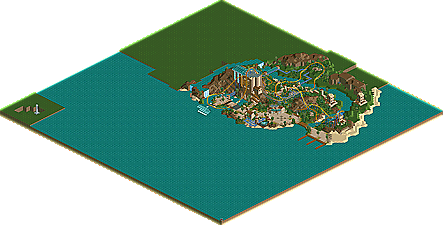
Park / Neptunes Fury
-
 04-July 10
- Views 143,057
- Downloads 683
- Fans 0
- Comments 109

-
 No fans of this park
-
 Download Park
683
-
 Tags
Tags
 04-July 10

 No fans of this park
 Download Park
683
 Tags
Tags
 Similar Parks
 Members Reading
I really think you are being a bit to hard on your self and your entry. You both deserve to go the the next round in fact all 3 entries for the Launched Coaster were amazing each in there own way. When I looked at the park(s) I looked for one thing first and that was the coaster, it held 60% of my score and yours beat NIN's. While the Disney park made by NIN was a beautiful little place his coaster just couldn't quite compete with your coaster.
Maybe I am wrong, but this contest is mainly about who can build the better ride first and the scenery is second correct? If not, and scenery is more important than the ride then I will have to adjust my judging for the next round.
The other 40% of my score for all the entries are divided up by scenery/theme and park atmosphere
The two entries broke down would be:
NIN
coaster - 47 points
scenery - 20 points
atmosphere - 12
total - 79/100 points < what killed the score was how short the coaster was, a very stiff, lifeless park and a non-functioning ride in the park (ROTO DROP would only spin at it's base and did not function as it should). The scenery was a perfect 20 points but it could not save the coaster which is what I thought this contest was mainly about.
DISNEYLANDIAN192
coaster - 54
scenery - 13
atmosphere - 17
total - 84/100 points < the coaster had a good layout for the most part. The over banked turn or inversion (whatever it was supposed to be) at the end killed some of the score but the launch mechanism alone was enough to make up for it, the scenery was well done but incomplete and the park did have a great feel to it.
Only 5 points separated who I felt won the round, that pretty much makes them both winners as far I am concerned but to me DISNEYLAND192 entry was just little better and so went my vote, once again based upon what I thought this contest was about. Someone please let me know if my judging scale needs to be adjusted to scenery being more important than the ride(s) or if they are supposed to be equally important and I will try again next round.
Once again congratulations to both of you for great entries.
Really fun set of parks. Tolsimir, wow. I thought it was engrossing.
unfinished look? no, just because there's not a tree on every space doesn't mean it's unfinished.
What do trees have to do with it? < if you have a problem with the use or non-use of trees that is your issue not mine.
60% of my vote came from the coaster not the scenery. Your coaster was moving 6/MPH in one of the inversions! That right there killed your entry (for me) more than your scenery did. Only 20% of my vote came from the scenery and yours scored a 12. While what was there was nice, to me there wasn't enough of it. His coaster was just better and his score for it combined with the same score of 12 for scenery I gave his entry beat yours. You did beat TOP GUN's score for atmosphere, 16/13 but that still wasn't enough to beat TOP GUN's coaster.
Yes, I gave you both 12 for your scenery, his was because there was a lot put into it even though it wasn't very well done and as for yours, it was very good, just not enough of it. Hence the word 'unfinished' being used.
Like I said before, if this contest isn't about the ride(s) and is more about scenery then I need to change the way I am looking at these entries.
NIN, the ride was working sorta, it would spin but not climb the tower. As for the lifeless comment. You are right, BelgianGuy's entry had no life in the park so to speak, just as yours didn't but his didn't feel lifeless. It had a better atmosphere than the other 2 who built the same coaster type and their entries had guests in them. In the comment above to Nokia I revealed his score for atmosphere and his beat TOP GUN's and it was also guest less.
Yours while very pleasing to the eye, it was also sterile and uninviting as if Mr Walt Disney himself was about to show up and all the employees just scrubbed everything so clean you could eat off the bottom of a trash can. Sometimes perfect clean lines may be nice to look at but may not always make it a nice place to be. What I just said is reflected in my score for your park. A 20 for the scenery and a 12 for atmosphere.
NIN, my friend we have been commenting on each others work for a quite some time at TPR and I have a great deal of respect for all the time you put into everything you do with RCT. I am sorry, your entry kicked butt, however for me and about 5 other people it didn't quite kick enough butt to win my vote. Had I judged yours and DISNEYLANDIAN192's as if scenery was the most important part you would have had my vote. < SEE BOLD PRINT ^ABOVE^
If you consider the coaster to be 60% of the mark, then that's good enough for me.
So there is not certain way I was suppose to be looking at these entries, it's all personal preference as to what is the most important part is. If there even is one. Cool, I really was beginning to think I had missed the mark and was just looking at these entries totally the wrong way.
Stupid I know but, I was so happy to see a contest like this happen instead of just seeing the left overs as I have for all the other contests. I actually made up a scoring system and I have a little tally sheet set up for this to keep track of who got what and why I felt that way.
^^ I agree NIN's was very realistic, but so was DISNEYLANDIAN192's. Just for fun, if I were to put SSSammy's in here, his would have killed both of them with a perfect score of 60 points.
They were all great!
Edited by dmaxsba, 07 July 2010 - 05:00 AM.
Also gota give myself a pat on the back for mostly guessing round 1 right. Only wrong on Milo and Austin55 and I might have been the only one to guess RCTCA would win, nice one man!
Yes, it was quite realistic. It was (more or less) an Xcelerator clone. And it was very nicely done; within a larger park I would love it. BUT, when the premise of your entry is "design the best launched coaster you can", regurgitating a real-world design rather than coming up with something new and interesting is very disappointing. It was, IMO, playing things too safe and hoping the surrounding scenery porn would distract from it well enough to get through. On the other hand, disneylandian's coaster had an interesting layout. However, the area directly around the coaster was unfinished, and the ride had some awkward transitions with regards to banking, etc.
I'm still on the fence about who to vote for, but if you go on, Nin, try to work outside the box on ride design more often?
-ACE
i think we'll get on just fine
it's called hang time, & thank you curtis.
How did mine score?
If you were talking to me about scores MAVERICK, here they are. You guys had a tough coaster type to build and like I mentioned in my review of them, they were very close. While your coaster had much better pacing, CASIMAR's had a better look to it. Really liked your transfer track set up. Your coaster did beat his. You lost it in the scenery and atmosphere areas. Still, they were very close in the end.
MAVERICK
coaster - 37/60
scenery - 9/20
atmosphere - 10/20
total points - 56/100
CASIMIR
coaster - 34/60
scenery - 13/20
atmosphere - 13/20
total points - 60/100