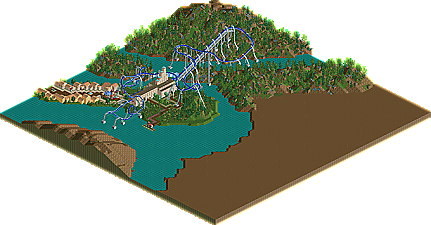
turtle, skull as rock sculpture, absolutely genius. unfortunately only rct2 can do these kind of things.
belgianguy, just beautiful. people need to understand that any theme can be done in millions of ways and thus be interesting. i'm really looking forward to seeing your next entry.
sssammy, just delicious ... you got good sooo quickly, it's ridiculous. SUCH a good design on the platform of excalibur. boomers are usually ridiculously hard to theme, but you did it very well. looks a little as if your focus on foliage is almost too much in places. and the diagonalness looks a bit odd to me. sometimes it makes sense to force rides into little space, but i don't think it's a must?
loopy, how you used the waterfalls where the track hits the water was just amazing. also the idea of split water was great.
dr dirt, traces of beauty.
airtime, really looking forward what you can do with ll in the next round
also, wasn't it funny how so many entries had really short and whizzy trains?
to all the forfeits: there are many qualities a good player needs to have, and one very important is the motivation to finish something. i know you had no time, or you didn't want to "waste" what great you have there unfinished, or your computer crashed, and then your cd broke, etc. for some reason, these things seem to happen to the same people over and over. you're not to blame, because it's not like you have to play, but i'd just be a bit more humble about my game if in the end nothing is ever coming out of it.
needless to say nin, i want to marry you. we should do a duo.
thanks go to Liam and trav.
slightly bigger thanks go to J K and posix cause you made me feel proud of myself slightly more than the others. haha.
posix - i've been around for almost two years, so not that quickly, haha. but thanks. i was worried about getting critisism about the diagonalness, but then again i was worried that people were going to finish their entries.
Sorry my entry was pretty unfinished. My band had a gig last night and we've been rehearsing during this whole first round. Not to mention I had a little trouble sending my entry last night when I got home, hahaha
I'll take a look at the rest of these tonight or sometime tomorrow. Well done dudes!
1) disappointing round, too many unfinished entries
2) dammit i could have won a round by just submitting an unfinished layout
3) what happened K0NG? nother error trapper i bet?
4) damn good screens Turtle, RCTCA, nin, and about three or four others.
So yeah, I couldn't get the hack to work that the whole design was pretty much centered around. I think it was a pretty original/accurate way to do a pretzel in LL, too, I'll have to keep trying. FAIL from me.
Good job to everyone else. SSSammy and nin = fantastic!
Yeah, I wish I had known 100% for sure that I was needed as trav was supposed to tell Louis but I hadn't heard from either of them that it was official, so I left myself open to last minute changes. Either way it's good to know my work made it a BIT harder for you to win. But with the amount of time I didn't put into mine I can't expect too much. It was fun while it lasted!
Steve vs. darkhorse: although there was little content in both, Steve had a nice little facade and a good layout. Steve
Liampie vs. incities: really didn't know where to go on this one. On one hand, I was impressed by incities scale, but Liampie had a better layout and wasn't as messy. Also it was themed to poop. Liampie
Wheres_walto vs. FK+coastermind: another difficult match up. It basically just came down to FK having more good looking architecture (for example the station) and for having a larger park, and the submarines. However, walto made a very good entry. FK+coastermind
Maverick vs. Casimir: I'm sorry I can't remember mavericks. Casimirs was good, although I really didn't think the grass/dirt and the trees were very sinbad-ish. Casimir
disneylandian vs. nin: the best matchup by far. Disneylandian had a good entry with some really strong architecture and an amazing atmosphere and detailing work, however it was a little unfinished around the edges and I didn't like the coaster, especially how it just snuck in a station with the freefall. nin had an amazing entry. stunning. no complaints. nin
ride6 (i don't have ll so I can't comment): this was a good, classic rct2 entry. It had a good atmosphere, although the coaster layout was a little funky.
splitvision vs. tolsimir: another tough matchup. tolsimirs was very good and well thought out, but the architecture just wasn't enough for me. splitvision won me over because of his great monorail station and the detailing on the coaster station. however, I didn't understand the imperial theme but also with glass buildings. Splitvision
Austin vs. Comet: austins was basically unfinished. meanwhile, comet had a stunning entry with amazing atmosphere and details. really superb, comet. Comet
Top Gun vs. Nokia: I didn't really like waggenfrabbenstabben whatever- there was no detailing and everything was basically just blocks with the wall pieces. Nokia had a beautiful entry with amazing landscaping, an amazing layout and stunning details. I especially liked the yellow awnings and the coaster station. Nokia
Turtle: beautiful entry, shame it went unmatched. The skull was very well executed and the architecture was excellent
Sssammy: One of my favorite entries. I was especially wowed by the diagonal que line part. Very original. Besides that, you had nice architecture and a great layout, and best of all plenty of details.
Dr. dirt: not much to say, I liked the awning entrance a lot though.
Favorites (in no order): Nin SSSammy Turtle Comet Nokia Disneylandian
109 Comments
Splitvision Offline
dr dirt Offline
Wow, I put too much time into that just to get a forfiet-win.
I'll comment on the entries once I'm done viewing.
posix Offline
louis, i appreciate it that it's all in one topic. thanks for being so considerate.
nin Offline
Wanted Offline
Edited by Wanted, 04 July 2010 - 03:52 PM.
Louis! Offline
As contest organiser I guess I will have the final say, but I will probably go to a select few outside for help.
No problem. I thought you would prefer it like this, I didnt want to cause any trouble.
Splitvision Offline
posix Offline
turtle, skull as rock sculpture, absolutely genius. unfortunately only rct2 can do these kind of things.
belgianguy, just beautiful. people need to understand that any theme can be done in millions of ways and thus be interesting. i'm really looking forward to seeing your next entry.
sssammy, just delicious ... you got good sooo quickly, it's ridiculous. SUCH a good design on the platform of excalibur. boomers are usually ridiculously hard to theme, but you did it very well. looks a little as if your focus on foliage is almost too much in places. and the diagonalness looks a bit odd to me. sometimes it makes sense to force rides into little space, but i don't think it's a must?
loopy, how you used the waterfalls where the track hits the water was just amazing. also the idea of split water was great.
dr dirt, traces of beauty.
airtime, really looking forward what you can do with ll in the next round
also, wasn't it funny how so many entries had really short and whizzy trains?
to all the forfeits: there are many qualities a good player needs to have, and one very important is the motivation to finish something. i know you had no time, or you didn't want to "waste" what great you have there unfinished, or your computer crashed, and then your cd broke, etc. for some reason, these things seem to happen to the same people over and over. you're not to blame, because it's not like you have to play, but i'd just be a bit more humble about my game if in the end nothing is ever coming out of it.
SSSammy Online
thanks go to Liam and trav.
slightly bigger thanks go to J K and posix cause you made me feel proud of myself slightly more than the others. haha.
posix - i've been around for almost two years, so not that quickly, haha. but thanks. i was worried about getting critisism about the diagonalness, but then again i was worried that people were going to finish their entries.
Comet Offline
No problem man, although I think I gave you a chance for an upset if you would've capitalized
Steve Offline
I'll take a look at the rest of these tonight or sometime tomorrow. Well done dudes!
Milo Offline
Gwazi Offline
2) dammit i could have won a round by just submitting an unfinished layout
3) what happened K0NG? nother error trapper i bet?
4) damn good screens Turtle, RCTCA, nin, and about three or four others.
not voting though, didn't download any
Nokia Offline
jusmith Offline
Good job to everyone else. SSSammy and nin = fantastic!
Maverick Offline
SSSammy Online
Fr3ak Offline
Louis! Offline
Cocoa Offline
Liampie vs. incities: really didn't know where to go on this one. On one hand, I was impressed by incities scale, but Liampie had a better layout and wasn't as messy. Also it was themed to poop. Liampie
Wheres_walto vs. FK+coastermind: another difficult match up. It basically just came down to FK having more good looking architecture (for example the station) and for having a larger park, and the submarines. However, walto made a very good entry. FK+coastermind
Maverick vs. Casimir: I'm sorry I can't remember mavericks. Casimirs was good, although I really didn't think the grass/dirt and the trees were very sinbad-ish. Casimir
disneylandian vs. nin: the best matchup by far. Disneylandian had a good entry with some really strong architecture and an amazing atmosphere and detailing work, however it was a little unfinished around the edges and I didn't like the coaster, especially how it just snuck in a station with the freefall.
nin had an amazing entry. stunning. no complaints. nin
ride6 (i don't have ll so I can't comment): this was a good, classic rct2 entry. It had a good atmosphere, although the coaster layout was a little funky.
splitvision vs. tolsimir: another tough matchup. tolsimirs was very good and well thought out, but the architecture just wasn't enough for me. splitvision won me over because of his great monorail station and the detailing on the coaster station. however, I didn't understand the imperial theme but also with glass buildings. Splitvision
Austin vs. Comet: austins was basically unfinished. meanwhile, comet had a stunning entry with amazing atmosphere and details. really superb, comet. Comet
Top Gun vs. Nokia: I didn't really like waggenfrabbenstabben whatever- there was no detailing and everything was basically just blocks with the wall pieces. Nokia had a beautiful entry with amazing landscaping, an amazing layout and stunning details. I especially liked the yellow awnings and the coaster station. Nokia
Turtle: beautiful entry, shame it went unmatched. The skull was very well executed and the architecture was excellent
Sssammy: One of my favorite entries. I was especially wowed by the diagonal que line part. Very original. Besides that, you had nice architecture and a great layout, and best of all plenty of details.
Dr. dirt: not much to say, I liked the awning entrance a lot though.
Favorites (in no order):
Nin
SSSammy
Turtle
Comet
Nokia
Disneylandian