Park / Walkman Of My Brain
-
 19-March 04
- Views 12,673
- Downloads 4,030
- Fans 5
- Comments 75

-

-
 87.50%(required: none)
 Spotlight

G Force 100% no csw 95% no Cocoa 90% no Kumba 90% no 5dave 85% no alex 85% no Liampie 85% no nin 85% no Poke 85% no ][ntamin22 80% no 87.50% 0.00% -
5 fans
 Fans of this park
-
 Download Park
4,030
-
 Tags
Tags


Keep in mind my intro. The park was good, but I find it hard to like parks that are hyped up like a coffee drunk child. This park will probably grow on me, but right now I would say it probably ranks somewhere between 15-20 on my list. Good job Mantis, I will look forward to all your future parks. Now all we have to do is to find a way for you to a make a park in less than 150 years
Btw, lol @ the lake!
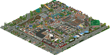
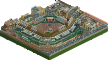
Discovery was nice. Digital Love is a funky coaster with a crazy, curving layout and good theming. Again, lots of little stuff to look at in this section...Aerodynamic was good...I didn't even notice that loop until it went through, I was like "what the heck?!" and then I realized it haha. Daft Punk live is a good stadium..possibly the best I've seen in a long time. Maybe ever.
Hotel Yorba was the biggest hotel I've seen haha. Small area, but I guess its just one giant hotel complex, and its very cool. I like the White Stripes, nice weaving techniques and almost dueling like near-misses. Nice job there also.
Pavonis Mons was a nice area..I like the architecture here, the coaster is good, but a bit fast even..nice theming, and I like that gocart ride.
Rooty is my favorite area in a long time...easily the best in the park. You said that not many people would like it cause its so weird? You were wrong, mantis.
Great park, mantis you've done a wonderful job. Possibly #2 or even 1 if I can fit it in.
Seriously, I can't wait to see this park! I thought WOMB was a nifty name, and I really do want to pay a visit to mantis' beautiful baby that was "born" (read: delivered) today!
Now I'm off to well, take a look if I can.
More later.
Whooo..hooooooo!
Kai
what happened?
http://rollercoaster...potlight_ti.php
I loved the two sections in the back though. Great colors there. Hotel Yorba I especially liked, nice interaction of archy and landscaping, not to mention the dueling woodies. Those were beautiful. "Discovery" I wasn't too sure about at first, but after looking at the other big section near the entrance (I forget the name, as I always seem to do) it seemed a whole lot better in comparison. Sorry, I just couldn't stand the other one. Too much going on, it made my primitive little brain hurt. Also way too many coasters/rides used as scenary, I think you might have had more of those than actual buildings.
I can understand why people love this park though. I am just too critical and nit-picky to fully appreciate it.
Can someone please tell me what I have to do when I get the "invalid data" message? I haven't touched LL in so long so I forgot what I'm supposed to do or download..
I opened "My computer".. then "Program Files".. then "Hasbro Interactive".. "Rollercoater Tycoon".. and finally "saved games". Clicked and unzipped womb.. then the message pops up on the menu screen. Am I doin' it right?
And Jacko, I got the same message the first time, but I restarted RCT, tried again, and it worked fine.
Well I got through about 2/3 of the park before I got an error trapper (
Magnificent park. Very creative and amazing.. it had that "adventurous" feeling almost everywhere. Kinda like that feeling you get inside IOA, or any DW park. I got through the Bingo Bango section, the Flaming Lips Section and the White Stripes. Coasters were all very good, especially that crazily hacked one in the FL section - also, I especially liked Bingo Bango for it's "nesteledness". It just fit in very well and felt very.. nesteled. It went through/around/inside just about everything, and I loved the path interaction with it. The terrain elevation in that section made it my favorite. Also, I loved that whole section dedicated the the White Stripes. Hardly anyone likes them, but personally I thought they definately deserve their own section.
Nice hacks with the sculptures also.. you've definately made me realize how different RCT and RCT2 really are. They are going in very different directions. Congrats again, mantis.
Corkscrewed Offline
Unless Mantis retires.
I'm voting for him.
no doubt you deserve your props for investing what seems to me to be a decade's worth of work into that park, and i understand that in it there's a lot to look at/for and appreciate as well.. the problem lays in me having no idea where to start. i liked Age of Empires a lot more because of it's flirtation with simplicity.
the use of colors didn't seem to be any new thing, either. i clicked on the color swatch and went through the park trying to find a color that wasn't used, and i found a few.. so maybe i'm not looking hard enough, or maybe you didn't work hard enough... either way, i found the ecclectic style of coloring in most sections(all but "Rooty..." fabulous section by the weigh) to be one more reason for me to close up the park and work on my Pro Tour entry.
the coasters rack my brain as well. if there's one change in Mantis's style i'm positive of it's his coasters. the utilization of the terrain, and the spaceousness of their designs was all good and jolly, but the appeal of the rides themselves seems to not be a large concern for you, which is fine as well. but then i go back and open up TI, and AOE, and see the cute little mild-mannered coasters and i wonder why there wasn't an attempt at "containing yourself" so to speak when it came to the WOMB designs.
but of course, all of this shit i'm addressing is just an element of style... an anti-style style, dare i say it. but in no way was it a gripe against chaotic, shoot-you-in-the-face parks that make my ass bleed and my head hurt after looking at them, because i enjoy how you've exceeded some marker in what parks could be. only i think that AOE was the furthest that a park should go, in your evolved style of building, at least. others seem to enjoy it, and irsi's enjoyment is all that matters, but i think that it's just a rut in a style that you have yet to finalize, and i hope that your next park will be a forward-deviation from it. Schwarzie wie schwarze Geleesbohnen -- niemand sie mag!
If you like restraint, you like AoE more, which is exactly what you said. Womb is just an exercise in...uh...lack of it. You'll hate my LOS.
Thanks for the comments everyone - I agree with all of the criticisms, especially about the buildings. It's one area in which I really need to practise and be more meticulous. This is a shock-park - it's not intended to be broken down and analysed, more to be drunk.
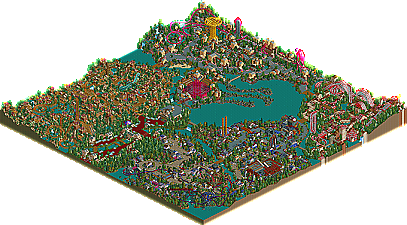
If I had to best summarise it - "it looks best zoomed out".
Thanks again.
gymkid - I don't know, really. I still like that park quite a lot!
First of all, i´ve become more and more stressed on how good a park looks all together. An area can be very nice, but might not fit in a park at all. The Alien park and Mongolian are in AoE totally ruined the entire park for me although the medeival, grecian, and egyptian areas were extremely nice. That´s what i do really like about womb. Even the lesser area´s (imo lesser of course) really fit in with the rest of the park.
The Portal
lovely little entrance. Strange, and that´s exactly what makes it nice. The Portal Cafe is my favorite part, just really small and nifty.
Discovery
Nice, but outdated. You evolved and it shows. The coaster isn´t as good, the archy isn´t, even the colors although nice could have been done a bit better. Some nice ideas, not boring to look at at all, but with too many "mistakes." The stadium is my favorite bit.
Rooty
This i just don´t like. Too big, too much weird stuff that just fits together in an ugly way. Trees i detest and a coaster that drags on through similiar looking coaster bits.
White Stripes
Lovely, red and white. Lovely coasters, lovely hotel, only the treeing could use a bit of work imo. Just something that looks the most like something i would make, in a way.
Pavonis Mons
By far the best area. Everything in this area exceeds the stuff in others.
the basic flowering is wonderful, the architecture is far far far far better than any other area. Sky scraper cafe is lovely, and the landscaping in this area is as well much much better in this area than in any other area in the park. Flight test is funny, and god do i love those flowers. The stadium in this area is also absolutely brilliant.
So it isn´t my favorite park ever, but it probably is better than i will ever be able to do.
Thanks wme for being quite complimentary
damn it kiri
Little did we think that you'd grow from RCTUK to this. Amazing.
You missed me out
600th post.
WOW....long awaited and very detailed park. I am mostly amazed at all the hacks in this park...I never did learn how to hack in RCT1 altho I have done some in RCT2...
My favorite areas were definitely Rooty and Discovery for the colors and innovative ideas. You are crazy good....but I guess everyone knows that now