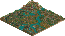
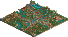
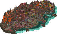
Park / DisneySEA Spain

44 Comments

  • mantis%s's Photo
    They're far from plain ;)
  • Toon%s's Photo

    They're far from plain ;)

    I don't think we mean plain in the same sense ;)X
  • Metropole%s's Photo
    What a park! From most of the screenshots, i was unconvinced, but when you see it altogether it's so atmospheric. Beautiful park. The atlantis area was thebest for me. It was simply fantastic. Great work corkscrewed, and a truly deserved spotlight place.

    Metro B)
  • tracidEdge%s's Photo
    I would love to see this awesome to actually see this park because its screenshots look amazing but my RCT2 cd is fucked and it wont work. :@ oh well.
  • deanosrs%s's Photo
    ^ if you've got it installed, you can get a no-cd file from megagames.com. It's legal if you own the game, I believe.
  • Steve%s's Photo
    Jesus Christ, that liquid coaster had to be the single greatest thing ever created. The combo of the architecture and theming and the colors was gorgeous. Definately my favorite area of the park.

    The entrance was also quite excellent. I'm loving the colors, and the hotel. Very classy. The rest of park was great too. The mountain was acually pretty cool.

    And well, the atmosphere just about owns, like, everything.
    Great job Corky! So.. when can we expect the other park? ;) :D
  • iCoaster%s's Photo
    Congrats! :)
  • Valp%s's Photo
    Excellent park, Cork... excellent.

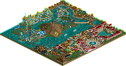
    I looked at this one for quite a while... there's so much to look at! It must have the most boring overview of all time, but close up, it's a masterpiece. I'm a man of few words, so I won't say much... I really liked New England! I thought it was just beautiful...

    On the whole, all of your tall buildings were fantastic- especially the ones that housed your log ride, Journey to Atlantis, and the Atlantis Theater--- all wonderful, big, and detailed!

    The little touches made it special... like steam in the whirlpools and my personal favorite, the Tidal Wave swinging ship with the boat zooming past waterfalls- awesome idea!

    The hotel was beautifully realistic; the whole park was.

    So that's all I really have to say. The whole park: beautifully realistic.

    Can't wait for your next one!
  • Six Frags%s's Photo
    I like big buildings, and the way you've excecuted them is amazing!
    It all adds to the atmosphere, although some places looked a bit rushed....
    Overall a great park, and I will look at it for many times I think...

    SF
  • thorpedo%s's Photo
    Don't get me wrong, I love your style of parkmaking and your architecture and atmosphere is BEAUTIFUL...but the textures on the buildings that you used in this park were absolutely horrible, IMO. The entrance textures (particularly the spanish walls) almost gave me a frickin seizure.

    However, I love Silverwhatever Fort was beautiful, and that liquid coaster=amazing. Best one ever created, IMO.

    Still, theming was beautiful and somewhat Pyro-esque. I like it. Tada.
  • natelox%s's Photo
    Corkscrewed, I must say, this is quite impressive. The entrance is possibly one of the most beautiful entrances ever made. The bold colours emerse you quickly into the fun loving Disney atmosphere. The tree selection and gardens in "La Mediterranea" are just beautiful and fit perfectly. Other stand out areas include: "Discovery Harbor" and, my personal favorite, "Oasis Quay". "Oasis Quay" is just pefect, from it's beautiful fountains to bold architecture and nice gardens (Sounds kind of repeditive, but why not repeat perfection?). The rest of the park had it's high points. Good architecture (The size was perhaps slightly out of scale, but it didn't phase me), good tree selection and atmosphere, the largest aspect of the park. Disney Sea Spain oozes with that pefect Disney atmopshere which I will forever be on a quest to create. Only one aspect of this park really hurt my take on it, and that was the layout. Please forgive me in saying this but of all the parks have the prestige of the "Spotlight" title, this one probably has the worst layout. The square shores and long, boring transitions from themed area to themed area really hurt the park. Granted, some parks do have long transitions, but they fill this lost space with intresting and intricate bridges. All the bridges I found looked like they had been made in mere minutes. The other attribute that displayed poor planning was "Puerto Tropical", which looks like it was shoved in at the last second. Like I said though, I still enjoyed this park greatly. Compared to "Meadowbrooke Falls Theme Park", there has been much improvment. It seems like you took more time with this and enjoyed the construction of it until the very end. As for my list (which will make an apperance quite soon in these forums), Disney Sea Spain ranks somewhere around the thirteen to fifteenth position. And with all parks, has the ability to move.

    Great job Corkscrewed! You just need to improve in two areas: Layout and speed ;)
  • Corkscrewed%s's Photo
    Actually, the park only took about six months to build, and it would have been four if my architecture stuff from school hadn't clogged up all my time. :D

    I definitely appreciate the comments. Coming from you, they admittedly mean a little more than some other people, since you are after a *Booker T's voice* FIVE TIME! FIVE TIME! FIVE TIME! FIVE TIME! FIVE TIME! NE Spotlight Winner. :D
  • Kumba%s's Photo

    Actually, the park only took about six months to build, and it would have been four if my architecture stuff from school hadn't clogged up all my time.  :D

    I definitely appreciate the comments.  Coming from you, they admittedly mean a little more than some other people, since you are after a *Booker T's voice* FIVE TIME! FIVE TIME! FIVE TIME! FIVE TIME! FIVE TIME! NE Spotlight Winner.  :D

    :lol:

    I loved that Hotel by the entrance, most of the time i hate white but that was great use of it. The huge blocky buildings were ok, i did not like them too much but they did not bug me, I liked the watercoaster but was not amazed by it. I liked the part with the gray paths and brown buildings alot, nice feel their. I think the only thing i did not like in the park was all the underwater rocky kinda landscapeing, i just like it better flat.
  • rK_%s's Photo
    the blocky-ness didnt take anything away from this park one bit, it was just so elegant and realistic, such nice work.
  • Janus%s's Photo
    Wow, awesome park. The detail in it will keep me looking at it for many more hours, and there is just something about it, a sort of really fun deep atmosphere, that makes it fantastic. As long as one doesn't zoom out, this park is really really cool.
    I didn't like some of the colour/texture combinations though, mostly in the entrance and mediterranian area, and wasnt there a few walls missing in the new england area?
  • Toon%s's Photo
    Poor corky...his masterwork is lost and forgotten in the feeding frenzy creatied by the PT. Don't go doing anything rash !
  • x-sector%s's Photo
    Cork I thought the park was great. its everything a disneysea park should be. I'm really busy at the moment to write more but I will do as off next week as I finish my course for ever.
  • Corkscrewed%s's Photo

    Poor corky...his masterwork is lost and forgotten in the feeding frenzy creatied by the PT.  Don't go doing anything rash !

    *firebombs Toon's secret project*
  • Richie%s's Photo

    *firebombs Toon's secret project*

    :lol: Good to know :X

    ....or are you pulling at our leg laughing?
  • Timothy Cross%s's Photo
    Great Park, Corky. That water coaster rules the earth. Layout of the whole park ruled too... Only complaint, some of the buildings were a little boring. Thats no big whoop though because they still looked good and fit in with their surroundings. Another great aspect of the park was the amazing atmosphere. It made the park very enjoyable. Also, the hotel area was fantastic. Realistic and a pleasure to view. Great work my friend.