Park / Hyatt's Clearwater Beach Resort
-
 06-December 09
- Views 4,174
- Downloads 930
- Fans 0
- Comments 19
-
 No fans of this park
-
 Download Park
930
-
 Objects
203
-
 Tags
Tags
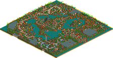
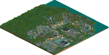
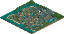
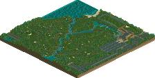
Welcome to Hyatt's Clearwater Beach Resort! RCTNW Designs is proud to release the fifth map as part of Project: Aries</SPAN>.
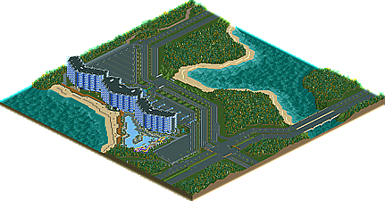
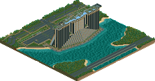
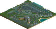
Hyatt's Clearwater Beach Resort is located along the shores of Lake Scarlett and features Five Star accommodations. Guest will enjoy walks along the beach or a relaxing day poolside or take a plunge down the resort water slides.
This marks the second completed resort as part of the Hyatt resort complex and is perhaps one of my favorite structures due to the shape of the actual resort.
Thanks to everyone for following along in the topic as construction took place. Your encouragement really helped speed this along.
James
haha great job man.
downloading now:]
@ Liampie, he already has enough accolades, so he saves the best to submit
I like how you handled those blocks at the top of the hotel's roof, as I thought at the screenshot you posted earlier it looked kind of blocky.. Now you rounded off the edges which makes it look a lot better!
I have one question; I saw this in other parks previously too, why are those traffic lights at the opposite side of the road? Is that an American thing? Because we in Europe have them right above the place where you have to stop, like this:
Anyways, great work and good luck with the remaining maps!
SF
Liampie - I've said it many times, I don't build for the accolades. Yes they are nice and I do appreciate the effort the site puts toward them and I admit, seeing my name on the front page is fun however, finishing the map and putting a closure on it is more important. Thats not to say I won't submit future maps to NE however the map needs to be special to ME before I do. HCCGC and HCBR were just fun maps for me to create.
Cena - Thanks and although you never have enough accolades, I do want to only submit those that are special to me.
rK_ - Thanks
Steve - Yes there is indeed room for another hotel on this map and there is a good chance that one will be added soon. Thanks
Hans - Thanks for the suggestion regarding the roof blocks, I too am happy with the modifications. And yes, the traffic lights are that way in the US. Glad you are enjoying the project.
Can't wait to see the rest of the project finished. I know you would be the one to finish it.
MF72 - Project Aries will never be finished. Thats not to say that I'm not going to work on it but rather this is a project that I can build on for years and yet still release things every now than then. If you think about it, I did five out of the 25 maps this year so even on that pace, it would take anouther 4 years and even that would be tough considering 6 of the maps are theme park releated which take much longer to build. That said, I appreciate the encouragement.
James
It just bothers me to know this isn't being built in real life
It's like seeing really good detailed concept art, but never getting to see the thing come to life
Still, loved the map. Especially the monorail over the road. I've experimented with this type of idea time and time again, and it really makes for some great viewing, though I've done it a bit differently in my own work (never shown), it looks so great done in your classic RCTNW realistic style.
Once again, great work. You're the best, James.
TC - The other blues were either too bold or it blended to much with the white. This is the first time I'm really worked with this color before and although I think it worked, I don't see myself using it again on any of my larger structures in the future. As for the monorail track, thanks even though it was a bit forced, I think it turned out as good as it could given the circumstance. I would love to see what your variation looked like one of these days as I'm a huge fan of everything that is monorail releated. Thanks as always for the encouragement.
James
love this =]
EDIT: I realize that would look very stupid but I hope you see what I mean. Mixing in other materials without it seeming forced
JJ - There is something seriously wrong with you.
Thanks