Park / Euroscape
-
 03-July 03
- Views 17,529
- Downloads 6,329
- Fans 5
- Comments 84
-

-
 77.50%(required: none)
 Spotlight

MCI 95% Kumba 85% 5dave 80% nin 80% Xeccah 80% Cocoa 75% Poke 75% RCT2day 75% Liampie 70% Sulakke 60% 77.50% -
5 fans
 Fans of this park
-
 Download Park
6,329
-
 Objects
339
-
 Tags
Tags
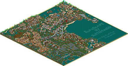
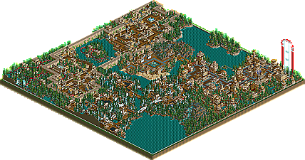
![park_4230 [H2H8/8] Celtic Legends](https://www.nedesigns.com/uploads/parks/4230/aerialt3992.png)
"Wow, RCT2 is so much better than LL, it even allows 256x256 maps!
I actually liked the expanded map better then the main map, i dunno why - just thought it used the space better.
The Coasters were deserved a big fat A+, and the archy was definitly up the top as well.
An amazing piece of work by Butterfinger - Congrats, you deserved a spotlight.
BchillerR
Butterfinger this is truly amazing. There are so many things I could say about it But ill just name a few things that I really loved.
The Mini Golf Course in EuroTropics Resort was great (I think Ive been to that one
Taurus was great I loved how it dove under and above the queu line
The like personal resort was great
I did notice that you had a Rodeo when its really Bullfighting but dont worry about it.
This is fucking amazing and prolly the best park Ive ever seen
Corkscrewed Offline
Anyway, this park is the spotlight so i'll keep quiet about other things.
Now, i'd read about Euroscape in that post about the 'scenery limit', and I knew that it hadn't been advertised. Sure, that's Butterfinger's way of doing things.
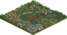
I opened the park earlier and got a blast of scariness. The park is visually astonishing. Zoomed out the lake is great, the car park astronomical and the actual park pretty frightening. Zoomed out parks usually look pretty quaint...this one looked like a beehive.
I'll complain first, because I don't want to end this on a bad note. There is a Scottish flag, but yours was good enough I guess. The quantity of architecture did overpower a bit, taking the emphasis away from quality, and yes it did get ever so slightly repetitive, but that's to be expected. It's "Wales", not "Whales", but I found that pretty funny. The coasters were mostly good, but you should practise what you preach and stop them from getting too slow
The good things: Scary, Detailed, Intricate, Challenging, Involving. Espana was wonderful. Taurus was a pretty cool coaster, but it was the way all the buildings fitted together and all the little objects and bits of foliage that I liked. I also liked the Irish area quite a lot, although I wasn't sure about some of the names. Anyway, the themes flowed and each area was about the right size in proportion to the map. I thought you really could have done more with the Highlands - proper mountains and some snow would have been cool, instead of the levelled architecture swamping what landscaping there was.
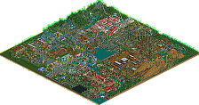
The extra map was pretty cool - especially the german area (I really liked the vines hanging off the walls!).
I can't really make a decision. This seems to be very hard to place on any list, which I guess accounts for the different arguments in this thread. I can see the reasons for calling this the best park ever, but I can also see the reasons for being underwhelmed.
All I can say is well done on provoking this reaction, and also creating a park that I find vastly superior to UCSR and also an enduring rct2 park that has actually made me a lot more interested in the game's possibilities.
Now come back to LL
This is a good park, well worth a Spotlight. But like all parks, it has its faults. I think the biggest thing for me was the lack of attention to detail, like the flags.... Do an internet search if you want to know stuff you're not sure of. Besides the flags, there were misspellings, no names for some stalls and staff, no mechanics to cover broke rides, a rodeo in Spain? etc. To me it seems like this was rushed a bit (if it could be rushed being so large) just to get it out the door, so to speak. I think any park maker should open all of the rides for a bit to test the 'smoothness' of operations for about 30 minutes, then do what he or she needs to do to wrap it up and release it.
Another pet peeve is the peep situation. RCT2 was meant to be a more peep friendly game. I can understand the case where you didn't want them due to the size of the park, but let the person that downloads it be the one who makes that choice. You don't need peeps in it to submit it, but at least give us the option. Besides, all of those peeps stuck at the park edge made the file bigger anyway.
Like mentioned before, remove the park boundry. It's simple and makes your park look just a bit more better.
The architecture repetiveness...... I'm both ways. Yes, it looked the same, but with slightly different colors per section. But each person has their style.
I don't find a problem with the parking lot. As long as the time was taken to make it look nice, then it's worth it. You did a great job with it.
I give this an overall 8/10.
PS. iris, how about that Double Spotlight rumor I've been hearing?
QAs to Mike's comments...lol @ double spotlight. I have to say I was honestly rooting for you to win your spotlight after like 4 years in the RCT community...
Yes, well, good to see people really caring about spotlights again.
I was bewildered by the sheer amount and quality of stuff. It took me 3 weeks to make pharaoh's realm, and another 3 for aqueductia. Those are 50x50 parks. The quality and concentration is much lower than this. This park is 250x250. That means there are essentially 25 aqueductias or pharaohs realms on one map, then another map. Wow.
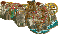
I loved it. I tought the coasters were innovative...such as the unique inversion for first drop on Atlantica. I liked how the flyer did the half loops on the second map onto and around a seperate island. I liked the bobsled racers on the second map. The woodie in the spanish area was amazingly large.
The architecture...a bit overpowering and overconcentrated for me...but everything was sooooooooo detailed.
Overall, I can't beleive this park. Certainly a top 3, if not the best park ever made. I am amazed.
After waiting about 5 or so days (just kept forgetting) to look at it, I must say I'm quite disappointed. Not because it is Iris' #1 park on the list, not because it defeated a very worthy MLF park from my club, not because other peeps love it. I respect all of those that like the park, as they have their opinions/preferences, and I have mine. It's just...
Let me give you credit Butterfinger, as there was clearly a lot of effort and time spent, if only it had come across better. Honestly, this large download amounts to a nice mini park with excellent examples of how to create very nice buildings in RCT 2, with a 256 filler map chock full of the overly repetitive and clumpy LL style buildings we saw all of last year.
True, I'll never spend 6 months to create a 256 map, as it takes me two and a half months to build a quarter of a 200x map With the completion of it, you join an exclusive club (Testudo, Mike Robbins, cBass and soon to be RWAdams-I've likely missed a few) to finish off the largest sized map. For that I applaud you, but I've seen better to be honest.
What disappoints me the most is what the popularity of this park might do to influence RCT 2 parkmaking here at NE. Aero's Wormwood, Toon's Gila, and RCTM's MLF are all great examples of how to take advantage of the RCT 2 scenery pieces available (standard or custom) to create an atmosphere totally unlike last year's trend of clumpy buildings in LL.
The concept is nice, and I did like the fountain with all of the flags on it, but the rest of the architecture/coasters was lacking. It totally threw me off that the red and white area was Greece, not Italy...Also, since the German area couldn't fit on the main map, it would've been nice to know where on the map it was supposed to go. Perhaps I missed it, but I don't remember seeing anything that good on the main map to represent it.
All in all, a nice effort, but not something I'll be visiting time and again....well, maybe the mini.
Thanks,
Kai
I'm sure this will eventually be passed up on the list...because nothing makes this stand out, and eventually someone will make another really good 256x256. But for now, this is not only the best megapark in rct2 released...its really one of the only ones.
As to Kai...theres no way I could ever see MLF being better than this, as much as I was rooting for it and it is a good park...but this has it beat on many levels.
For the third time today i agree with Gym...
awesome park. so much to look at. very beautiful. architexture is great. my favorite RCT2 park so far. Maybe my favorite park ever.
and the like Bigger City~