Park / Euroscape
-
 03-July 03
- Views 17,587
- Downloads 6,333
- Fans 5
- Comments 84
-

-
 77.50%(required: none)
 Spotlight

MCI 95% Kumba 85% 5dave 80% nin 80% Xeccah 80% Cocoa 75% Poke 75% RCT2day 75% Liampie 70% Sulakke 60% 77.50% -
5 fans
 Fans of this park
-
 Download Park
6,333
-
 Objects
339
-
 Tags
Tags
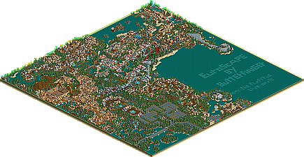
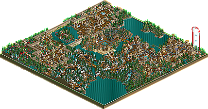
![park_4230 [H2H8/8] Celtic Legends](https://www.nedesigns.com/uploads/parks/4230/aerialt3992.png)
A great park Butterfinger, top 5 for me, but not #1.
And to talk about the spotlight for a bit while still downloading... funny how this has gotten 50 replies (give or take) in one day compared to Arnos, which just got 40 today, after being out for about two weeks.
I liked your park Butterfinger...I already posted that...but I do want to add a couple things
Why is it that you dont use a trainer to get rid of the stupid white fence?
Why cant parks in RCT2 be peep friendly? Its not that hard now....on your first map..they couldnt even get in the park...not to mention rides were breaking down with no mechanics fixing them.
The first message you get is "This is the most disappointing park"...lol...
some of the rides didnt have paths from the entrances and exits so those messages were coming up all the time...
Its just annoying...you know...and really...totally unnecessary...you could have made this park for peeps....
I still liked the park...though
No, I think its just more of a great debate, considering half the people who have replied love it, and the other half hate it. For Arnoes........ well, there really wasnt much to debate, as most people liked it (And the comments wernt as....... extreme, I guess you could say).
Just a question......... um, how is it that many of you have replied with complaints of unrealistic coasters? Maybe I'm just blind or something, but to me these coasters thrive with realism............ thats the way I wanted them to be. Any one of these coasters are realistic enough to pop up in real life. At least from what I can see. I dont get it........
AP- I would have liked to make the park peep friendly, but do you realise exactly how much more storage that would require?!?! The game would be so slow it would have been virtually immpossible to move anywhere! The file is all ready at 1.9 megs I believe. The white fence and green ring around the park....... well, that really doesent bother me. I really dont see why it bothers anyone....... just ignore it. In addition, I was all ready a good deal into constructing the park when that trainer was made, and was afraid that my work might be affected by inverting the map. I just didnt want to deal with it.
About all the messages......... well, thats why I always keep the sound off
Anyway, keep the debate going. I enjoy the comments, even if many are negative
B&M first of all does not have boxed supports. They also do not have such a complex twisted layout. They also would never have the inversions like you had. Expecially with two dive loops..
But then again, I liked it. More fantasy than real.
You have never seen one of those before? Its sort-of a rendition of a boomerang element. I thought that way of making it looked much better and ran smoother, but whatever. I wont be picky
Turtleman
Corkscrewed Offline
When I opened the park, I was definitely wowed. This was incredible work, and the scale and size of this project really blew me away. The first encounters with theming and architecture were very nice and the theming was quite splendid. Unlike UCSR, I could understand why Iris liked this park.
The roller coaster were innovative and realistic, or at least possibly realistic. What I mean is that they could theoretically be designed in real life without too much stretching of belief. I liked the large half top hat into a corkscrew.
After a while, though, I started to get a feeling of "whoa, this is awesome... but is this it?"
Which isn't a bad thing.
Basically, I started feeling that things were getting a bit repetitive. The architecture didn't established differentiable themes for the separate lands. It was almost like it was just different colors. Of course, that's a generalization. The park was quite detailed but I did end up feeling a bit hungry for more in a slightly negative sense. That might be a consequence of the park's initial amazement. I was so impressed that I wanted this quality to keep up, and in my opinion, it waned a bit, and so that disappointed me a bit.
Still, though, his park is more than deserving of a Spotlight, and I can understand why it'd be a #1 park. It's not for me, but then again, that's because I've seen another certain park....
(though I still like Tropico Horizons better
Anyway - Nothing like a bit of shameless promotion Mick, VTW what park was that again? I'm so interested in this i completly forgot about your n00B project with Tyke Robbins.
some of the most respected opinions, xsector, rrp, fatha´, corkscrewed, posix, and even myself haven´t been dandly positive have they?
I bet if I never said that it was #1 on the List, it wouldnt be getting half of these negative comments. Why did you just get so worked up over what he said?
And what Turtleman wrote sounded to me as if he was trying to accuse us of being jealous because we're not #1 or think we could do better than Euroscape.
4 pages in like ...2 days? Arnos Springs could only have dreamt of that.
I would of said the same thing if you didn't say it was number one. I liked the park but it didn't have the wow factor for me unlike it did for the other people that have replied with nice comments.
like butter said its a hit and miss park. I loved all your other stuff you made(especially your contest entry) but not this one.
I don't know that this is so much a love or hate park, because I far from hated it. As a matter of fact I thought the second map was brilliant. As stated by so many others tho, the first map just wasn't as good. Whether it was lack of custom scenery, sheer size, or repetition that held it back is worth argument. Definitely the best RCT2 release to date and deserving of a high spot on the list.