Park / Euroscape
-
 03-July 03
- Views 17,546
- Downloads 6,331
- Fans 5
- Comments 84
-

-
 77.50%(required: none)
 Spotlight

MCI 95% Kumba 85% 5dave 80% nin 80% Xeccah 80% Cocoa 75% Poke 75% RCT2day 75% Liampie 70% Sulakke 60% 77.50% -
5 fans
 Fans of this park
-
 Download Park
6,331
-
 Objects
339
-
 Tags
Tags
![park_4230 [H2H8/8] Celtic Legends](https://www.nedesigns.com/uploads/parks/4230/aerialt3992.png)
sboarder Offline
Fatha' Offline
Nobody is jealous over any park here, your assuming too much. Everyone has different opinions at this site, and guess what? Everyone won't think this park is the best thing ever created. I'm not basing my opinion on this park off of screens, I would have to see it first before I make my final decision. I am just saying that by the looks of the park, it seems to be Top 10.
The next thing you moan on about in your 'rant' is that we should all love 256x256 parks cos they are so special even tho most of the time they look like complete chit because people spend about as much time on them as anyone else would on a normal rct1 size map.And taking loads of time doesn't make a park good.
And the other thing i will complain about just to be like you is that you say the coasters are fantasy and 'interesting to watch', i think you need your eyes tested there son.
like ive said before no offense to butta or anyone im just putting my points of what i think is wrong with the park.Thats what this forum is for right?
Turtleman
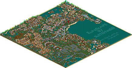
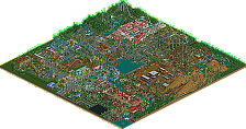
The main map is where my problems lie, we will get to the expanded map in a second. First I would like to point out that turlte, the huge map thing hurt badly in this case. Because he ran out of object room he was forced into wasting about half the map on water, and another chunck on the pointless parking lot and roadways. All that comes off as just blowing off space, but in this park's case I can see why it was done. Had you been able to get both on the same map I might have enjoyed this one a little more. As for what was there, I wasnt too thrilled about it. The whole map looked the same and had the almost cartoonish look to the architecture that drove me away from RCT2 for awhile. I just couldnt find anything to really latch onto, everything was so ordinary, which probably comes from the overall lack of true variation in theme. Everything started to look the same with the exception of the entrance with its out of place purple, or the Atlantis section which looked like the rest of the park but replace the castle walls with white. The coaster selections was, different or special to be nice, but nothing overly amazing. I just really didnt find anything of substance in the main map.
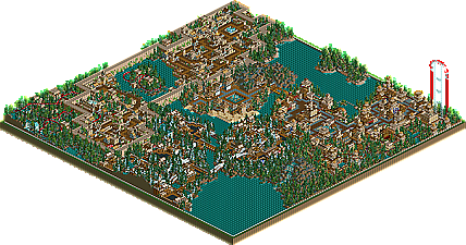
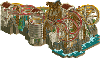
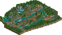
Sorry you had to sit through that part Butter, but it gets bettter for you, on to the expansion map. That was incredible. The best example of what RCT2 offers ti date. The themes in this map were well defined, each with a distinct architecture all its own. And that architecture looked great. It wasnt the junk everyone is using that you displayed in the main map, it was truly different. The atmosphere was so much better also, each area was a joy to view. This maps downside, too small, why couldn't you flip the sizes around and make this the big one?
In the end the brilliance of the expansion map wasnt enough to even out the monotony of the main map, and for that reason as a whole Im not to thrilled with the park. But, for the work in the second map, congrats Butter, you really did earn it with that alone. Axe the main map and it would be a top ten in my book.
I liked this park...I think its well deserving of a spotlight..especially for RCT2...this IMO is much better than the other RCT2 spotlight before....mostly because of its detail....
Yes...it was repetitive but hey...it was good stuff ...lol...and I thought the coasters were WAY better than the other RCT2 spotlight before too...
Im not crazy about parking lots either but its perfectly acceptable for the size of park he was working with. I definitely noticed improvement on the second map...thats only natural when working on a project this size to improve as you go along...
Well done Butterfinger!
The GOOD: my favorite thing in this park was the pirate theme mini golf coruse its just like the ones down here in FL and an idel im gona rip off soon
The BAD: i did not like any of the steel coasters very much (well i did think the flyer was ok) just too un-real and poorly designd i.m.o. also i liked the archy the first time i saw it but around the 8th time i wanted to hurt you. and the footpaths were confuseing.
1# park of all time
Don't get me wrong or anything, it's a very solid park but not a w...o...w park for me.
Fatha' Offline
Any parkmaker is bound to have the same style of architecture throughout his parks. Tropico Cove and Tropico Horizons both have the same type of buildings, its just that TH's buildings are more updated (See RRP's post to get what im talking about). BGSS I don't include, because it's a completely different game (Even though the architecture is somewhat similar to TH's, but I tried to make BGSS look like RCT1 for some reason). Ports of Call will have the same architecture as TH, but just updated and slightly better. Like RRP said, as a parkmaker makes park, his architecture improves, but stays the same (Because it's his/her style).
I think the park was pretty good and I really liked the parking lot a lot (that doesn't sound gramatically correct), the coasters were a little non-realistic but maybe Butter was going for that and the scenery was pretty good as well, and I can appreciate how long it took to make this park.
I have a feeling that everyone who didn't like this park will pick up well with Mike and My park, MLF.
I am sure many of you will love our park.
.....Oh BTW I wasn't promoting my park. Geeez.
Back on topic.....after further review of the park I am kind of enjoying the park more now, butter. A lot of detail I didn't see the first time around. Congrats.
so I can't comment yet, but from the screens I'm probably gonna go with RRP and Xsector, looks crowded and unlandscaped.
$Hevydevy