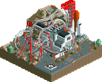
Park / Space Time Continuum

12 Comments

  • geewhzz%s's Photo


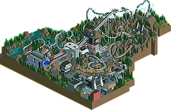
    It's been a while since we've had a dueler win the Design acolade here at NE, maybe because they are quite difficult to do, however Evil WME makes it look like a breeze with his latest creation, Space Time Continuum. | Read On...

  • Liampie%s's Photo

    + Coasters
    + Concept/ideas
    + Atmosphere
    +- Foliage/landscaping
    +- Theming

    The theming was not really interesting, and the foliage+landscaping was nothing special, but overall it really made the atmosphere. Somehow it reminded me Red Alert 1, even before I noticed the tesla coils! Grim, but not evil. Love it.


    And the building in the rocks looks like a chihuahua.

    Congratulations! Keep building! 8)
  • posix%s's Photo
    i opened this and saw the coasters duel and thought to myself "aha, the master of duellers shows of how it's done again, eh?", ... and THEN i noticed the brakes hidden where the track went underneath the station. it was quite shocking ;) the duelling itself was of course very beautiful to look at though. i suddenly remembered when rrp said why one would want to "waste" something as difficult to pull off like duellers for a mere design instead of using it as the highlight of one's solo park project. but i guess solo parks often enough turn into your quest of the holy grail that you just don't see yourself finish.

    i enjoyed to see this was very concept driven. that was definitely beneficial. yet unfortunately it was too fantasy oriented. i just too seldom enjoy this kind of approach to projects. it was set in the future, modeling real life, instead of modeling a park, itself modeling a future theme. but i know you never intended for that anyway. but why you have this tendency to always make the surroundings mountainous, mix grass and rock texture and some bland tree combo is something i don't think i'll ever be able to make sense of.
  • SSSammy%s's Photo

    And the building in the rocks looks like a chihuahua.

    Congratulations! Keep building! 8)

    it actually looks like that bear off the "uprising" video.


    i really enjoyed it. the dueling element wasexecuted really well.

    keep 'em coming WME :D
  • Evil WME%s's Photo

    i opened this and saw the coasters duel and thought to myself "aha, the master of duellers shows of how it's done again, eh?", ... and THEN i noticed the brakes hidden where the track went underneath the station. it was quite shocking ;) the duelling itself was of course very beautiful to look at though. i suddenly remembered when rrp said why one would want to "waste" something as difficult to pull off like duellers for a mere design instead of using it as the highlight of one's solo park project. but i guess solo parks often enough turn into your quest of the holy grail that you just don't see yourself finish.

    i enjoyed to see this was very concept driven. that was definitely beneficial. yet unfortunately it was too fantasy oriented. i just too seldom enjoy this kind of approach to projects. it was set in the future, modeling real life, instead of modeling a park, itself modeling a future theme. but i know you never intended for that anyway. but why you have this tendency to always make the surroundings mountainous, mix grass and rock texture and some bland tree combo is something i don't think i'll ever be able to make sense of.


    Thanks for the reply, posix.

    The brakes... yeah. I'm not too proud of that part but it's not as bad as you make it sound. The trains are unaffected by them; they're purely for the ratings. The ratings were fine, but rose above 10 by theming. I was too far along with this project and really liked how I got two differently duelled corkscrews at the end. Hope that explains that. The trains have different speeds and that is why one catches up to the other one.

    Personally I think it makes more sense to make duellers in a design.. since a design should be all about coasters. To each it own, I guess.

    I tried to make this somewhat realistic, though, but a little bit larger than life. Maybe it's a bit double indeed that it has a future theme in the future.. hadn't really thought about it like that. It was never meant to be the 'far-future', maybe I should have made it something like 2030. That was a much later decision, but the concept was based on making something relatively realistic, but larger than life (thus like a coaster in the future).

    I thought the landscaping was interesting, and I never made it quite so dark.. but yeah, my landscaping is quite a habit! :P

    Anyways, I'm really happy that I finished the last bits off. It was sitting around, almost finished, for a while. It's always nice to have a release, I'm glad it received design status! My first design :)
  • posix%s's Photo
    aah, pity the brakes were just for ratings. in that case the duellers are totally impressive. i would probably even have voted it higher had i known.

    and this is your first design despite the amounts of releases you've had over the years? reason to celebrate! :D
  • dmaxsba%s's Photo
    The two coasters worked amazingly well together, something I have never been able to accomplish in all the years I have been playing this game. Well done! :mantis:
  • Louis!%s's Photo
    Yeah until you actually attempt to build duelers (or triple duelers for that matter :p ) you dont realise just how difficult it is to get things right. This is definately the best timings I've seen :) and it inspires me to get to work on another set of dueling coasters myself :D
  • lucas92%s's Photo
    I love that design! I would love to ride those rollercoasters in real life. XD
  • zburns999%s's Photo
    Sorry I don't have much time to comment, but what a fantastic design. It appears I enjoyed it far more than most, as I would have probably scored it around an 18 or 19. What a turn-around from Mt. Doom, which I really didn't like at all. Everything about this design was just fun and felt so oldschool. The coasters look so simple from the overview, but in-game they are awesome to watch. The only downside I can point out is that this isn't the focal point of a larger solo park haha. Congrats man.
  • Ride6%s's Photo
    The architecture, trees, and some of the overall theming choices seemed a bit visually bland; however, the brilliantly-executed coasters over such a rugged landscape will win me every time. The timings and the unconventional nature of so many of those duels makes them truly a sight to behold. This how you do a design: the coaster(s) is/are the focal point and here they're absolutely brilliant.

    You're an inspiration WME.

    Ride6
  • AvanineCommuter%s's Photo
    Absolutely loved the coasters. So much fun to look at!
  • Maverick%s's Photo
    I remember building a dueler in LL a decade ago that had some similar duels. Of course, the surroundings were flat and green.

    This looks much nicer ;)