Park / Ports of Magia
-
 23-March 05
- Views 13,865
- Downloads 3,744
- Fans 2
- Comments 73
-

-
 78.75%(required: none)
 Spotlight

Poke 90% Cocoa 85% MCI 85% Fisch 80% inthemanual 80% Stoksy 80% 5dave 75% Liampie 75% Xeccah 70% Kumba 60% 78.75% -
2 fans
 Fans of this park
-
 Full-Size Map
-
 Download Park
3,744
-
 Tags
Tags
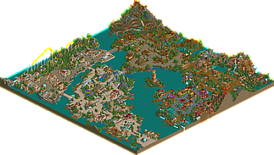
I agree with the argument of protecting the sanctity of the spotlight and whatnot, but don't take it out on Chris who HELPED NE by submitting his park, but calling it a ripoff, entirely unoriginal, etc.
I mean i knew this would spark some controversy and im glad it did, we BGE all i got was "this park was great" blah blah with the odd expects when people actually gave me realy comments. I like the comments i have gotten with Ports of Magia, it is the only way for me to improve. Although i should tell you that POM was started basicly as soon as i finished BGE so the style was going to be a little similar. Now i know what i have to do to improve and make my next park "spotlight material" which imo im going the right way with it atm.
Like the frist three areas of PoM were made me my usal stuff, great looking but very infulenced and the same old stuff, but when it came to Watermelon valley i really thought about what i was doing and played around with a couple of buildings for about 5 hours then i had worked out the theme and imo refined my style a bit more. Many people will agree that calyspo cove wasn't the greatest but imo it was my second best area. Now my style is getting more refined and my own i shouldnt have a problem, plus im getting ALOT of new great ideas, well you will see in my new solo and hopefully if that one gets spotlight it wont be a dissapointment.
To the people who have said pretty mean stuff, not slob not toon not x none of you were mean, i loved your replys and i have taken them in but to people who think i have done something wrong, well you can basicly shut the fuck up because i have done nothing wrong i have built a park and submitted into spotlight for you all to enjoy, how was i to know it would get spotlight..
Anyways i guess i will see you soon with a new park or maybe not
Corkscrewed Offline
Less than 24 hours and PoM has already reached the mandated third page (remember the old "three page rules" before a new Spotlight is posted?
I can respect Toon's argument. Essentially, he's saying even if we have to wait years, then so be it. And then he sticks to his argument without letting any subjectivity creep in. I disagree with the opinion, but that's better than arguing about styles and stuff. Honestly, I liked it a lot more than Toon. Whereas Toon thought half the park was kinda boring and not themed well, I really enjoyed all of it. The point that we differ on is that Spotlights "should be masterpieces," (and if that's the case, then that would be changing it from before, because I would argue that half of our Spotlights are not instant classics). I'm willing to bend, but Toon and Posix (even though I argued the semantics of your post, I understand the gist of it) and apparently many of you refuse to budge from your standards.
Ultimately, this feedback is stuff I enjoy, because it:
1. Shows the community is still interested and not dead
2. Motivates people to action
3. Generates buzz and interest. No publicity is bad publicity, I say.
I want to make it clear that I didn't post this park just to cause a stir (or else Bayfront would be a Spotlight
On the subject of Iceman (and I know you're not trying to argue, but I wanted to point out a few things so you don't think you were being unfairly graded), there were a couple of glaring flaws that took it under Spotlight level.
- Treeing = very bad
- Rides = very lackluster
The treeing is almost a consequence of your personal choice to change scales, so it's sort of something that can't be helped. Still, where you needed a dense collection trees, say on the Jungle Cruise, your execution really detracted from the atmosphere. When compared to how strong it is where your architecture is rich, the inconsistency proved to be a real downer.
Though theming is more important to me than rides, I do like rides, and yours weren't quite to the caliber. That's not meant to be offensive to you. After all, my rides, for the most part, suck too. But since Disney rides and theming are connected, your rides affected your theming there (case A: Big Thunder Mountain), and detracted from the quality too.
So basically, to me, it wasn't that your park was Disney that it didn't make it. The two above reasons were the biggest factors, given what I had to judge (which, as it was, equaled like 6000 screenshots). I admit that I can't make a 100% accurate accessment, since I don't have WW, but hopefully, that explanation allays your worries about being unfairly judged.
Still waiting for cg? to rip this park a new one... or something.
It's kinda funny, because I honestly think this park was better than Bijou, but Bijou got MUCH more positive feedback than this. The only reason I can think of is because people seem to be put off by the "unoriginality" of this, how it's "too similar" to recent parks or something. I don't think that should really matter, but to each his own. It makes for a more colorful site!
EDIT:
I dunno... most of the stuff seems aimed at me, not you, Chris.
When I look at this park, i don't see "five different parkmakers." Really, I don't. The entrance area looks as much as some early xsector work, as corkscrewed's, as johns to me. Maybe it looks like a bit of turtle too, well, who cares. It's actually a very plain, calm theme, which doesn't spark out any one who particularly made it. The problems I had with this areas was the obvious coaster end. Goddamn you Chris for not changing that!
Now this, people, should be what a post about a park is about first hand. Whether you think it was spotlight quality is actually almost irrelevant, it seems. Now the discussion has been started I'll meddle in too, and i stand almost where corkscrewed and iris stand. I might have been edging for a super runner up but after giving the park more of a chance i might have made the same decision. Furthermore, waiting for an "incredible" park from parkmakers that just aren't there yet for the most part seems nonsense. In the beginning of NE the bar for spotlights was lower as well, and why shouldn't it be now? Because of all those whiny people that know "better"? And not even talking about the beginning of NE, what about DNET spotlights? And yes, a lot of parkmakers have dissapeared or almost dissapeared. For one thing, even though iris said this h2h captaining took me away from soloing, it actually got me back into rct and atleast making h2h parks. I haven't even attempted to start a solo in a long time, and i don't think i will anytime soon as i know i just won't finish it. And possibly, that's because my 'standard' is too high. I take ages to get something the way i like. Although, yes, inspiration can drive you to make something quickly, but a full solo needs more than that. Thought on how the paths weave the areas together, the way the areas look in comparison to one another, the way the entire park looks like one park and not like four. All this is really an incredibly hard concept, and its actually easiest not to know what you're doing and just building straight off and forget about what you've learned from your previous park efforts. Possibly half of the extra efforts most parkmakers put in their parks go unnoticed, because other people don't have the experience themselves, too. What i notice most about my last solo efforts is that i often just get stuck, and don't really build anything but just change minor things here and there. The outcome is a feeling you've done the absolute personal best, yet most people won't really notice it until they're able to look really well into a park. I'm probably not making much sense now, and i think i'll stop. What corkscrewed said is right though, who are you guys to critique artist like this? For one thing, artist, imo, is well on his way to becoming one of the better, maybe best, parkmakers on this site. If not with this park, look forward to his next.
Corkscrewed Offline
I don't think we'd be having so much "outrage" if I had waited until April and then posted this as an SRU. Honestly. I'd probably have 15 people say it should have been Spotlight, and then the rest of you comment on how great it is. By my placing it as a Spotlight, many seem to have immediately raised their glasses to utopian subjectivity, thus ignoring what's there. It's like when Iris unveiled Sea World Atlanta and called it "perfect." At once, people channeled in on how it wasn't actually "perfect," as Iris had said, rather than talk about the park. They only nitpicked on negatives, or mostly nitpicked on negatives.
This is RCT. It's a game, and a fun one at that. Why must we be cynical? In six years of playing, I personally think I've retained the same awe and respect for fine work now as I did when I first discovered Danimation. The knowledge and understanding of "what is good" may have changed and expanded, but I don't go around calling good parks "boring" or "crappy" or whatnot. I get a lot of that at NE... it's like the only way people can be impressed nowadays is by cutting edge, totally original, previously unimaginable works. If not, it's just a 'meh.'
Whatever happened to simple enjoyment of the game? This park is still better than 99.9% of all other RCT parks in existence. I think that counts for something. I feel that often, we're so consumed with innovation that anything less is failure. To strive for innovation and use that as motivation is one thing; to let this demand govern your mindset is to inhibit your own progress.
As with the way I govern my life, I believe balance is the key. You can never go completely gung-ho in any direction and hope to move. Just as you don't escape quicksand by thrashing about intensely, you don't go anywhere with parkmaking by always striving towards a pinnacle. It won't happen, and as many of our members have found, if you keep on aiming toward something and stopping yourself because you haven't gotten there, you'll never produce anything. In turn, if you view others' parks in the same way, you'll never GET anything.
The fact is that this is a great park. I don't find its flaws to be glaring. I don't see them detracting enough to hurt its chances. Once again, I maintain that this park is better than Bijou Magic. If that could get a Spotlight and a great reception, why can't this? Because it's "similar?" That's just boulderdash.
*** Note: these past few giant posts I've been making in this thread is more of a comment to the community in general, rather than personal defense. That's why this one above isn't only about Spotlight vs SRU but also about attitudes in general. But this thread seems to be the right place to vent these musings. ***
*** Note 2: Actually, reflecting upon this, I'd like to get your opinions on just what should be a Spotlight and what shouldn't. Talk about that here. Keep this thread on track about Ports of Magia, but I'm actually interested in what people have to say about judging parks in general. ***
corkscrewed, hmm, i guess i could keep discussing with you for a while, quoting every word you wrote and give my shit to it, but honestly, i'm little too lazy, and i'd rather talk on aim about it.
anyway, chauncey's posts are always top consumable quality, i agree.
Watermelon valley (as everyone said) was by far the best area. Those watercoasters were supreme and the colours worked excellent. A great display of originality.
The area with the invert was quite nice, probably the second best area in the park, again with some nice colours, it just seemed that not quite as much care was put into this section.
The left hand side of the park was solid, nothing more, nothing less. The architecture was mainly uninspiring and all similar in style and design. It's when buildings become unique that an area looks better (like watermelon valley) It must be said that you did pull this area/s off well, and there was nothing bad about them so to speak, but they just didn't jump out at me at all. If the park was based off more original ideas that I know you can do then there would be no doubt that this is spotlight worthy.
In a way, I don't think this should have quite made spotlight, personally. Yes, it was better than BGE, and BGE did deserve a super runner up, so it would make sense for this to be spotlight, but I don't think it is quite there. I think Bijou was spotlight quality, and this was very nearly there. I don't think it should be based on the fact that this was the best park in 4 months or whatever. Spotlight quality is spotlight quality. On the other hand, I don't think a park needs to totally bewilder and Wow you to be spotlight. Turtle's park didn't do that, as that was not it's aim, but the parkmaking skills and the aesthetically pleasing architecture, landscape and rides were definately spotlight quality. I think that in all of these aspects, Bijou was superior to PoS.
However, the feeling I get from these replies is that Chris is to blame for that fact that his park was made spotlight when in some people's opinions it didn't deserve it. Like Iris said, at least he is releasing quality parks at the moment, which is more than most of us (myself included) Comments like "this is the second worst spotlight" just aren't needed in my opinion, putting down the parkmaker and park, when quite simply, it is a quality park that deserves recognition. They don't really get anyone anywhere.
Anyway, congradulations on the quality park and spotlight place Chris, and I look forward to seeing more parks that you are churning out at an incredible pace. Congradulations.
Metro
I can't open the park - saying I'm missing an object?
Your posts were fine and i didnt have no problem with them. Although i didnt get to see the edited ones, lol.
It was chapel's reply that had pissed me off, i have done nothing wrong and even though you may have not blamed me but the way you phrased your comment was like it was my fault.
Anyways thanks for the comments everyone.
I don't see why some of you are getting all uptight with this. Who cares if he wants to build in a style that someone else builds in.
For an example I'll use my PT entry. Some people said things like I was trying to imitate Foozy or John when in reality I was trying out their styles and putting my own spin on it just like Artist did here. Now look how many people are building in that over-detailed way.
Imo, building in someone elses style helps you move on to invent your own style(Which I've done since that entry.). I think as long as you don't rip of their ideas or actully copy the person, then I don't see the problem in building in their style.
Also, when did the idea of "Someone who builds in a certain style owns that style" come around? I don't see how someone could own a style.
I don't really want to get into a whole long post about this. My point is, if Artist wants to build using the style of other parkmakers then let him. I think this is a good way for him to invent his own style and become a great parkmaker. Plus, if I was one of those parkmakers, I'd actully be glad that someone wants to build in my style. It shows that person/people truely like your work. Just as long as they did it to improve there parkmaking skills. Now if Artist used the styles of other people in every single one of his parks, then I could see why some people would get mad about it but he doesn't seem to be doing that.
slob was touching on a point here -
When the park that's serving as the inspiration is unreleased, it seems a little unfair.
My problem with the park isn't that it was "inspired" by other work, which is what people seem to so adamantly defend; my problem is that the themes were not pulled off well enough given how similiar they to the originals.
At first glance I was shocked and surprised to see that someone would be inspired by Venetia Harbour - because I don't care for it too much myself. After the original flattery subsided, I felt insulted. A park of mine that I am not exactly particular to served as "inspiration" for an area that was no better - and perhaps worse - than what I had originally built! It's a far cry from just looking alike due to scenery or texture limits... just looking at the two eliminates that as a possibility. But maybe that's because I built the "inspiration" and see it differently, I don't know. It's one thing to take an idea or theme and expand on it - because that's what everybody does in one way or another; it's a completely different thing to just take the idea or theme... and virtually copy it. I'm sorry if all of this has come off as sounding arrogant because that was not my intent and that's not how I am. No grudges or hard feelings. I know that it's all just a part of your growth in the game. Sometimes it needs a little venting though.
I'm happy that Ports of Magia exceeded Corkscrewed's expectations for spotlight.
It's a little depressing that at the same time, it had to exceed my limit for "inspiration".
Next time I hope to see less everybody else work - and more Chris - in there.
I honestly do like this park a lot, I'm just very unsure is spotlight is the right title for it. Artist it's not your faunt that the whole place has blown up over your park, nor is it really Corks or Iris's. This is really a release of NE's negitivity, all at once. I really think the site will be far better off for it in the long run and the activity is rather refreashing. The last time I remember topics going to three pages in two days was two and a half years ago when I first joined.
ride6
However, I do agree with Toons view on the spotlight. I'm also going to play devils advocate and raise the question of whether this park would have won spotlight if Busch Gardens Eurpoe hadn't have come first? It just seems that this being a slight improvement over BGE had a large baring on the decision.