Park / Ports of Magia
-
 23-March 05
- Views 13,912
- Downloads 3,750
- Fans 2
- Comments 73
-

-
 78.75%(required: none)
 Spotlight

Poke 90% Cocoa 85% MCI 85% Fisch 80% inthemanual 80% Stoksy 80% 5dave 75% Liampie 75% Xeccah 70% Kumba 60% 78.75% -
2 fans
 Fans of this park
-
 Full-Size Map
-
 Download Park
3,750
-
 Tags
Tags
Corkscrewed Offline
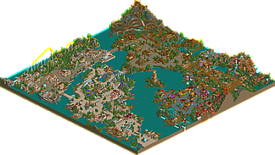
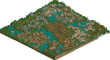
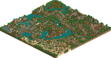
No, your eyes don't deceive you. You are looking at the first Spotlight in the Corkscrewed Era. After months of parks that <i>almost</i> made it, Artist finally cracks the perceived glass ceiling with his beautiful Ports of Magia! A park that approached Natelox-speed with its 1 month 1 week 4 day construction span, Ports of Magia is a gorgeous throwback to the traditional, realistic Spotlights full of stunning atmosphere, great theming, intricate architecture, and fantastic rides!
Richie Offline
I got goosebumps when I looked at this park last week and knew that it had the makings of a spotlight. I still don't believe how fast you built that too. Its mind-boggling even to me. Eitherway, certainly worthy of its now elevated legendary park status. Congrats Chris.
The rest was like the usual. Super-Runner Up at best.
Congratulations, though. Others seem to like it.
You know my thoughts on the park.
Brill.....
But good job.
The park seemed like a standard park nothing special really except watermelon Valley and I did like the wooden coaster also. the rest seemed blah in my opinion
congrats tho still and its good to see a new spotlight sorry i'm not excited by it.
Corkscrewed Offline
Seriously, though, here are my thoughts:
I know full well that people will react differently. Some will love it and agree that it should be Spotlight. Others will say it's so-so and no better than any of our SRU's. A few may curse my name and say I smoke crack cuz my choices are awful. Except for the third one, I can those points of view.
There's a fine line between SRU and Spotlight, and Chris crossed it--though not by much, I admit. To be honest, if I only posted parks that absolutely wowed me and gave me visual orgasms, then probably only Toon, Kevin, X-Sector, Mala, and cBass would win. Well, probably Natelox and Fatha too. So there's a point where I have to set aside my personal preference and look at this objectively.
I'll admit that initially opening this up didn't give me that instant WOW feeling, but I was impressed with the quality, detail, and work. In making my decision, I also compared it to the recent Spotlights and SRU's. In my opinion, this is better than the SRU's I've posted. The quality is consistent and immaculate, and everything is very well executed. That's one checkmark for Spotlight: consistency. I also compared it to Bijou Magic, and in my opinion, this park beats it. I prefered this over BM (though Turtle's park was pretty awesome as well). Comparing this park to the older Spotlights, I feel that this bests many of them. I'd say Phantasia and RoB are better, but this park is better than Euroscape and Wormwood (and well it should be) and on par with DisneySEA Spain. So that's another checkmark.
And ultimately, it came down to a gut feeling. My gut feeling said Spotlight. Not overwhelmingly, of course. Had this been, say, Toon's IOA, then the feeling would have been a LOT clearer. But it's a great park. I highly enjoyed it. And I think a lot of people here will as well.
Now, you can still argue that it's not worthy, and as long as you're reasonable (as in not just insulting me), I'll understand. Part of the tradition of Spotlights, in my opinion, is that they cause a buzz, for good and for worse. If everyone always agreed that a Spotlight should be Spotlight, then that wouldn't really be interesting. It wouldn't entice discussion. Personally, I do see some flaws in the park. Not connecting Calypso to the entry area was one no-no. The first two areas pretty similar as well. And the park as a whole has similarities to BGE. But in this case, they were not so glaring to detract from the decision.
And besides, if you didn't think this wasn't "that good," build a better park and show me you can do better. Give me something to post as a Spotlight that will be more amazing. Use it as motivation to finish your park and elevate your reputation. As long as you're not fanatical about it, that's all part of the fun.
In opinion. It's like his style hasn't improved since BGE, but the ideas in this park are better than BGE. Not sure if I said that right, but I think it deserves a Super Runner Up.
When someone wins spotlight they usually become parkmaker, so...is Artist gonna be a parkmaker?
p.s. worst pick since Elsinore Falls but still better then that one
Corky I was not insulting you either by saying you made a totally bad choice. I agree there was some nice stuff in it but at the same time there didn't seem to be enough, Your right with saying not connecting Calypso was a no, no but that didn't bother me as much as the area as a whole. I award the great use of colours but the area seemed bland and not on par with watermelon Valley that was sitting right next to it. Watermelon Valley was great and I found no fault with that. The entrance area and the area where the giga/hyper was didn't nothing for me I kind of brushed over them as It was like I seen them before and I know artist can do a lot better. Its a great park for how long it was built in but not spotlight worthy in my eyes but everyone has different tastes
Next, since Busch Gardens Europe was posted as a SRU, then there really was only one possible way to post this in my opinion. I could also agree with BGE being a normal runner-up and this being a SRU, but this is fitting as well in my opinion. It's definitely a pretty significant step up from BGE in my opinion, so it'd be wrong to give them the same award. Plus Cork made a good point. Not every single Spotlight is going to completely blow every single person away. Not every single park is going to top the List, and completely blow everyone away. Parks like "DreamWorks Great Australia", "SAP Cataclysm", "Aero's Wormwood", "Lost Era Resort", "Meadowbrooke Falls", "California DisneySEA", etc. are all parks that probably don't hold up against the ROB's, SWA's, WOMB's, or TH's out there. We have raised our standards for the Spotlight...but really what is the point of having a Spotlight at all if only 5-6 parkmakers are capable of making it there. I mean sure we could just carousel parks from Fatha', Natelox, Cork, Toon, X-Sector, or Ed (hyptothetically) but that's not the right answer.
Again, there will be many who believe this doesn't deserve anything. But really, I look at this as the best park to have come along since Bijou Magique was released. That's both a testament to Artist, and a statement about the other parkmakers at New Element. Now, Artist WILL be a Parkmaker when NE3 opens up, joining the ranks of those who are slated to get spots with the new site. That comes from his work in BGE, this beautiful Spotlight, and screens of his next park which seem to be even better. Not to mention that on a site where nobody builds anything besides H2H3 (and JKay), Artist has released two parks in about one month, and is well on his way on the third park. For a parkmaker as talented as Artist, shouldn't we celebrate and reward that type of enthusiasm and productivity? There are a lot of cynics at this site that will swear that Cork just made a huge mistake, but really...where are they with their parks? The only three other parks submitted in the past three-four months that we even ever CONSIDERED for spotlight were Bayfront Parc (which definitely had the ideas, but the overall execution in half the areas dragged it down too far), Disney's Utopia (which was a great aero park, but didn't stand out enough from the rest of his work), and closest of all, Iceman's Disney park (which would have won if not for Disney parks flooding the market.)
All of the really 'established' Parkmakers haven't submitted anything lately (with a couple notable exceptions of course, like aero). Corkscrewed has been busy with running the site, and is trying to finish WDE (yet another Disney park...). Evil WME had to put his park ideas on hold to take over captaining a H2H team. Fatha' retired and came back, but is still nowhere near completion in his newest park. Natelox has encountered his first 'slump' in his career that I can remember, and hasn't submitted anything since Aegean (which is still better then 99% of parkmakers
Basically what I'm saying is, I think that any of the parkmakers in the above paragraph could probably come up with a more Spotlight-worthy park then Artist did. The key thing is...they're not doing it. Artist is out there submitting parks left and right, and submitting some damn good ones too. If Steve, or x-sector, or chapel think that it's not Spotlight worthy, why not give us something that is? It's very easy to sit back and criticize when you're not doing anything yourself. I know X is building his park but he still has a ways to go I believe. I'm backing Corkscrewed in this decision, and any parkmaker who feels like Cork doesn't know what he's doing should just shut up, and save that energy and gear it towards their parks because Artist right now is ranked a lot higher in my book then a lot of these so-called 'best new parkmakers'. Designs are great, H2H parks are cool, whatever. Full parks is what this site is based on. They are the most important aspect. We've gotten away from that with contests and H2H, but those are supposed to be a diversion, a break from making parks. Not to completely replace them. Congrats on a well DESERVED spotlight Artist. I would have picked it as well. Great job, and welcome to the staff.
This park is absolutely beautiful from end to end, excellent quality and with the exception of the first two areas there was even good shifts from area to area. The main problem is that there is no "spot" in this park. Or at least no obvious one. There isn't a point that just grabs you and the little parkmaker in your head crys for mercy and bounds with fresh ideas and outlooks. The park completely lacked that. Rob has Lemuria, DSS has Discovery Harbor, Euroscape has Spain, Bijou Magique has La Rochelle...
Other than Wormwood (which Aero has since greatly supassed) I would say this is the weakest rct2 spotlight.
It's not so much that it does anything wrong, because that would be a lie, it does everything very nicely. But nothing seemed to pull me in. Personally I like that Calypso Cove isn't connected back to the enterence. I think it's good that he was willing to take risks and expeariment that way. Another thing that really impressed me was the landscaping... Your old stuff was all choppy and sloppy and even with the height shifts just looked bad. This on the other hand is beauful, flowing and large. Congradulations on winning, even though I would'ntve been one to hand this particular honor over...
Maybe the reason this pains my so much is that examples of perfection like Portal of Heaven by Ablaze or Emperor Of the Forgotten Relms sitting at runner up...
ride6
Watermelon valley is terrific, my favourite area. The coaster layouts are even better, especially the woodie...
Thanks for letting me work in it and i can't wait to see what you do next...! Possibly my favourite spotlight so far, but yet again... i am biased.
-X-
Again, congrats, Artist. Your new park is looking MUCH better, and I hope you win a spotlight with that one.
Edited by Steve, 23 March 2005 - 04:35 PM.
I'm happy to see this park released, and i'm amazed at the speed in which he did it. The thing is, for me, the standard here is not that much higher than that of the later areas in BGE. I think that there are notable areas where he takes maybe a little too much inspiration from other parks, when he has his own style (Watermelon Valley) that is just so much more interesting to look at. Your style needs refining, in my opinion, as it is a little messy at the moment, and lacks the finesse that set the good apart from the great.
Your next park looks to be the business, and I eagerly await the front page spotlight announcement for that one next month.
Steve, shhhh!
Richie Offline
More origionality (like watermelon valley) would make you a much, much better parkmaker.
Nice park Chris. Congrats on spotlight and the parkmaker spot.
The park was beautiful, just visually stunning...the foliage, colors, etc. all looked nice. But this was not much better, apart from one or two areas, than BGE. Believe it or not, the hyper was actually my favorite area in the park, because it was visually nice, and just really smooth and flowing.
But, PERSONALLY, I don't think this deserved more than a Runner Up...maybe Super Runner Up at best. Certainly this is the second weakest RCT2 spotlight for me, behind Wormwood as the weakest. The woodie, even though it was both you and X250's work, I thought to be kinda n00bish...it didn't interact with anything for a lot of the layout, and just went through its own structure most of the time. The archy was good but your style is just so much of the same. I donno.
Also, like ride6 mentioned, this park didn't really have any memorable areas. It was just all beautiful theming with weak coaster designs. Seriously, in my opinion, that's the problem that this park has, the problem that keeps it from being memorable. It just boils down to more and more of the beautiful settings with weak coaster designs.
But congrats. You deserved recognition on this, not that I would be the one to award you recognition this high, but you deserved recognition.
Well done, but try to be open to growth in the future. Don't keep doing the same stuff; we've seen it in two parks back to back. Make more memorable stuff, and you will be the greatest parkmaker around here.