Park / NE's Masters Isle
-
 04-June 03
- Views 6,065
- Downloads 5,254
- Fans 0
- Comments 21
-

-
 80.63%(required: 70%)
 Gold
Gold

G Force 85% no Ling 85% yes posix 85% no Scoop 85% yes Cocoa 80% no Liampie 80% no RWE 80% no Xeccah 80% yes Poke 70% no csw 65% no 80.63% 30.00% -
 No fans of this park
-
 Download Park
5,254
-
 Tags
Tags
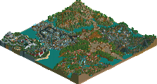
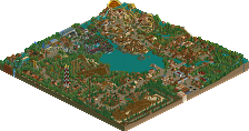
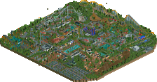
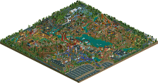
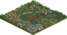
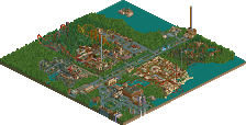
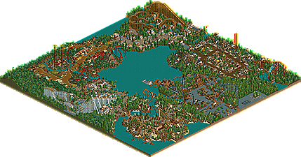
The final Group Park that was started in 2002 is finally unveiled, only a few days after Chateau Lake. A more traditional themed-area approach type park, featuring six diverse areas that are sure to have something for everyone. Whether it be an old, English Textile Factory, to an ancient civilization, a sunny boardwalk, a pacific island, a roman city, or even a forgotten continent, you'll sure to find something here that you like. Featuring a diverse group of parkmakers, all given a plot of land and given one task: create the best area on the map.. So who accomplished this? Was it vTd, ToonTowner, RRP, Fatha', x-sector, or Natelox? Download this tremendous park and make the decision for yourself. Enjoy!
NE's Masters Isle
Darn, I didn't think the park was going to be released, so I took down my logos. Alas the logos for this park are really nice, good ol' Cork, slavin' away in his little dorm room/house, making logos for parks. Congrats they're great!
The moral of this lovely park: MORE COMMUNICATION!
Dulany Steelworks: The fences were questionable in their quantity but the overall execution is wonderful. I love the simple yet creative style vTd shows us...occasionally.
Delano: Unfortunately my least favorite section in the park. I say unfortunately because there really isn't much to hate about it, there just isn't really very much to like about it. Elegant, yet rather small. The roman borders were questionable as well.
Suncoast Shore: I would like to apologize to RRP for saying what I did. This is something new! And exciting! And good! Very nice color and creative architecture. The classic woodie-with-a-large-loop was excellently done as well.
Hawaii: And like Chateau Lake, the new parkmaker comes through with the best section. Truly amazing as usually found in ToonTowner work. The coconut trees are brilliant and every aspect of Hawaiian atmosphere is captured.
Victoria: Nothing we haven't seen before but nothing bad. Enjoyable Fatha' as usual.
Forgotten Continent: I love how X-sector had the balls to use the walls usually reserved for rocks in his archtecture...you don't usually see that. The coasters were all well done and this time I don't mind the bare mountain. A few flaws in the architecture but a very good section nonetheless.
Congratulations NE on another very well done collabo!
Delano -- I love Natelox's style. I just love this style. It's one of the styles that really inspired me to build a project of mine that most of you haven't seen. I love his bare rocks, and the coaster is one of my favorites. Great architecture, great theming, great coaster, great section. Because of the huge reviewer's tilt here, I'll give him a nice *9/10*.
Suncoast Shore -- RRP bursts out here with a hack that I've imagined, thought about, but could never think of quite how to pull together until this park. I now know how to do this hack, and probably will be using it a bit now. The work shown here is great, and I really love this section because of the great theming and the wonderful coaster. Unfortunately, the architecture did not click as well as the rest of the section, so I'll give a *7.5/10*.
Hawaii -- I like the archicture quite a lot. The mine-train roofing is used a lot here, and it looks very nice with the theming that TT has done. The coaster is nice and creative, and everything in the section is pretty nice. Also, the atmosphere of this section is very well captured. *8/10*.
Victoria -- This section would get a lot higher than it will be getting for one reason. I've seen this section before. In Ancient Pastimes II, lots of the theming is nearly identical. But then, I've seen this theming before also. And before. Fatha' just doesn't seem to want to try a new style, but instead, further refine an already near-perfect style. Had this been themed to anything else (other than tropical), it would have scored much higher, but it'll have to have a *6/10*. The woodie saved it. Great woodie.
Forgotten Continent -- 3 coasters. Pretty impressive, seeing as the rest of the sections had one. This theming is a lot like Fatha's Ancient Pastimes II, and I thought it was Fatha's section for a quick moment. But, since X-Sector doesn't primarily use this theme, I'll give him something. His coasters are pretty wonderful, too. I like Ruins (or, whatever the mine train is called) a lot. But, because of the Ancient Pastimes Factor, I'll have to deduct a few points from this section to be fair. *8/10*
All in all, Delano and Suncoast Shores are my favorite sections in the park. I realise that Delano is not actually the best section, but since I love that style so much, I had to give it a little bit. It's so hard to judge art fairly when you already have such a bias. Suncoast Shores just had it for me. I'd heard about the hack reading it, and the hack itself is very impressive. So, Nate and RRP get my props, and I'm out.
...
If you disagree with my review, write your own.
Aérôglòbe
good job everyone who worked on this
That's my favorite logo.
Delano This is the only area I never got to see as Nate went last. I'm glad you got to rework your section. This is far better and has a good and refreshing look to it. The only thing thats bugs me is its alot smaller now that you re-worked it but I'll get over it. nice theming architecture and colours.
Suncoast Shore Beautiful. abit small (I wish there was more) but hey it still was beautiful. RRP does some great work here The coaster has to be my fav Woodie and the hack was done well. The are is well themed and I love the architecture.
Hawaii TT does some awesome creative work again. The area was amazing it had a love volcanic atmposphere mix with the nice atmosphere of hawaii. It was done really well TT.
Victoria Well same old, same old fatha really. It doesn't bother me tho as fatha is my fav parkmaker (along with mantis and harakiri). Here fatha has just perfected another theme.
And Finally my area well what to say for that lump of shit. Well its not my best work. When iris asked me to redo my area I was happy as it didn't look great but after I deleted everything I was then stuck on what to build. I went through loads of designs. some traditional and some wacky but the wacky ones never fitted in between vTd's and fathas area so I decided to go for something that fitted in nicely between vTd's and fathas area. so thats why its nothing special but I still in a way like it a bit.
Corkscrewed Offline
im going to go their next year
Corkscrewed Offline
As for the park:
I expected quite much from vTd's area after FDS because it's really a milestone park in my opinion. I wasn't disappointed at all. "Dulaney Steelworks" has to be my favourite area of the park. Such a difficult theme done so well. I'm heavily impressed. It even managed to live without 1/4 flowers.
The architecture was just stunning. So was the coaster. I hope this guy might do another LL park one day.
Natelox' area wasn't as good. Still nice but a little cheap and sloppy. Nevertheless, I liked it alot. The colours were very intense and evoked that great Natelox atmosphere. Good coaster aswell (although it needed boosters). The design after the loops was interesting and very well done.
RRP's Woody amazed me as well. I don't want to know how he did that hack as the stations are somewhere burried far away in the mountains...
Easily the best coaster of it's kind and a very original and well executed theme. I missed a few stalls or some flat rides or just something to give all these buildings a purpose though. Still, a very nice area which shows he put alot of efforts into it.
ToonTowner's Hawaii section was again, very impressive. This is probably the best use of rides for theming I've ever seen. The minetrain never looked better. Very original too and those towers are just fantastic. The flyer was actually a really good coaster too but maybe a bit inconspicuous. If this guy's next park won't win Spotlight then I really don't know...
Fatha': This was TH and TH is awesome! The woody was another masterpiece in my opinion and Fatha's treecombo never fit better. Very strong atmosphere. The rest of the area was of course nice but just too typical and too often seen by now. Some sloppiness here and there as well (wrong ground textures, missing names and even a bare spot somewhere near the woody's entrance).
x-sector's area was the weakest of the park in my opinion. Oh well, looks oldish and we all now what he's capable of now.
Overall the best collabo ever done in my opinion. Represents the NE title well. Probably in my Top10 somewhere. Great job everyone!