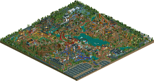
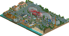
Park / Chateau Lake Amusement Park

Park_1342 Chateau Lake Amusement Park

32 Comments

  • posix%s's Photo

    You have a point Micool, but you also choose a particularly empty area to take your screenshot of. Screenshots mean nothing really. If somebody I'd never heard of sent me Schuessler's section here and asked me what I thought I'd proclaim them the next god of RCT. Just like in IOA Hollywood, it isn't the details of the theming that make it great, it's the big bicture. Taken as a whole this section has brilliant landscaping that's lightyears beyond the lazy rocky terrain almost everyone uses now. It also has very simple architecture which really only looks good to those who appreciate the old style of parkmaking. The key to Schuessler's magic I think is in sheer perfection. It may not have the frills of some other parkmaker's work but it makes up for it with a consitent atmosphere that is very simple but just detailed enough to work. It's a less is more, old-fashioned approach certainly but as one of the old timers, I love seeing this style. There's nothing innovative or fancy about Schuessler's work. It's just plain good and there was a time when that counted for something.

    That's exactly what I think.
    I may add that the colours in Schuessler's section (or basically in his parks) fit together so harmonically that it's sort of scary how much they shine and work together. It creates an atmosphere which is just unique. And even from the screen you pick Micool, I'd say it has a strong atmosphere, a nice realistic looking coaster and simply no mistakes. Perfection although it's simple. That's what counts for me.
  • Scarface%s's Photo

    I would just like to try something here. Imagine I'm this new guy. Like from RCT Station. I'm promoting my new park.

    so like heres my new park!!!!!! it's name is western junction for now i know its dumb but i dunno what else. here isa pic anyways  its AWESOOOMMEE!!! trust me

    exactly my thoughts
    well said
  • RRP%s's Photo

    . ??? RRP's was okay, I've never really been overly impressed with his stuff as his architecture is sickeningly predictable. *places a wooden wall with a mahogany fence and a black path. Then a brown wall with a peach roofing tile. Look I'm RRP!*  :p (Don't forget to slant always, unless you include the black path!)

    where have u been?

    khama cove is easily my best released work
  • Evil WME%s's Photo
    ok.. i finally get around to posting.

    1st impression was.. nuttin much special. rrp´s area sucked let´s face it, nice woodie tho. Aero´s area sucked, and Corks was Corks which i generally don´t like anyways. Scheuslers area. ditto to Micool. U can praise it ALL you want but this just plain SUCKS. and then we have coaster ed´s area.

    Ed, you are my hero :D .. Shuffle thing was genious, i LOVED that. The shooter ride was by FAR the best ever created. The coaster´s start wasn´t that amazing (the turn into the cobra roll wasn´t my fav) but the loops beautifully executed, and the best ending of a beemer ever. the landscaping was probably the most impressive thing about it. Posix told me it looked like my work and i can feel flattered :lol: there were some minor things about the area i would change but i loved the atmosphere.
  • Coaster Ed%s's Photo
    It's probably worth noting that my section was built much later than the other four. How much later I really don't know but I went last and the park had been sitting around gathering dust for at least a month before I laid eyes on it.
  • Andrew%s's Photo

    Taken as a whole this section has brilliant landscaping that's lightyears beyond the lazy rocky terrain almost everyone uses now. It also has very simple architecture which really only looks good to those who appreciate the old style of parkmaking. The key to Schuessler's magic I think is in sheer perfection. It may not have the frills of some other parkmaker's work but it makes up for it with a consitent atmosphere that is very simple but just detailed enough to work. It's a less is more, old-fashioned approach certainly but as one of the old timers, I love seeing this style. There's nothing innovative or fancy about Schuessler's work. It's just plain good and there was a time when that counted for something.


    I believe that can best be expressed as Aristotle's "golden mean" which Schuessler fell perfectly into, it only makes me wish my RCT1 worked so I could see it
  • Micool%s's Photo
    Well don't get me wrong guys, Moonlight Magic is one of my favorites of all time and I see why you would love his work but honestly after that I've never really been impressed with his stuff. Yeah, sometimes I get mad because I spend so much time making everything perfect. (You'll notice that in anything I've made after LotL, I rarely ever put two buildings next to eachother with the same wall type. It's not because I don't like how it looks, it's because I've developed this perfectionist psycho-whim that I can't break. Also, when I make jagged rocks I usually take about 30 seconds to one minute making each one look right. Then I destroy them with trees and bushes.) Sometimes I feel like Schuessler puts way too little effort into his stuff. But I did say I love MM, and I do. The bare rocks in that work perfectly. They fit perfectly. But in everything else (IoAH, this, blah blah) they honestly have no right being there and just look stupid. And the mummy area in IoAH. How was that not the lazist, most boring section ever made? That's all I'm saying. Maybe I will try to make a traditional park like that, I don't know, I do think I should start trying new stuff. (Maybe High Rollers, it isn't like I'm going to win anyway :p).

    EDIT: I just went over IoAH once more and I actually started to appriciate it. It's still boring but I think you guys are converting me. :rolleyes: ;)
  • Blitz%s's Photo
    bah, thats nothing micool...
    you haven't met a "true" perfectionist ^_~
    *cough*
  • posix%s's Photo

    EDIT: I just went over IoAH once more and I actually started to appriciate it. It's still boring but I think you guys are converting me.  :rolleyes: ;)

    I hated it until last month and now it's my #1 park.
    Keep looking... or rather analyzing it. I bet you'll like it because it all starts with that "attraction" you soke of.
    Does anyone want to start a "everyone who doesn't like Schuessler's work doesn't know much of RCT" debate? :p
  • Scarface%s's Photo

    Does anyone want to start a "everyone who doesn't like Schuessler's work doesn't know much of RCT" debate? :p[/font]

    called opinions
  • x-sector%s's Photo
    Corkys Entrance- Same old corky but I still loved it.

    JS Area- I'm going to have to be another one that moans about the area sorry. I normally love JS work but this was lacking something. Perfect layout I give him that but just a bit bare.

    RRP's Area- I really liked, just abit over treed thats all. I love the woodie and the little flat ride that sits so nicely in the middle of it. Nice custom flat rides and architecture.

    Aero21's Area- I loved this area aswell true aero style which is great Mr sinister has to be my fav Arrow looper coaster. awesome layout. and that log flume is wicked. great work aero21 :)

    Coaster Ed's Area- Ed your God I love everything I have ever seen from you. El Ranchero is incredible My fav Beemer :) I loved the beginning I thought it was different and looked good. the water ride is pukka. the Shooter ride is brilliant and the theming and architecture are perfect.

    Corkys Area - I think I would have to say this is my fav corky area ever I don't know why theres just something nice about it. Dawson Pony Express = lovely coaster. Theming and architecture are lovely.

    Incredible work everyone Its a very, very nice callabo. It all fitted together really well. well done iris for picking a load of awesome parkmakers which created a stunning park.
  • Corkscrewed%s's Photo
    FYI (Trivia)

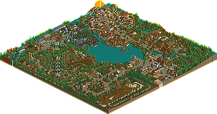
    It was named Chateau Lake before we figured out how it'd be themed. Then it just morphoed into a very traditional park. Go figure... but we were too lazy to change the name. ;)

    I chose "Dawson" because it's a town in Alaska, I think... or something of the sort. I think of The Call of the Wild with I think of that name, for whatever reason, and it sounded like a good name. Besides, I chose it before I even knew your last name, Ty. :p

    Ed's area was the most recent. I believe the order of construction went: Entrance, Schuessler, RRP, Corkscrewed, Aero, CoasterEd. :)

    RRP screwed up the map with one of his hacks. If you try to open all rides, the park will crash, and it's cuz of one of the cars in one of RRP's flat rides. :D
  • Cocoa%s's Photo

    this is up for voting, interesting. I think what is clearly RRP's area is just fantastic, really a prototypical theme from him. I always really like the area around the yellow beemer, but that one feels a bit harder to place. I think its ed's?


    the other areas blended a bit weirdly or didn't age as gracefully, perhaps. but still a fun look