Park / Chateau Lake Amusement Park
-
 30-May 03
- Views 6,373
- Downloads 3,955
- Fans 1
- Comments 32
-

-
 74.38%(required: 70%)
 Gold
Gold

chorkiel 85% CoasterCreator9 80% G Force 80% Cocoa 75% posix 75% RWE 75% csw 70% Jaguar 70% Scoop 70% geewhzz 60% 74.38% -
1 fan
 Fans of this park
-
 Download Park
3,955
-
 Tags
Tags
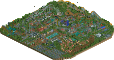
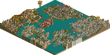
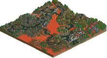
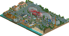
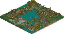
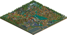
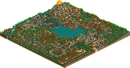
Almost a year after the park was finished, NE's Chateau Lake Amusement Park is finally released. The first ever uni-themed group park, all following the same traditional tone. Located in Phoenix, Arizona, NE's Chateau Lake Amusement Park is one of the more rustic, western-traditional type parks you'll ever see. Originally opening in 1986 with one coaster (Tidal Wave), the park continued to expand until being purchased by New Element Parks in 1992. From there, a flurry of new rides and expansions were added to the park, and by the time 2003 rolled aorund, it had grown into one of the most popular parks on the west coast. A great place to bring the family on a hot, sunny, Arizona day, and experience one of the best times of your life. Five separate New Element Park Designers collaborated together at various times to bring together the ultimate theme park experience. With wooden coasters, steel coasters, water rides, and almost anything else you can think of, Chateau Lake is definitely worth the measley $30 ticket price. Thanks to all those who participated in the construction of the park, and I hope everyone here enjoys it.
-Coaster Ed
-Corkscrewed
-RRP
-Aero21
-Schuessler
NE's Chateau Lake Amusement Park
Corkscrewed Offline
BTW, does my rapids ride feature a vertical drop or steeper than usual drop? I think so, not that it matters.
Best ride - Corkys pony express and RRP's woodie
Nice park but i wasn't keen on scheusslers area much.
After looking at his area anything else of the park wasn't that interesting for me.
His area was so aesthetical, had by far the strongest atmosphere and no mistakes at all. Great arrangements, perfect pathlayout, awesome names and another of his fantastic woodies. This is what I'd call perfection, although he forgot to name one Information Kiosk and had some banners saying "Happyland". Anyway, this area was my personal highlight of the park.
I surprisingly liked Corkscrewed's entrance too though. Reminded me of vTd somehow which is a good thing. The architecture and colours were ... well.... Corkscrewed-ish so I can't love it but like it.
RRP's area wasn't good in my opinion. Treed, boring and too SWA-ish. The custom rides had that horrible sound which made me run out of his area quickly.
I can't say much about Aero's section. Never liked his style...
About Coaster Ed's, well, the BM was nice and it's probably the most popular area in the park but he again didn't get me. It had a sort of weird feel because of it's unordered arragements which reminded me a bit of WME. Like Erwindale, it was too cluttered and too detailed and I couldn't really orientate or look at it with placidity (<--- couldn't think of a better word).
Overall a park which deserved the "NE" title.
That's all I have to say,
Hevydevy
Would've been really great, had there been more attempts to theme. The theming lacks so bad, that I would say that it is the worst area of the park, although I absolutely LOVED the coaster, one of the best wooden coasters I've seen according to realism...and the archy was kickass. I loved this area, but I didn't.
Lost Heritage
KICKASS. RRP is the king of hacking, and this is no exception. His creativity is to the max, with the custom rides..and his archy is top notch. Theming could use a little work, but this area is easily the best area in the park.
American Pasttimes
Incredible stuff. 100% Aero, which is not considered good with his spotlight park (Aero's Cinescape East)..[offtopic]I find it funny that one of his two spotlight parks is worse than his runnerup park, and lower on the list too. Mid-America rocked.[/offtopic]...but I loved this area. Very space-y, and nicely themed. The coaster was the only downside, with lots of speed problems. The log flume is incredible. I especially like the rotating platform, extremely creative.
Red Rocks Valley
Coaster Ed's area. Awesome. My second favorite area...but only due to the lack of theming. His archy always amazes me, so complex, yet not. I love the coaster, nice layout, excellent atmosphere. I commend you, and bow down. Nice job, Ed.
Dawson Village
WOW. This is a really nice area...not very Corkscrewedish, actually. His style is much more colorful usually, but I like this side of him better. The Pony Express is SO awesome...nicely done. I love the way he incorporated so many elements into the coaster, making it an awesome experience. I like the trick track.
Great job, everyone. This has to be my favorite group park since TSR. I love it. Yay iris for posting it!
my area is so old, its nothing like what im capable of now.
Good job everyone none the less
Edit:good to see people havn't heard about swa then.....i may not be finishing it but it will be finished cos there was not much that i had left to do but id lost motivation on it.That should be done sooner rather than later now i think.Well in my idea of soon that is.
~Prince Ashitaka~
Corkscrewed's section really surprised me when I first saw this park. Dawson Pony Express is a wonderful coaster mixing so many elements together. The raft ride also has some creative elements to it. The architecture is very blocky in the Corkscrewed style but that really fits for a mining town more than any other theme. I love all of the flowers in the entrance area too.
RRP's section suffers a lot from over-treeing but it does have that signature atmosphere that RRP excels at creating. It's sort of a mix between the new ultra-hacked style and the traditional SACF style. The coaster is still great no matter how long ago it was built, and the mix of colors throughout is probably the best in the park. Like Schuessler's section there's a simplicity here that really adds to the atmosphere.
aero21 suffers on this map because his style is so unlike everyone else's. The ideas in this section though are some of the best. I see this as the old Yankee Harbor from PGA with the Tidal Wave motifs and the rotating station log flume. I don't like the mixture of haunted theming here but the rides are all nice and there's some good architecture throughout too. Not aero21's best work, but good nonetheless.
As for my own section, I can definately see where you're coming from Posix. Everything I make has a cluttered feel to it because of the way I stack layers of details on top of each other. The shootout ride in particular I would redo if I made this section now. I made that section immediately after finishing egypTopia so I was really interested in the architecture at that time more than anything else. I thrive on assymetry and seeming randomness though so you'll probably never see me make something as ordered and simple as Schuessler's (amazing) work. I think that's for the best though. Even if I can't "get" everyone, I'm happy knowing that I have a unique style and sensibility.
I really liked the entrance, with the glass and all, it was good. As for Schuessler's area, I thought it was okay, I would have liked to see more theming for the woodie, and I thought the bare rocks stood out like a sore thumb, unlike in IOA Hollywood.
Good job to everyone, though
so like heres my new park!!!!!! it's name is western junction for now i know its dumb but i dunno what else. here isa pic anyways its AWESOOOMMEE!!! trust me
My reply would be that it needs some serious work. It's nice how you're going for a realistic look but that probably took you like 10 seconds to theme. Maybe if you could put more effort into theming that would be good. Oh, and try not to make the train go through the coaster fence if you really want the realistic look. Otherwise it's an okay start, I guess.
Well anyway you can probably guess what I thought about JS's area. I liked all the others, though, especially Corky's (though the entrance was a bit cluttered) and Coaster Ed's. That "Churro Shack" was so simple yet amazingly elegent and really stood out I think. Aero's was fun to look at but I don't get what it has anything to do with American pastimes.
Well overall it was a wonderful park if a bit boring. A lot of it was kind of drab, but Aero added the needed creativity to make this a super park.
RRP's section was nice. Better than BGL imo. Although, I am definitely not a fan of BGL, but this area restored my faith in you.
Aero21 is the man. It was awesome! Great theming, and the coaster was great.
Coaster Ed has to be the shining star in this park though. Beautiful ideas, rides, colors, and everything else. The shootout ride was great, and I think it would be really fun to ride in real life. Great job, glad to see more of your stuff (unlike Green Thumb
Corkscrewed did an awesome job, but I was a bit annoyed by the overtreeing in places. Great rides, and the architecture was good, but it didn't quite surpass Ed's section for me.
Overall, my ranking of the sections are as follows:
1. Coaster Ed
2. Corkscrewed
3. Aero21
4. RRP
5. Schuessler
But anyway, I'm not really disagreeing with you Micool. In a way you're right. It is very simple and most people would say it needs work but I love it for what it is. Simple, old-school parkmaking at it's best. Just as I loved Timothy Cross's park despite it's theming flaws, I love this section despite it's lack of innovation or detail. The two are completely opposite but both have an incredible atmosphere and uniqueness that makes them standout. And blah, blah, blah...