Park / Islands of Enchantment
-
 28-June 05
- Views 19,799
- Downloads 5,135
- Fans 5
- Comments 133
-

-
 83.13%(required: none)
 Spotlight

inthemanual 90% no ][ntamin22 90% no Liampie 85% no robbie92 85% no Stoksy 85% no Cocoa 80% no MCI 80% no nin 80% no Xeccah 80% no Poke 75% no 83.13% 0.00% -
5 fans
 Fans of this park
-
 Full-Size Map
-
 Download Park
5,135
-
 Tags
Tags
it's silly even arguing about them.
oh and jelly, you are the one who brought bitching to another level at ne. maybe me as well.
Why you always gotta hate, Pos?
you sure find your bitching amusing? stop showing off. you're not humorous.
Does it hurt to enjoy life every once in a while?
ride6
Corkscrewed Offline
Anyway, the ones I didn't make:
- Universal Island Xtreme
- Visions Amusement Park
- Cinescape East (this and Visions both look more like banners in their proportions, so that's sorta an obvious clue)
- Snow Drop
- Disney's Tilted Acres
- Rivers of Babylon
- Phantasia
- Bijou Magique
Okay, so make that eight.
Now... what exactly were we talking about? Something about IOA?
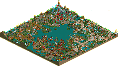
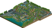
Those duelers were timed perfectly (although the layout didn't quite look "clean" enough) and the colours were awesome. The medievil section in general was excellent. It's obviously going to share some resemblance to Gotheburg as it has red and blue duelers themed to a grey medievil castle. But I think it was quite different with some charming architecture and some nice bare-ish areas which worked for me. The supports were cool apart from a few which looked kinda dodgy, like one that was position weirdly on one of the helixes, but it was generally good.
The gaia section was neat. Nice launched coaster and some of the best architecture in the park. I still don't like those waterfalls falling onto the path, but I knew you were going to keep them, so no worries. This area shone with vibrance, I really enjoyed it.
I didn't enjoy the pirate area quite as much as some people here, I don't feel it was the strongest in the park. The architecture was solid, though got a little repetative for me with an overdose of deep red and gold rooves etc. Cutlass was awesome, though I feel you shouldn't have used 2 steel twists in the park (despite one being launched and one not) but perhaps could have used an alternate coaster type.
I enjoyed the land before time most out of all of the areas in the park. A very nice coaster layout and some excellent Dino theming, some of the best I've seen in RCT2 (though as someone mentioned, Outpost Prehistorica still claims the crown) I love that bits that jutted into the water with the fence around it, that was neato, and generally, the whole area was a joy to explore.
The Resort/Waterpark was pretty good, but was strangely placed as it seemed like another section of the park that anyone could access, rather than seperate from the park, where hotel guests could enter the park but not vice versa. The waterpark was pretty cool with some nice flumes etc. and the hotel structure itself was good also, nothing amazing though, that made it stand out as a hotel.
Overall, an awesome park, and damn your fast and productive! Great job, and deserved win on the spotlight thing.
And for the record, I prefer corky's logo
Metro
But overlooking the theme redundancy, unorigonal components, and uninspired general design, this was amazing. Truly. The architecture was superb, level of detail immaculate. I might even be willing to overlook the bad side of this, just because those buildings are so pretty.
But here's a suggestion. Just a suggestion. Next time, try a little different formula. Break away from the dull four-corners style. Try just a little creativity. Just a little..... please. The product would be unimaginable genius. The world might just implode. Yes, it would be that good. NO ONE could rightfully complain.
anyways...i look back on IoE and i think damn i could have made "this and that" much better, thats the thing with me i never realize these things untill i look back when the park is released but i suppose its a good thing, helps me improve for my next park. I am very happy with most of these comments the good and bad ones they always make me happy and help me improve. I guess i dont really have much more to say but i would like to thank Iris and corkscrewed for the spotlight you guys really made my day. thank you.
anyways see ya soon in the advertising district.
Kevin Offline
I just wanna say congrats on winning spotlight 2 times!
I wasn't a huge fan of PoM but I really liked this park, and it definately deserved spotlight.
I can't wait to see your next park. Judging by how fast you've been improving, I'm sure it'll be amazing!
I'll try to be brief on my comments. You improved your foliage tremendously, yet aside from Hammer Forge, the foliage was identical throughout the park. Just try to change it up a bit, and the themed areas will be that much stronger. In addition, I really didn't like your coaster selection. 2 B&Ms, 1 Intamin, and 1 supposed Intamin, which was actually a B&M. That's 3 Beemers, 1 Intamin. No, no, no. You need 1 woodie at least, and what about an Arrow, or something Premier or Vekoma? To top that, the supports on all of the coasters were identical, with the same approach. Ok, they're appealing and pleasing to the eye, but come on.
Wow, I didn't mean for the "bad" paragraph to be that long and insulting. On to the positives. Compass Cove was a great pirate section, probably the best I've ever seen. The architecture was fab, and I loved the rapids ride. One of the drops was very Splash Mountain-esque, and I liked the pirate ships. Cutlass was very good for the most part, way to improve your coaster skills. Now to the Land Before Time section. New Breed was definitely an excellent coaster, many high speed exciting, unexpected turns. I certainly thought this section had the most atmosphere out of all of the sections, and I love that music. I liked the little jutted out piece of land with the electric wire around it, very nice. The architecture, for the most part, was excellent in this area, except for, as I mentioned before, the color overdose. For Mountain Forge, or whatever, I didn't really like it that much, but I thought the architecture was top in this section, even if it was heavily based on Slob's work. The Garden of Eden had some nice spots and great foliage. I'm really tired so I'll sum this up quick. The park was a huge improvement, and you finally unleashed some creativity bits here and there. You also had some great hacks, like on a 3 tile section, hacking a 2 tile sign over a different one to give the appearance of a three tile sign. Great little hack that I've never thought of or noticed in any park. I also had no idea how you made some of the brick walls diagonal in height in the Hammer Forge section. I probably could figure it by tooling with zeroing absolute.
On the whole, very nice job. Congrats, on the park.