Park / Islands of Enchantment
-
 28-June 05
- Views 19,644
- Downloads 5,121
- Fans 5
- Comments 133
-

-
 83.13%(required: none)
 Spotlight

inthemanual 90% no ][ntamin22 90% no Liampie 85% no robbie92 85% no Stoksy 85% no Cocoa 80% no MCI 80% no nin 80% no Xeccah 80% no Poke 75% no 83.13% 0.00% -
5 fans
 Fans of this park
-
 Full-Size Map
-
 Download Park
5,121
-
 Tags
Tags
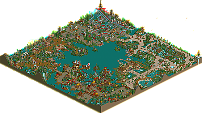
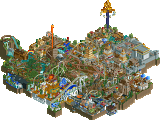
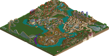
- Pirate area: I liked this area a lot. The archy for the most part was excellent, but it was just strange how the entrance to the whole park was right in the middle of the pirate area...I mean, usually the entrance is in a more "neutral" area of the park. But anyways the coaster was good, I agree with Ride6 about the placement of the launch segments, but the layout was good, especially everything up to the Cobra Roll. Oh, speaking of the cobra roll I HATED the fact that it came out of the middle of the water, it was just poor planning and I would've liked to see it over the path. The color scheme was good and the rest of it was good. The rapids ride didn't do much for me though.
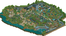
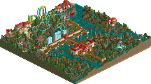
- Dinosaur area: This was okay. The foliage was good and the hyper was decent, not great, but not bad. The helix turnaround was just about the only part that was memorable for me. I did like the splash boats ride a lot, the lift climbing up the back of the mountain was good. The flowers worked nicely, and while none of this area stuck out, it wasn't bad.
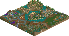
- Garden of Eden area: Didn't work for me. It was very sloppy, and a lot of little things bothered me like the little courtyards with the grass that was not mowed. That is a huge problem I have with parks -- take the time to make sure all your grass is mowed, especially if you're going for a spotlight. The rocket coaster was interesting. I wish the initial tophat was "open" rather than the inverting one, 'cause you already had another inverting tophat later and also, for a first inversion the open tophats are the best. The rest of the coaster was was good, especially the ending. I didn't really like the foliage, though, and it all seemed rushed.
- German/medieval area: This was pretty good. The duelers were outstanding, the best duelers I've ever seen, even much better than Gotheburg. The interactions were brilliant, just a masterpiece. I liked the archy here actually and it wasn't bad at all. The station for the duelers were well done too. The only thing is though, dueling inverts with a medieval theme are getting old.
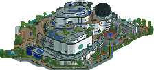
- Hotel/Waterpark area: The waterpark was okay, the hotel didn't work for me at all. The top of the building was strange and it seemed like you just wanted to top it off rather than elaborating on it a bit. This is just another one of those things where you seemed to rush, like other parts of this park. The underwater stairs on the pool and such were nice little touches as well.
-----
General positives:
- Archy was all solid, for the most part.
- A huge improvement from PoM.
- The coasters were all solid (even though you only made one completely by yourself. One major one at least.)
-You managed to capture the atmospheres of each area for the most part.
- It was spotlight quality and deserved, I think.
General negatives:
- You can argue about it as much as you want and make excuses (and it's getting annoying by the way at least for me) but you "overdid" the guest appearances a bit. One coaster is fine but for you to deserve all the credit for the park is kinda unfair if most of the major coasters in the park, at least with the layouts, were made by other people. Yeah yeah yeah, I know, you did most of the theming. But still, it was overdone and for you to deserve entire credit of the park is kinda crazy if a good amount of it was done by others.
- Nothing really memorable about the park apart from the brilliant duelers (which seemed to be done entirely by WME, so nice job WME)
- Little sloppy things throughout. Un-mowed grass, titles of rides which aren't capitalized, etc. Little things that were rushed and make me think you made this just to get it done and win your spotlight. If you're gonna win a spotlight, make sure you touch everything up.
Overall: A deserved spotlight finally, congrats. You're improving but still making sloppy mistakes and therefore aren't as memorable for me as some others.
7.9/10
As for the park, it was nice. Nothing too outstanding, but easily spotlight quality. Good job, Artist.
thanks for the comments guys. they mean alot to me and will be alot of help when im ready to start another park.
The whole park was too reminiscent of Islands of Adventure.
Love the 'offical' logo by the way.
Compass Cove: Very nice the atmosphere was excellent, I thought that the foliage was well done and those yellow flowers suited the area very well. The architecture wasn’t that great imo but the rest was just fantastic. The coaster, Cutlass, had a very good lay-out and I loved how the queue path interacted with it. ‘Search at the cove’ was very good as well, I always like rapids rides more if the track’s hidden. All together, I think this is my second favorite area.
Land Before Time: Impressive although it looked quite similar to that area in p.o.m. I liked the variation in colors and how everything comes to life in this area. Then there was this wonderful giga coaster meandering through the area with some nice custom supports. And there was this nice song playing what just did it for me. So for me this is my favorite area of the park. One thing though that I didn’t really like was the amount of yellow plants everywhere, there were just too many with a result that it looked a bit sloppy in some places.
Hammer smith Force: Those duelers were amazing, great job on that (Evil Wme). The colors were perfect and the lay-out was fantastic as well. The coaster both dueled very good and the custom supports looked very nice. The rest of the area was nice, not too special or interesting. It looked very similar to Götheburg so I wasn’t really impressed or something because I had seen this theme before. If I look at this area in general, ShÃvá outwheighs the rest and thus after I had taken a look at the coaster I quickly went on to the other area…
Gardens of Eden: a lot better then Hammer smith Force. I really enjoyed looking through this area, the running water everywhere looked cool. The atmosphere was pretty good too although something was missing but I don’t know what exactly… Gaia was lovely to follow around through the landscape and inversions. The kiddie coaster was fun to look at.
The whole park in general was fantastic. It showed a lot of skills and improvement from your last Spotlight. My only tip is actually what I didn’t really mention above is that you should maybe try and improve your architecture a bit more. Not that it’s bad now or anything like that at all but just for a change because p.o.m showed pretty much the same architecture skills as this park.
All by all: 8.5/10
i just feel like it's the same as every other rct2 park i've seen in the past. generic layout, generic theming, generic architecture, etc. granted, the level of skill is pretty impressive, all this stuff seems so played out. i've seen it so many times. either way, congratulations on winning your second spotlight. maybe my dissatisfaction with this spotlight will convince me to actually finish thrillmatic (or even start working on it again).
My review:
Compass Cove - A decent area. Nice warm colors with plenty of details. I kinda got overwhelmed by the 2x2 archy, as well as the redness. The coaster here was really nice, but thats about it. And whoever built those pirate ships is a God...
Land Before Time - Definitely my favorite themed area, with my second favorite coaster in the park. The giga was incredible. That figure-8 turnaround was just purely brilliant. The theming here was you at your best chris, imo. There were so many neat little attractions and colorful details tucked away in every nook and cranny. I just loved it. The foliage was top notch too. Not overdone, but still very thick and pleasant.
Hammer Smith Forge - I definitely got the Gotheburg feel here. As ride6 said, you obviously did not copy straight out, but it certainly was implied with the classic, quaint midevil buildings and the red/blue duelers. Regardless, it wasn't all that bad. The duelers are too good for words. WME is a god; no wait, "the" god. But chris, you did pretty good with the theming and supports on the coaster here, so I can't discredit you too much. Nice job.
Garden of Eden - This area didnt do much for me. Atmosphere yes, excitement no. I must say the foliage was very well done tho, as well as the coaster. I realize this area was built for atmosphere and not excitement, but it just didnt hold my attention at all.
Hotel and waterpark - Hmm. Not really my cup of tea either. Again, another area with loads of atmosphere and little excitement. The waterslides were pretty nice, but the hotel structures themselves were quite boring imo. Nice foliage as usual tho.
Overall, I must say when compared to PoM, I didn't really like this park as much. I do think it shows how you've really developed your own unique style chris, which is really something to be proud of. I also think this park demonstrates some generall improvement, although I think you really try to expand your themes a bit more. I'm also not completely satisfied with your architecture. Either way, this park deserves its rank and I did enjoy most of it. I just hope something more exciting is on the drawing board.
I'd give 7.5/10
As for the park...I understand people saying it's very cliched, because by all means it is. But to say they've seen all this before is an exaggeration I feel. It seems to me that only a handful of about 3-4 RCT2 parkmakers actually build parks, so seeing good work on a scale this big almost automatically qualifies it for spotlight.
Compass Cove - I thought this worked very well as the entrance area. "Cutlass" was a great coaster with a layout with only a few minor flaws, still nothing big enough to really detract from the quality of the coaster. The theming in this area was done almost flawlessly in my opinion, as far as a pirate area goes. He stayed true to the theme and still found a way to make it look fresh and beautiful, whereas I feel most parkmakers really suck when trying to use the pirate theming in RCT2. The rapids ride didn't really draw me in all that much, but I didn't hate it either.
The Hotel/Waterpark Area - I admit I was a little disappointed when I saw this. It almost seemed like the cheap way out of finishing the park. The hotel itself was pretty nice, though I tend to enjoy hotels more that have their own architectural style from the park, whereas this one kinda blended in as just a 'really big building' still in the park's tone. The waterpark visually was nice, albeit kinda bare and empty. I mean only two or three slides doesn't make for much of a waterpark.
The Garden of Eden - One of my two favorite areas of the park. I think the theming here was just about perfect, as was the architecture and the colors. I don't know why people seem to have a gripe with this area, I think this one is almost as good as anyone else could have done. The use of the grass mazes in there was great, I loved all the water-interactions with the entire area, and the entire soothing atmosphere really drew me right in. The coaster was nice, good to see something somewhat different, the architecture was the best in the park IMO here as well. Great job on this area.
The Medievel Area - Not a huge fan. I absolutley love the layout to the duelers, major kudos to Evil WME for those. Still, I think that medievel themed dueling inverted coasters have been done just about as many times as they can be. That's the reason Gotheburg worked in my opinion, cause at least the coaster types were different making it not the same exact thing we've seen. The architecture looked very borrowed from Gotheburg as well.
The Dinosaur Area - The other of my favorite areas in the park. This reminded me of something that maybe Harakiri would make in RCT2, which is a pretty high compliment. Great choice of colors and foliage, the Titan coaster was definitely the second best in the park, and the architecture and complimentary rides were great, with the exception of the river ride which I didn't care for. Just looked out of place with it suddenly sticking up just about as high as the quote unquote 'hyper coaster'. That's the only part that didn't really work for me.
Still, a great park and definitely a deserving one. Definitely one of the best 2 or 3 RCT2 spotlights we've ever had, which you can consider a testament to Artist, or as a sign of the times with today's agonizingly inactive parkmakers. Either way, Artist is probably the #3 RCT2'er at the moment (his talent and productivity lock him down there), with only Phatage and Turtle ahead right now. Great job Artist, and I can't awit to see more.
Glad to hear someone else like Eden. Wonderful area, neo-classical at it's absolute best. It could've used some height variation however it doesn't need it. Something else I didn't like about this park and I just remembered it though was the fact that there weren't stalls in buildings claiming to be resturants and souvenir shops, this is forgivible in LL were it requires hacking and chews up valuable rides that can be used for architecture however in rct2 there is no excuse other than lazyness, the other things that bugged me was the name to some of the attractions. The grass maze (which I love) was named "a walk in the garden" please... How about "A stroll through heaven's forest" or something. You can get the same meanings with words that just seem so much more, um, interesting. Really those are my only two big issues with things in LBT, CC and Go/E. The other two areas weren't at all my thing being all the typical "done it already" stuff, except for the duelers, which were both well designed and well done in the support and theming sense.
Still one of the best parks in a good amount of time imo. Sure it has its flaws but it wasn't built by the few parkmakers who achieve new levels of excellence with each release. Artist is the "honest hardworking parkmaker". Sure he's not the most talented but he's the most productive.
ride6
Corkscrewed Offline
To each his own. As it turns out, half liked his, half liked mine. But if I had known you were gonna fuss about something so trivial, I might have made a logo ahead of time and had you use it.
It's there for your comparison. Actually, maybe it was that slightly blurred sun that bothered me.
About this comment:
I see your point, but you also have to be careful about going too far the other way to where it sounds like you've got a bad case of 'thesaurus-itis'. Sometimes short and to the point really is best. Something short and simple like 'Mantis' is better than a forced alliteration like 'Murderous Mantoid' or 'Slippery Swallow' for example. Finding the right ride name is a delicate balance between being overly banal or overly decorative. A ride name like "A Stroll Through Heaven's Forest" probably wins points with literature teachers but your average park goer may not be so amused.
If it's really Eden you might as well use the liturature style of the book of Genisis when using phrases.
I guess I'll just leave it at, "The names could've been better"
ride6
My favorite park had to be the part with the duellers in I think. The duellers were very well timed, so good job on that WME. The archy was quite nice in places, but more of it was a let down.
The pirate area was nice too. But I thought it got a little repetitive. The coaster layouts were good, and I liked the boats. I didn't like the thing the cobra roll came in and out of though.
The land before time, hmm. A little like Calipso Cove, and now that I've just looked at Calipso Cove again, I have to say I like CC better. The archy just wasn't my style. I wasn't keen on the giga neither...
The Garden Of Eden had some very nice and picturesque archy but there wasn't much of it, and I couldn't get the coaster to work, it kept breaking down whenever it hit the chain lift booster.
The hotel was the most disappointing area of the park imo. I didn't like it at all. The hotel was a bit small and it just didn't work imo. There were too many pools that could have been used to make some more archy in that area or to expand the hotel.
All in all, this was a decent park, but not as good as PoM. 6.5/10 for this one.
1. Check for random floating blocks. They annoy me and I'm sure they annoy others and it's not like they don't stick out. Look for them.
2. If a building is labeled a cafe I want some goddamn coffe or cake on the inside not just a building.
3. Make sure each area had atleast some though behind it. I mean a hotel in the center of a park that is just stupid and I'm not just picking on Chris here I have seen some other stupid things in spotlights were I just thought "Did they even think that over for a minute?"
4. Coaster Variation. If I were a wooden coaster I would feel like a red headed step child.
5. Make sure the park path flows and doesn't just end at some point so people have to work through the rest of the park to get back out. Now wouldn't it be a bitch if IoA had no bridge connecting Seussland and Port of Calls? Yeah it would.
6. Have the best coaster in the park be made by the park's creator. It shouldn't have to be said but I guess it does now.
7. Have atleast two areas that use a new theme or atleast give a done theme a new look or a different way fo doing that theme.
8. Don't make a park spotlight merely to livin up the site.
9. Limit guest spots to only two parkmakers. Honestly its not called a solo for the hell of it.
10. Run it by me first.