Park / Islands of Enchantment
-
 28-June 05
- Views 19,581
- Downloads 5,118
- Fans 5
- Comments 133
-

-
 83.13%(required: none)
 Spotlight

inthemanual 90% no ][ntamin22 90% no Liampie 85% no robbie92 85% no Stoksy 85% no Cocoa 80% no MCI 80% no nin 80% no Xeccah 80% no Poke 75% no 83.13% 0.00% -
5 fans
 Fans of this park
-
 Full-Size Map
-
 Download Park
5,118
-
 Tags
Tags
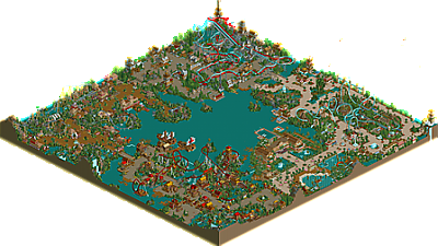

Corkscrewed Offline
Islands of Enchantment
Nemesis Chris. Fable. Internet troll. Brit. Graphics enthusiast. You can call Chris Turner a lot of things, and now, you can call him two time NE Spotlight winner! Fresh off of his solid though controversial Spotligth, Ports of Magia, Artist is back with another RCT creation: Islands of Enchantment. And this marks a significant improvement over his previous stuff!
More thoughts later.
Corkscrewed Offline
And which two? Cuz "Cutlass" actually works. And Gaia is an accepted variation of Gaea. *shrug*
Fatha' Offline
This park just didn't do it for me. The inverts were weak. The coasters in general were repetive.
As much as I love artist as a person I just can't give this park my full endorsment.
Honestly, it has lowered the quality of spotlight.
Edit: german area should have been removed...
Corkscrewed Offline
Besides, Iris and I both agreed on it, so
I mean, I'm a LOT more sure about this over PoM, which was Spotlight quality but "barely." This is definitely there for me. Not the best ever, but not every Spotlight has to be.
That and I have a plan.
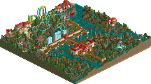
The park - A significant improvement over PoM, definitely. I'll run through each area.
Pirate area - I like this one, probably my favorite area. Slightly unorthodox layout for the coaster, but not too bad at all. A nice rapids ride, too.
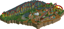
Dinosaur area - Good coaster, and good use of white blocks and track to make bones. This looks like a "full" area, the most professional, to me. Lacks the charm of the pirate area, though.
Eden - Once again, a very good coaster. Probably my second favorite coaster, behind the duelers. Some nice ideas, but it's a bit too flat, for me, and I'm not crazy on the foliage on the buildings, although I recognise that as being part of the theme. The windmill seemed completely pointless to me... since when did Adam have a windmill? Must have missed that part of the Bible.
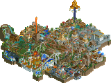
German area - Lovely coasters, until it gets to the dive loop duel. After that, it loses a bit of momentum, for me. There's some nice snapshots in this area, but a lot of it seems rushed, and not really focussed. Doesn't look like a lot of research went into it, and the atmosphere isn't too strong here. None of the flat rides stand out.
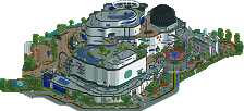
Hotel bit - I really like the waterpark, but the hotel is a bit boring in places. Doesn't look as if it belongs in the park, really. Also, what's with the name? The nature of the "ñ" means that it's impossible to pronounce. A bit more thought/research would have helped.
Some pet peeves were the naming - lowercase letters look unprofessional to me. I think the main thing that hurt this park was the fact that you only built one coaster by yourself. It's not a bad coaster, either, so why not build them all yourself?
Overall - A very good park, and deserving of the spotlight, I think. A good stepping stone to your next park, which you will hopefully take more time to really polish.
there was my video with the ioe logo in it.
he sent you the logo in an even improved version in the same zip the park was in.
you go and make him a shitty logo and use that.
anyway, i think the park is very nice. it has convinced me ever since, which was why i wanted to make the rctmv. great work, chris, it's nice to see there are still people with enthusiasm around.
Anyways, I've seen so many versions of this park it isn't funny, so I'll download it when I have time.
Well congrats again Chris, now I'm off to work...
I think it's beautiful, and a much better park than PoM by about a hundred times. In places - like the german area - it looks a little rushed, but the duelers make up for that.
I quite enjoyed the coasters. I didn't think they were weak at all. Some of the finest imo.
Anyway, nice win, and congrats Chris.
I like the park ,it's better than PoM i think.
The coaster lay outs ae very nice and your theming too i think the german are is the best a good mix of nice coasters and good theming
Nice win Chris. Honestly, when I look at the overview of this park, I see vast improvement from PoM, but see little variation in your style. But hey, at least you've got a style, better yet a style that has now won two spotlights in two attempts; thats a feat that will have most NE'ers envious for days to come.
I'll check out the park tonight and post some feedback, but I just wanted to give you a few words of honor first. good job my friend.
with this new logo, people don't recognise the park from the video.
The duelers were some of the best I have ever seen... maybe all duelers should be red & bule
9.0/10.0
Awsome park.
P.S. The logo on the spotlight page owns the logo that came with the park.
thanks so much
Also, build your own coasters.