Park / Bijou Magique
-
 10-November 04
- Views 9,729
- Downloads 3,356
- Fans 3
- Comments 46
-

-
 77.50%(required: none)
 Spotlight

Poke 85% Fisch 80% Jonny93 80% Liampie 80% MCI 80% Stoksy 80% Cocoa 75% Xeccah 75% 5dave 70% csw 70% 77.50% -
3 fans
 Fans of this park
-
 Full-Size Map
-
 Download Park
3,356
-
 Tags
Tags
Congarts on the spotlight and being a parkmaker when NE3 goes up.
inVersed Offline
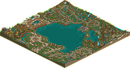
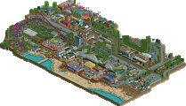
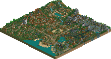
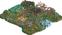
The whole park was very classy. Hell, even the logo was classy, and the name too. The entrance was a nice taster, and from the screens you'd shown I was expecting more of the same throughout the map. Well, there was a lot of class and a lot of loveliness, but my favourite parts came when that loveliness had a bit of panache added in. La Rochelle, for example, was astounding. This is the sort of thing DJ has been showing us and it really is a style i'd like to see more of - stunning landscaping, brash colours, bold architecture and really adventurous ridemaking. 10+ excitement dueling river rides with drops straight out of the station are exactly what I like to see, and those large blood red buildings with the coaster-track ornamentation demonstrate what's possible when you take the good stuff from both games and go wild with them. And that ship was the icing on the cake. This area could have been bigger.
Al Hassan Oasis was nice, but slightly small - I would have liked to have seen a larger attraction there, perhaps at the expense of some of Lost Continent, which, while lovely, did seem to be overly large for the map. The duelers had excellent colours, but the layouts were average. If I hadn't seen Two Forces i'd probably say they were good, but Two Forces really demonstrated what can be done with duelers, and a few better-timed classic duels (along with some innovative ones) wouldn't have gone amiss. The electric fencing was a nice touch. I wasn't especially keen on the river rapids either. In an area as big as that I think you could have gone all out with the rapids, with the realistic station loading and some effects. Lost Continent seemed lacking in contents, really, for such a big area.
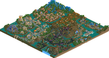
That's in big contrast to Iguaca Falls, which was a return to the striking, surprising style of La Rochelle. Stunning landscaping, taking a leaf out of WME's book in terms of taking risks with challenging rifts and ranges. The coaster was nice, too, although a little awkward in places. Nice bird statue, too, and here I liked the small attractions (and Jaguar made me smile thinking of Ancient Ruins, oh so long ago). It's funny that this area is so busy, with more main attractions than Lost Continent. A little more balance between areas would be great in future parks, and some more whole-map equilibrium. Most of my favourite parks do have discrepancies in area size, but this is never so pronounced as to make me wish areas were bigger/smaller. Here I really wanted to see more of La Rochelle and less of Lost Continent.
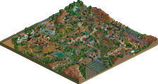
Mycenae was in the middle, really. I did like the theme but it was less challenging than the others, and didn't grab my attention as much. The height tricks with the pathways were reminiscent of Butterfinger's amazing overlaying in Trojan Dynasty, and it's good to see you really trying with the different architectural tricks (building into the sides of mountains, for example). Sometimes, though, there's the odd building which looks quite mundane - even more so when built next to something much more interesting. In really great parks you find that most of the buildings have something interesting about them. The coaster hugged the terrain well, but also suffered from being underground for too long. It had a bit of the Kentaur about it, but Kentaur was proudly displayed for much of its course - this woodie seemed to want to hide most of the time!
The central lake was expansive and might have been better with another feature in it, but I also wonder if that would look forced. The park already had many areas, so I suppose another would reduce the impact of each. It'd be good to see a different park layout next time, because it's always great to see people challenging themselves.
I really enjoyed looking at this park (which might be evident in the length of this reply...for an rct2 park!), and congratulations on the parkmaker spot, but moreso on the spotlight. In spite of people muttering about it losing its value, it is still what I hold to be the pinnacle of RCT achievement, and it is the best platform from which to share your enjoyment of the game. And well done on advertising this park - enough to keep peoples interest piqued, but not too much to reduce the interest of the final product.
All in all, thanks for sharing this with us! Now, get back to bouncing around - Beijing?
This looks like one of my favorite spotlights ever!
Aérôglòbe
Congratulations again, and I can't wait to see more from you, and hopefully I'll work with you in the future.
Congradulations anyway though, and welcome to the team.
you are my hero.
A classy, sharp, and talented undiscovered parkmaker finally shows what he's made of.
AMAZING!!!!!
Uh...
At least I do....
Um...
I want to be a parkmaker