Park / Draca
-
 08-June 10
- Views 5,627
- Downloads 763
- Fans 0
- Comments 22
-
 64.29%(required: 65%)
 Design Submission

][ntamin22 80% inVersed 75% Roomie 75% SSSammy 70% chapelz 65% Kumba 65% Ozone 65% robbie92 65% Sey 65% turbin3 65% CedarPoint6 60% geewhzz 60% Liampie 60% Evil WME 55% Six Frags 55% 5dave 45% 64.29% -
 No fans of this park
-
 Download Park
763
-
 Objects
294
-
 Tags
Tags

downloads: 409
Edited by geewhzz, 09 June 2010 - 03:34 PM.
inVersed Offline
Thanks inVersed, I thought I had it with this one.
Attached Files
downloads: 337
Edited by disneylandian192, 09 June 2010 - 04:22 AM.
Congratulations on finishing though.
Keep it up!
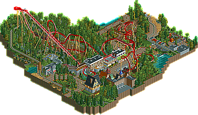
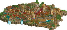
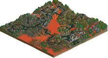
I can see though why this didn't quite reach all the way; it's still too similar to Fenrir. The cobra roll placement, brakes before the first loop, the station/queue (especially with the waterfall beneath the queue), small dirt/rock piles with dead trees on it... In short it was too obvious where you got your ideas from. I dare say, hadn't fenrir been released prior to this, you'd have your design accolade for sure. And while it's of course not a bad thing to be inspired by other's work, giving it your personal touch is what really earns you respect and accolades. If you keep that in mind for your next project I have no doubts you'll win something.
Any help please? I'd like to check this out.
Wow I feel sorry for you man! This should have won. You got screwed just because your entrance building was similair to Steve's. That's just unfair.
This design was great, especially from a beginner. The architecture was interesting and good, the layout was gorgeous, the foliage was amazing, every part of it was good enough for design but somehow you just got screwed and I don't understand. I hate to bring up this example (I've brought it up before- no offense Maverix) but I don't understand how a design like Hammerhead could make it but this couldn't.
If I were you, I would still call it a victory in parkmaking, if you know what I mean.
Nonetheless awesome work, man. I loved it.
It didnt stop me from liking it.
I loved that the layout was a sort of extension to the compact Dark-Knight style beemer layout, but something still felt a little off.
The foliage and archit- huh. now that I'm looking at both overviews the train and terrain cropping are rather similar... but every park has a train, right? And this style of cropping a design has been in for a while. Although actually some of the foliage looks similar as well... but there are only so many trees to work with. Oh, and the steeper-pitched northern-european style roofs. And the brown at path edges.
The main reason I didn't mark this as Design-quality was that it didn't have any standout elements; it came across as very vanilla. I realize now that the reason it came across as vanilla was that I'd seen something done similarly and very well before. The more I look the more similarity I see; these actually seem like they come from sister parks.
I can't speak to how much influence was taken from Fenrir, but the simple fact that it exists means that this design is weaker. Unfortunately I think the panel saw too much of Fenrir in this to front-page it, right or wrong.
good work and I hope you dont feel disheartend that it didnt quite make it
I think its safe to say, whatever you finish next will be even better
http://forums.nedesi...a...t&p=494715
That is why they are referring to it. He changed it a lot though.
God, I hate when that happens.