Park / Congo
-
 01-June 10
- Views 5,202
- Downloads 757
- Fans 2
- Comments 17
-

-
 75.83%(required: 65%)
 Design

Kumba 90% Liampie 85% CedarPoint6 80% Evil WME 80% geewhzz 80% Ozone 80% 5dave 75% inVersed 75% posix 75% chapelz 70% Six Frags 70% SSSammy 70% turbin3 70% ][ntamin22 65% 75.83% -
2 fans
 Fans of this park
-
 Full-Size Map
-
 Download Park
757
-
 Tags
Tags
inVersed Offline
...but not as much as I look forward to SFSF
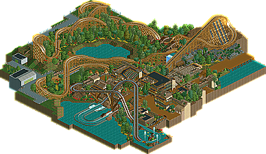
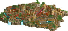
However when I take time to look over this I can't help feeling something isn't quite right and I think it is the architecture that hinders the overall impact of the map.
It all feels a little bit too messy and over done and doesn't really compliment the coaster here. I personally don't like the use of coaster stations for balconies, I prefer using rapids or mini golf as the track and station lights detract from the overall flow of the building. I also just can't focus on any focal points when looking at the station for EC (I think too much of the same colour with the roofs and paths) and it is kinda hard to work out the flow of the queue or where the exit and entrances are.
Away from the ride area I thought the storage buildings were nicely done and the doors were well executed. Also when zooming out and imagining this area as part of a full scale map it seems to make more sense and I would love to see you complete a full scale LL park. From your recent screens and guessing that this was finished over a month ago I think it is safe to assume that you've improved already from this design though, so I wouldn't worry about the small problems with the archy, and I can't wait to see more LL from you.
I don't think it was the archy. The surroundings had a very nice Sea World/Busch Gardens feel to it and the minimalist approach to surrounding helped aura. I loved the design layout(a step up in layout from the Comet mos def
i'm serious.
-ly joking with that statement. but do them.
i wasn't really as eager as everyone else to get their noses nice and brown, but i really did like this. as it's your first release with this game, it's really interesting to think what you'll bring us in the future. really good work. get that bastard spotlight and be done with it.
James
But its great to see someone else trying their hand at LL
edit: how did I screw up posting the picture?, when I previewed it the first time it was there and now it just a link.
Edited by dmaxsba, 03 June 2010 - 11:08 AM.
SF
I find it funny how everyone really likes the water ride, I think it's the weakest bit.
You have a really nice style but it's a bit messy here with the architecture, but I know that you now produce a more clean style. I really liked this, LLLL.
Really, everything about it
It has so much atmosphere and depth in my opinion
I think it'd be really interesting to see you build with older objects in RCT2, say the bench from Isole Calabria, I could see the results being magical
I did like that as well, probably even more than Comet to be honest