Park / Ogopogo
-
 24-May 10
- Views 6,826
- Downloads 706
- Fans 1
- Comments 22
-

-
 69.64%(required: 65%)
 Design

5dave 80% Ozone 80% SSSammy 80% inVersed 75% Kumba 75% robbie92 75% Evil WME 70% Liampie 70% Sey 70% Six Frags 70% CedarPoint6 65% K0NG 65% turbin3 65% geewhzz 60% chapelz 55% posix 45% 69.64% -
1 fan
 Fans of this park
-
 Full-Size Map
-
 Download Park
706
-
 Objects
280
-
 Tags
Tags
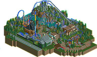
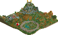

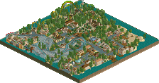
zburns999 came onto the scene with a very memorable first park at New Element called Paramount's Xtreme. Finishing a park of that size was and still is very rare, so when it happens, most people think these people are serious players that can stick with a project until the end. For the most part, zburns999 has remained quiet leaving people guessing if we will ever see a park to follow Paramount's Xtreme improving upon the skill shown in it. He popped his head out of his shell a few times, once in Micro Madness with his entry The Chamber and again in Head-2-Head 5 with the trio Land of Wonders and now he's back with a nice small Design winner Ogopogo. | Read On...
Work on smaller architecture to fill the area, more dense foliage perhaps to give the landscape a more realistic feel and keep churning those nice ideas to give the map more depth.
Congrats dude!!!!
Now, onto the actual surroundings. This is more my type of thing, so I'll go into more depth here haha. While many may say that your architecture is blocky, or awkwardly shaped, I tend to see it as rather accurate to real life. Sticking with your realistic style, you never see uber-ly themed/detailed buildings at your traditional theme park (outside Disney and Universal, mind you), so you're style fits in quite nicely.
The one thing that I absolutely love, and even though I've said it beforehand, is your ability to make everything you touch seem like, well, a cartoon. Awkward, yet sharp shapes, colors, form, etc. just seems to give everything a vibrant look that just makes your work fun to explore. The peeps definitely add to this, making everything even more lively and fun. If RCT2 would have been made with the objects we have today, the original parks that come wit the game would look just like this; the game was meant to look like what you do.
Also-to however made the logo, its awesome. It looks like something from a nickelodeon show.
inVersed Offline
RMM Offline
Congrats, Burnsy...nice to see you complete something again. Now...get serious...I know what you have in you.
inVersed Offline
I understand what your coming from, but when I think of the some of the early '90s arrow custom loopers, they seemed to have these long stretches with simply loops and turns. Look at GASM at SFGAdv.... Drop... giant loop, straight turn, 2 giant loops. I feel like this almost gaudy aestetic is what burns was going for here. You get the same aestetic on SFMM's viper between the two loops and its third loop:
Thanks so much nin for the write up, and to whoever did the logo, I love it. It's awesome. Basically I've had the idea to do a design for quite some time, screwing around with different coaster types. I think I said in Steve's Fenrir topic that I was sick of people doing the same old B&M designs over and over. Assuming that nobody else agreed, I decided that I would have to take it upon myself to produce a design using a somewhat unique coaster type. I've always been fascinated by Arrow Dynamics--especially with two coasters in particular: Drachen Fire and Tennessee Tornado. Although I think this is more Tennessee Tornado inspired than anything else, I think there's still a small Drachen Fire inspiration.
Overall, I'm pleased with the end result. Honestly, I do think that it's my best work. I've got more in the tank, but this is the best I can give right now.
Okay, thanks to those of you who replied. Just to address what seems to be a common point: my architecture. It is my hope that a year or two from now I will look back on this and think its really awful, but I just can't say that right now. I think I have a pretty unique way of doing things, and I like to think that somewhere along the line I've developed my own style. I actually like my architecture lol. I know its a little garish and over-sized, but it always gives the feel I intended, and I always feel like it serves a purpose and had some thought and inspiration to it. Anything you guys dislike about it can be attributed to my lack of skill at this game, I suppose, because in my mind, I built exactly what I set out to build haha. As for individual responses...
JK: So glad you liked the layout man. Thanks for the kind words. Regarding the architecture, check out the above comment haha. As for foliage, I've always struggled there. I can make it look good in small clumps, but I have trouble making dense foliage flow from place to place.
nin: Again man, I can't thank you enough for the kind words you always have regarding my work. It's funny because I think you "get" my stuff more than even I do. I don't have any real intention of building in the vibrant, cartoony style that I often end up building in; it just sort of happens haha. And I'm glad you liked the architecture. Thanks for the write up, also!
Austin: Thanks man, I really liked the station as well. I worked through many models before I came up with that one. It was by far the most simplistic, and by far the one I enjoyed most! Oh, and I agree, the logo is awesome.
Inversed: Thanks a lot man!
Ozone: Thanks buddy, glad you liked it! It's also nice to get a comment on my landscaping, as this was the first time I really made an effort to do something other than a flat map lol.
Evil WME: Unique is what I was hoping for. So glad you saw it that way. Thanks a lot man.
robbie: Thanks man. I noticed a lot of people saying the same thing about the few screens I posted in the dump/fiesta. Glad the full design carried the same feel.
RMM: Haha, I actually never noticed this until you pointed it out. Eh, I like to think that I can find a balance between what looks good in game and what would be fun to ride in rl, with an emphasis on the latter. I still think this would be a blast to ride. I know its right turns from the second loop on, but still, that helix and first turn (I imagine it being nearly overbanked in rl), would be left hand turns, and crazy ones at that. But thanks for your comment man. Much appreciated.
Sam: Thanks a lot man. I'm glad you enjoyed the layout and custom flats. I put a lot of effort into those flats haha. I've only ever done a few before, so I was just trying to experiment with new styles. Here's to setting a pretty mediocre benchmark for a Zamperla Mixer!
KONG: I see what you mean man, but I don't know if I can agree with saying it could have "easily" been much better. I submitted this knowing it was my best work. As I've said, there's no doubt I've got more in me as an RCT player, but for now, I'm pleased with this haha. I can only hope that this is just the beginning of bigger and better things to come. Thanks for your comment man. I appreciate it.
So I guess that covers everyone for now, although I'd like to see more than ten replies in a design release topic (whether its mine or anyone's) haha. I mean, I remember cp6 getting like three pages of replies off of two screens! I could use a little criticism here! I'd love to hear from those who didn't like it just as much as from people who did. Thanks a lot guys!
Edited by zburns999, 27 May 2010 - 12:11 PM.
Echoing other people's comments; I like your style: detailed and realistic without ever being over-the-top... it works well. Likewise, there is no doubt here that the ride is the star... but everything else supports it nicely. As for any criticisms - as I say, it's unique in that it is your take on a different, un-traditional RCT ride type. This is no B&M looper. But I still think it just lacks some spark or creative flair - something really different and novel to elevate it from a solid, 8/10 nice design to something more like a 9/10!! Congrats though!
+ Details
+ Custom flats
+- Layout
+- Foliage
- Architecture
- Flow
All in all it barely made it, IMO... The coaster was pretty good, supports included. The custom flats were nice as well, and there were more little things to notice than I thought at first sight, so good job on that.
Architecture is clearly your weakness, and because every building was different they looked sort of random... There was no consistency, style-wise. You should definately work on that, because it would benefit your work so much! Next time I hope to see better foliage too. Foliage is like glue, and you definately needed glue here to make it all come together.
Congratulations. 14/20 (but it could've been 13 also!)
The layout especially was fun to watch, lots of nice elements and transitions. Something that is pretty important for a Design..
Hope to see more parks from you!
SF