Park / Arnos Springs Resort
-
 17-June 03
- Views 7,383
- Downloads 3,403
- Fans 0
- Comments 40
-

-
 74.38%(required: none)
 Spotlight

5dave 80% Jaguar 80% RWE 80% saxman1089 80% G Force 75% Ling 75% Cocoa 70% Scoop 70% Liampie 65% posix 65% 74.38% -
 No fans of this park
-
 Download Park
3,403
-
 Tags
Tags
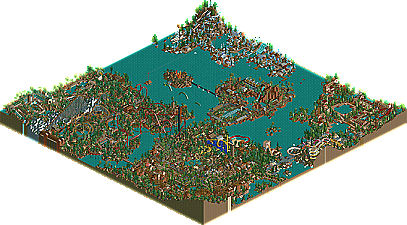
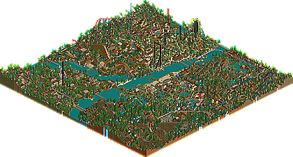
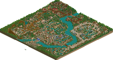
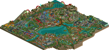
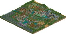
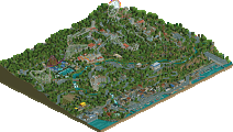


Arnos Springs:
Hurricane Beach
I like Hurricane Beach it had that nice feel to it of a jazzy seaside town. The colours of the area were great and the layout seems nice and cosy. Hurricane Beach Twister is a very nice compact coaster that sits lovely on the edge of the beach area.
Arnos Creek
I think this area has to be my favourite. The area is done so nicely and has some cool rides here. First we have the La Viper that sits lovely at the back of the area but my fav part about the area is the Mack water coaster and mine train that interact with each other on the mountain and then you have the rapids ride next to it.
The Wilderness
Very nice look and atmosphere in this area it captures the forest look well. Grizzly Run is a cool Woodie and I love the turn around by the water and Outlaws escape that runs right beside it down the water looks good also. Mountain Biking Xtreme looks good as well.
The Lost City
I like this area as well its like and over grown lost city and looks good. The invert reminds me of nemesis in a way which is a good thing. I just noticed you got quite a few rides in this area as well
The Jungle
A very small area but it looks good so it doesn't matter I like the woodie with its twists and turns.
Agrabar
When you first showed me the park this was the only area I wasn't to sure on but taking a second look at it now its growing on me I don't love it as much as the other areas but It might get there. Lone Warrior is still beautiful and better. and the new coaster Tormenta de Fuego is insane. I the speed is awesome and the underwater tunnel bit is a nice feature.
Arnos Springs Resort
Mt Fuji Hotel
I love mantis work and this hotel is amazing as well great work mantis. It has a beautiful colour scheme. Its just awesome I love all your work.
Lost Springs Hotel
This hotel looks very nice and calm looking. great colour scheme and I also like how it travels down the hill side.
Ice Springs Spa
Looks great and has that nice feel of a winter town. The sea monster attacking the boat is cool.
Flora Emporium Water Park
Nice work by WME. Pick a Slide Elavator was a cool idea. Kind of a smallish area but still looks awesome I get a kind of sence of Harakirii but then again I know WME likes his style.
Lost World (2 pens)
Both pens are awesome its good to see Iron Eagle come back as raptor as that was my fav coaster in Arnos Grove. The tilt coaster was a nice idea.
The Labs
Great addition to the park. I really like this area for some reason it looks good and it mixs that jungle theme with the techincal theme in a way and thats why I think I like it.
To roomie Thanks for choosing me to build a hotel. It was great for you to say build what ever you want and how big you want. I had a fun time building it.
Awesome park I loved it
I didn't expect this lol
Thanks to everyone who helped out too..
This. however, is certainly deserving.
I thought the coaster layouts really shined. The tilt coaster was a good idea...and the crazy rocket one was great. I also loved Lone Warrior, and the woodie on the 2nd map. Ditto with hte invert.
Mountain Biking and the LuTse's soaker ride were quite creative. Good jumps on that.
More coasters, roomie :-).
The architecture was a bit too "brown" for me, if that makes sense. Wood brown, to be precise.
gymkid dude, on Jun 17 2003, 02:29 PM, said:
Yeh but didnt iris say this will be a double spotlight month again ??ill post my review later
Lone warrior was good and temple del fuego was great.
Rattlesnake is one of my fave woodies now.
Mountain biking was creative.
The hotels were absolutely amazing also..
Overall 8/10 Because of the rides....
~Prince Ashitaka~
hpg Offline
Arnos Springs:
One huge eyesore was Lone Warrior. The custom supports were way to bulky IMO, and the layout really could've used some work. The hacks incorporated into Tormenta de Fuego were great, but once again the layout could've used some work. My favorite area was undoubtedly The Lost City. The architecture was great, the coaster was great, and everything fit together wonderfully, which was unfortunatelly unlike the other areas.
Arnos Springs Resort:
Arnos Springs wasn't really that impressive to me, but the resort map was absolutely gorgeous. Everything was executed perfectly, and the Mt. Fuji Hotel was the only oriental themed area I've ever seen that didn't look like monkey droppings. I'm not really sure why you put a turn right after the drop on Prehistoric Escape, but the hack itself was executed perfectly, A+. Pick a Slide was another great idea, but I'm not sure how pleasant the result of going on "Brunfelsia" would be.
Overall, Arnos Springs was somewhat of a dissapointment, but it's resort map was stunning. Wonderfull job.
Innocent, on Jun 17 2003, 01:44 PM, said:
I forgot to mention that. That was breathtakingly done, excellent work.~Prince Ashitaka~
Congrats,
Hevydevy
I must say I prefer some areas of the main map to others, but your talent for landscaping can't be ignored....I mean, that mountain that rises behind Warrior is just incredible. I also LOVE Rattlesnake. Bloody hell what a great coaster.
Great job on the rest of the Resort too - I think that your hotel is fabulous, as is the Labs section (even though I expected to see more dinosaurs breaking out of the time machine...)
Well Done to everyone else involved in the Resort too - X's hotel is, I agree, a masterpiece in RCT. When I first saw it I thought Ed had made it. The fact that it's by X is just mind-boggling. He's definitely left the CDS days faaaaaar behind him
Thanks HPG for the comment on my hotel
Go Roomie! I just feel sorry for the runner-up.....maybe i'll do him a walkthrough to make up for it!
what a brilliant job. Map 1 was a-mazing with a capital P.
Map 2's hotels were brilliant! I loved x's one and also mantis' one.
It's all good baby.
but i was one of the testers you left out.
Still, the coasters, and especially Tiberius, were all very impressive. I liked certain bits of theming too but it looked all too much thrown together. Some buildings seemed to have no idea in them either.
I think the resort map was alot better. x-sector's hotel was easily the best of it's kind and gave me the jawdrop-effect. I liked mantis' one too in a way but I saw x' first so it didn't have much chance.
I loved how the park was "alive". Everywhere was something in movement.
What kills it for me are the single wide paths. I just don't manage to like them. In some places you couldn't even see the paths as the buildings hided them.
Thanks for all the comments
Hee hee i realise my style is like marmite. You either love it or hate it ussaly lol.
but i'm glad that most people can find something they like. Tiberius only just made it into the park actually. there was a woodie there first but it was moved to become rattlesnake.
Sorry Supreame Being... i knew there was someone
Unfortunatly i guess i'll always be a single wide maker (Except the up and coming Project Empire) as i love to test run my parks. i like the fun of being able to what guests think and whats the most popular ride. lol. a little credit to Blitz Sama to for the inspiration behind the time machine
Thanks again
PS: Prince i wouln't be able to use something u said in my sig would i???
Twisted Offline
Your style of parkmaking is indeed different but there's something about it I like.
The coasters were all awesome especially Tiberius.
All 3 of the hotels on the resort map were great too!
Congrats and thanks for letting me be apart of it
I am also very awed by your work on the hotel map. The Jurassic and Mt. Fuji hotels must be the greatest and most well thought out hotels I've ever seen. These two hotels make up for everything else on these two maps that I might not have liked. Amazing.
Congrats rr. You rock.
Gutterflower, on Jun 18 2003, 10:24 AM, said:
i THOUGHT it reminded me of me...w00t! I inspire!