Park / Divinity Ridge
-
 29-May 06
- Views 9,899
- Downloads 3,671
- Fans 0
- Comments 37
-
-
 76.88%(required: none)
 Spotlight

inthemanual 85% 5dave 80% csw 80% Kumba 80% Poke 80% alex 75% Cocoa 75% Liampie 75% geewhzz 70% MCI 70% 76.88% -
 No fans of this park
-
 Full-Size Map
-
 Download Park
3,671
-
 Tags
Tags
![park_4119 [H2H8 R4] Incident at Billy Wonka's](https://www.nedesigns.com/uploads/parks/4119/aerialt3859.png)


Corkscrewed Offline
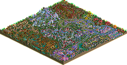
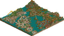
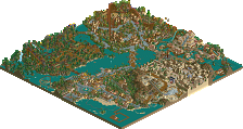
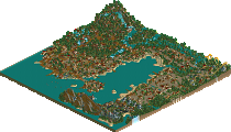
This is NOT a traditional Spotlight by any means, but there's no denying it is one sweet and addictive park! Introducing Divinity Ridge, by JKay! This colorful, whimsical park takes guests on a journey through the famed candy delights that have made many a childhood memorable!
Talk about this most unique Spotlight (and first of the year... it took long enough didn't it?) here.
I love it. Color are a bit meh, but anyways, it was a sweet spolight.
Congrats...again...
Corkscrewed Offline
Anyway, this was sort of tough, but the enthusiasm and creativity pushed it beyond the border for me. Plus, Danimation had a Spotlight themed to candy. So should NE. Gives the park a sort of old school feeling.
The coasters were pretty much the major detracting point. JuJu was just... ouch. And the flyer, while intense, was also sorta badly designed. I'll forgive you for 10+ intensity ratings this time, but don't expect that again.
However, there are a lot of places where the atmosphere is just immaculate. The theming on the "south" end of Bubblegum Valley was just gorgeous in the way you arranged the shrubbery and landscaping to sort of enclose a cozy space. The Chocolate Factory was just awesome. Totally Willy Wonka! The Ice Cats was a really neat idea to do with the dodgems. The waterfalls at the top of the lift for Peanut Swamp Explorer.
Basically, there are a lot of little details in the park that somehow gave a nostlagic feel, almost like the LL Spotlights of Danimation, where the perfect blend of parkmaking sophistication and old-fashioned scenario-ism fun come together to produce something sublime.
There were enough of those moments to convince me to give this park the Spotlight nod.
And in any case, this is one of those parks that will have arguers for both sides no matter what it is.
I'll just sum up what I thought were positive and negative;
(+)
-Architecture
-Theming
-Landscaping
-Colour scheming
-Twist-a-vator
-Candy Cane Tower
-Lollitrain's Station
-Juju Racer's station
(-)
-Coasters. Most had a few awkward pieces of track on them, and their lay-out didn't really appeal to me.. For example Bazooka first meanders through some turns and hills after the initial drop before diving into the elements.. I prefer to after the initial drop have the inversion, but that can be personal.. Also, on Juju Racer after the lifthill it first drops into a not-so-steep track piece, and after some of those it suddenly falls into the steep track piece.. It takes the flow right out of the coaster imo... Almost every coaster has some of those moments.. But on a positive note, you certainly have improved on your coaster skills in comparison to your previous work!
-I prefered sour patch planet and Lolli Pop had more architecture
All in all a great park, so congrats JKay!
SF
Edited by Six Frags, 29 May 2006 - 01:51 AM.
From your advertised screens it looks like i'd enjoy this park, but from the comments above it seems that'd be marred slightly by the coasters. I guess it's something you can improve from park to park - practice makes perfect and all that - but for the moment it really seems to detract from otherwise creative and accomplished parkmaking.
Well done on spotlight!
I'm kinda on the line on the spotlight, SRU debate. Its a fun park to look at, and its not a 'typical' spotlight park.. yet again, nothing you do is 'typical', lol. I looked at the park for quite a while, however that was probably because of the fact i wanted to see this coaster crash, and i wasn't dissappointed.
-X-
I think my favorite section is Sugar Whip. The castle with the Cheshire Cats ride in it was very cool and the coaster was probably the best in the park, IMHO.
The colours were horrid in a couple of areas (Peanut Butter Swamp and the Lollypop land). The rest of the colours were just ok, except the castle area, those colours worked. Your architecture is getting really repetitive now, I think I said this to you in the topic for this, but the entrance is practically exactly the same as in RMM. And the colours in RMMs entrance were better. The rest of your archy all looked the same throughout the park, but with different colours and maybe a different block here or there, but they were all formed on the same basis.
The coasters weren't all that good either, although I did like the coaster in the pink and blue area. The rest were going too fast in places and too slow in others.
One thing I do like about your work are the details you put in like the chocolate fountains, like the red path under the maze, if only you calmed your colours down, varied your archy and improved on your coasters, then you could easily be one of the best Parkmakers around.
-X-
BreakAway, on May 29 2006, 01:05 AM, said:
I hope you are kidding BreakAway, or that was accidental. WME only dreams of getting spotlight....
Anyway, I must say I'm thoroughly surprised this got spotlight. I kinda thought it would be borderline SRU - Spotlight, but I'm glad it had that extra "spunk" to get the highest award.
Cork. You are the man. Period. First, for making this spotlight. Second, for putting up with my 14 re-submissions of the park. Lol. Third, for your constant dedication to NE and the parkmakers around this site. Thank you so much.
I won't respond to anyone's individual comments quite yet, but I will say this park is not for everyone (obvious by some of the feedback so far).
Anyway, great park JKay!
it says that in the readme
Edited by Ge-Ride, 29 May 2006 - 04:58 PM.
blah188, on May 29 2006, 01:10 PM, said:
Well maybe I didn't read the readme!