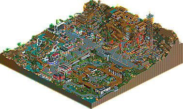
@RRP: JDP and Louis are exactly pointing out what I was going for with the GIB. I wanted a big, threatening coaster that's towering over the whole park, also I think it would be awesome to soar over the pit at the animal exhibits.
@JDP, Louis & Cocoa: Thanks guys!
@JK: Thanks for the review, bud! I think the entrance area might remind people more of my mexican area, because of the fountain and the archy. Those entrance areas are still a weak point of mine I think, as they always turn out pretty similar. haha - need to refine that a bit more! And I also agree about the naming, especially the flat rides are pretty generic - but that's mostly because they're filler and don't really have a such ideas behind them like the tracked rides....
@Cena: I loled at the sentence 'being a Dutchman finally pays off'. Haha!
This is my favourite release of 2010 so far. It's excellent! Great architecture, great rides, great details, great atmosphere, no cliches and yet everything was very believeable (aside from the safari).
The atmosphere on Nelson Mandela Square was incredible.
This park only made my liking for your style stronger. Seriously you have all the aspects of the game, great coasters, beautiful architecture and foliaging, incredible atmosphere and original ideas. My favorite part was from a screen you posted in the dump a while back:
There were some things I didn't like though:
- The safari was, as mentioned, a bit too "clean", could have been refined a bit. - The wooden roofs on the station to Diamond Chase and to the park entrance didn't really do it for me, they looked kinda wierd. - The Sony screen. Although executed well I didn't feel it fitted in at all.
But those minor details aside, thanks for an extremely enjoyable park!
Took me a while to look at this, honestly I don't really look at anything any more...
That said, i'm so happy I did look at this. For such a relatively small map, it was incredible.
I LOVED the little awnings and eating area in the middle of the park. Pure perfection.
The mine ride was fantastic for such a small footprint, really kept me guessing and kept good speed throughout. Great theming all along the ride, too. I'm sure i'll find more stuff to like about this the more I look.
All the other rides were excellent, the rapids really stand out as being wonderful. I loved the queue line being a part of the ride's space. Really excellent atmosphere throughout, and great foliage.
I'll have to do a "little things" for this, I think.
@Splitvision: Thanks for the review, glad you liked it! Why do the rooves look weird? I can't find anything extraordinary about them... The Sony screen is there only during the FIFA cup 2010, the rest of the year it's a random stage. IMO it's a good sign you think it looks out of place, haha.
@Turtle: Thanks again, I'm always pleased you like my stuff that much! Thanks
^I dunno, there was just something about them that seemed a bit weird... Can't put my finger on it Oh and I meant the roof on the river rapids ride, not the mine ride. I should have made the screen/WC connection, the park being located in South Africa and all...
33 Comments
J K Offline
5dave Offline
@RRP: JDP and Louis are exactly pointing out what I was going for with the GIB. I wanted a big, threatening coaster that's towering over the whole park, also I think it would be awesome to soar over the pit at the animal exhibits.
@JDP, Louis & Cocoa: Thanks guys!
@JK: Thanks for the review, bud! I think the entrance area might remind people more of my mexican area, because of the fountain and the archy. Those entrance areas are still a weak point of mine I think, as they always turn out pretty similar. haha - need to refine that a bit more! And I also agree about the naming, especially the flat rides are pretty generic - but that's mostly because they're filler and don't really have a such ideas behind them like the tracked rides....
@Cena: I loled at the sentence 'being a Dutchman finally pays off'. Haha!
Thanks!
"MFG"
panther33 Offline
Liampie Offline
The atmosphere on Nelson Mandela Square was incredible.
geewhzz Fan Offline
ahank Offline
Edited by ahank, 28 January 2010 - 03:47 PM.
5dave Offline
Hope you've read the readme a bit, to get some of my inspirations and such... Should be worth a read!
"MFG"
Splitvision Offline
There were some things I didn't like though:
- The safari was, as mentioned, a bit too "clean", could have been refined a bit.
- The wooden roofs on the station to Diamond Chase and to the park entrance didn't really do it for me, they looked kinda wierd.
- The Sony screen. Although executed well I didn't feel it fitted in at all.
But those minor details aside, thanks for an extremely enjoyable park!
Pudding Offline
Cena Offline
Turtle Offline
That said, i'm so happy I did look at this. For such a relatively small map, it was incredible.
I LOVED the little awnings and eating area in the middle of the park. Pure perfection.
The mine ride was fantastic for such a small footprint, really kept me guessing and kept good speed throughout. Great theming all along the ride, too. I'm sure i'll find more stuff to like about this the more I look.
All the other rides were excellent, the rapids really stand out as being wonderful. I loved the queue line being a part of the ride's space. Really excellent atmosphere throughout, and great foliage.
I'll have to do a "little things" for this, I think.
5dave Offline
@Turtle: Thanks again, I'm always pleased you like my stuff that much! Thanks
"MFG"
Splitvision Offline
Jaguar Offline