Park / Virginia Key Resort & Casino
-
 10-May 10
- Views 11,464
- Downloads 1,588
- Fans 5
- Comments 38
-

-
 83.33%(required: 70%)
 Gold
Gold

inVersed 95% yes SSSammy 95% yes turbin3 95% no robbie92 90% no Roomie 90% yes CedarPoint6 85% no Liampie 85% no Ozone 85% no posix 85% no 5dave 75% no Evil WME 75% no K0NG 75% no chapelz 65% no geewhzz 65% no 83.33% 21.43% -
5 fans
 Fans of this park
-
 Full-Size Map
-
 Download Park
1,588
-
 Objects
494
-
 Tags
Tags
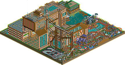
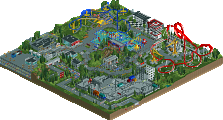
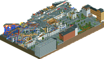
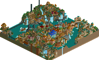
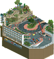
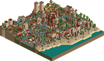
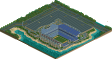
Like I told you on AIM, I don't dislike the park. Far from it as all the details and the fact that it was functional made this a great park to explore! I just disliked the coaster as I though it looked out of place in this setting.
Yeah I know you did not dislike it
Amazing Work Kumba!
Edited by Austin55, 13 May 2010 - 08:25 PM.
I discovered how much fun watching the go karts is too.
Likes:
1) The building. The walls alone could have spent me a million years with each of my hairs plucked out one by one not to mention they would grow back.
2) The buildings detail. ditto. How the fuck was your patients possible?
3) The building has an inside structure?!! don't even get me started. I am a very impatient person an boyu does this boggle my mind. The last time i could find this much amazment in rct hasn't hit me ever since becoming a member to new element!
5) Not even near as much work, and it more fun to build but hey! your coaster & water rides were amazingly creative! btw i can't really tell what the brainwash is but it still looks sexy. Is it supposed to be like this ride type @ kings dominion?..
6) The go karts. aparnetly its based on a movie i didn't see but my friend chris recognized. btw chris suckz at the game tremendously and has never seen ne parks. HE WAS STOKED. he says "how is this game fun anymore--its just too much work!" That was reffering to the building. But yeah, i thought the crash was hilarious. I wouldve used a waving peep oobject of there is one. Ya know.. like to indicate "help me im burning!"
7) Oooo diving boards!
Dislikes:
1) had to think hard on this. probably all the 'bulit' stuff that didn't need to be 'built'. e.g. beach lounge chairs. theres a custom object for that and it looks much better imo.
2) Lazy river's train. methusalem's funtubes look better than bboats.
3) FUCK what else to complain? uhh.. how about i absolutely hate how you are just so damn good at parking & color schemes. there i said it.
During my summer break (starts mid-june) i'll have loads more time to make objects, so if you need anything major (like rides), the requesting will start then. Its been fun looking a vkey and i can't wait to see more of your up coming parks! sorry i didnn't say all the above sooner. Happy Summer!
-Joe
Likes-
Everything JoeZia said,plus the LCD football screen on the wall of the building.
Dislikes-
The building was so huge, it lagged the game on my netbook with 1GB of RAM and 140+GB of hard drive space
Edited by GigaG, 16 May 2010 - 11:42 AM.
I am still amazed by all the things I am still discovering in this thing, I opened it today again and found some amazing things
I should write an little things/awesomeness things about this
it takes great patience to put up with an immature 17 year old like yourself,
Or Kong: however old you are..
Why the hell is it such a problem to just let GigaG be?
Anyways, my comments on the park when I first saw it:
OZONE - I rarely notice lag, but I did a little with this. That's why I added a peep free version. As I have said, Gold was fine with me. My goal was for it to average a 16 and just be a candidate for spotlight and it was nice to achieve that. It even look like I could get a 17 when the first half of the votes were in... maybe next time
Luketh - Thanks. I knew it would be a pain to make everything peep friendly and it was extra hard since I started it back when I did not add peeps, so I had to re-do a lot. Sorry about the crash, that coaster liked to blow up every 5 RCT years or so...
Hulkpower - Don't agree that it should have been a spotlight due to it's size and it being just a resort, even if a resort with a lot of extras. But hey, I am gald people think it was that good, thanks for the kind words
Austin55 - Thanks and good point on the dramatic changeds you can get with it just by rotating the view
Liampie - The speakers idea was semi lifted from something RRP did, I think in Amity Cove... The round lockers where one of my favorite touches and most useful since they give you a error trapper when you right-click them. Best way to exit RCT2 quickly
Joezia - Well it did take me about 4 years, tho I worked on it on and off and not till the end was it a top priority to me. Brainwash was mostly based on the Brainwash @ wet-n-wild in Orlando:
Only I opened the funnel, tweaked the layout/ending and added open sections. Also I am not a huge fan of custom scenery or rides. When I use it I like stuff that looks like RCT objects or things that have been from editing them like that nice AE peep laying on the RCT slide may you did. Thanks for the feedback
GigaG - Thanks, good eye to know it was an LCD and sorry... about... the... l...a...g...
Cena - I love it when I get comments like that. It is always a goal of mind to add enough details that you can keep coming back to it and finding new things. A "little things" post on this park would be awesome... as would those Kumba signs... both and your the greatest person ever!
WME - BD128 is just a hit or miss coaster, sorry it was a miss for you. Glad you liked the billboards, added all of them kinda last minute, I think the one nin tease posted (tho I made it) was the best. Great to hear more praise for the mini golf. I think my favorite holes were the windmill, the gas station, the plane crash and most most of all the high tide sea monster. Thanks to a glitch and some animated scenery the water rises up every 3 seconds, hope you guys have noticed that one
@Kumba- there is abunch of scenery that doesn't match and that fucks up the game, your right.
i didn't notice that water rising thing. do you mean the pool water in general? how'd you do it?
Nice job Kumba and props for staying so passionate about the game.
p.s. I can see how the coaster could be considered realistic to you as similar rides were developed for the Stratosphere Tower but there are certain elements like the barrel roll that I really dislike and for me take away from a potentially feasible layout.
Thanks for your comments TPM
I think Brainwash is just about as good an attempt at a Proslide Tornado that you could make on RCT, but I think it might have worked a bit better had the pre- and post- funnel segments been a little simpler, and not criss-cross past the funnel... it would have looked a little less messy. I didn't like Big Daddy, for the most part. I liked the scale of it. I think the concept of this type of ride on this map was fine. But the problem was that it went that little bit too far, and went from 'good over-the-top' to slightly TOO far. The inversions and twists and so on all seemed a bit too much. I think you should have just stuck to a big drop really, kind of like an Arrow Fish-hook coaster concept perhaps. It was just a bit too much and was too much 'fantasy' for this map.
All in all, therefore, I think a Gold is a fair score. There's a lot of really great stuff on this map, and I only have a few gripes. It also has a spark - a really unique feel. I much prefer this to all your previous work and will look forward to seeing some future releases, perhaps along similar lines. Good job.
Hope you create more solo parks like this..
SF