Park / Busch Gardens San Simeon
-
 25-December 05
- Views 21,457
- Downloads 4,390
- Fans 8
- Comments 67
-

-
 92.50%(required: none)
 Spotlight

][ntamin22 100% no geewhzz 95% no Kumba 95% no Liampie 95% no Xeccah 95% no 5dave 90% no Cocoa 90% no csw 90% no MCI 90% no Poke 80% no 92.50% 0.00% -
8 fans
 Fans of this park
-
 Full-Size Map
-
 Download Park
4,390
-
 Tags
Tags
![park_4086 [H2H8 R1] Tahendo Zoo](https://www.nedesigns.com/uploads/parks/4086/aerialt3817.png)
![park_4087 [H2H8 R1] All Coasters Go To Heaven](https://www.nedesigns.com/uploads/parks/4087/aerialt3818.png)
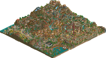
This is the official Spotlight topic, split off from the "Fatha Grinch Stole Christmas" news topic.
...Holy *beep*...
Best park ever, without a single doubt.
It just had everything the ultimate RCT park should have in my opinion... Creativity, originality, details... and of course a custom flat
I have no complaints... altough the bridge between Canyon Runner's area and Machu Picchu looked bare and rushed (but I guess it may be like that because of the sprite limit) and it's just plain too bad that Tempest missed a set of cars :/
But whatever, it's a fabulous park, Fatha! Definately #1 on my list...
9.8/10 - 0.2 let down by the queues and no splash boats
City of God impressed me too, because it was so different from every other area, and the coaster in the area too had a good inversion order, speed and fitted in perfectly with its surroundings, reminded me a bit of 'Drachen Fire', but with extra bite. The entrance area was crafted very well, extremely colourful and welcoming, and all that roofing and 'hackery' must have really taken ages!
Congrats on a superb park, definitly worth its spotlight placement... Even though Cork seems a bit reluctant to let that fact be known...
[This part censored by the "Keep the Surprise a Surprise Committee
-X-
Edited by Corkscrewed, 25 December 2005 - 01:18 PM.
I'm sort of dissapointed. My expectations may have been set too high, but this park didn't live up to them at all. The park was underwhelmingly overwhelming, or vice versa. Not sure.
First, the entrance area. Starts good, but then - my eyes! The whole thing just melted together in a large, bright yellow mess. There were no contrasts or negative space at all, which really killed it. Each building or hack in this area might have been wonderful on their own (and I liked it more when it became less busy towards the red canyon area), but here it was way too much. Might have been the point, but I didn't like it at all.
I got that feeling from most of the areas, actually. They didn't engage me at all, with a few exceptions. Either it was too much detail and too much chaos, or not enough detail.
Machu Picchu was the best area, as it achieved a good mix between the over-top detail of most of the other areas, and the subtle niceness of the red canyon area (and most of Fatha's earlier work). Really the only area I liked. I also liked the large-scale elevation changes in the park, but a lot of that felt obscured by the stuff on top of it. I dunno, I would just have liked to see some more focus on the landscape, as it was a good landscape.
Perhaps the park becomes better after repeated viewings, but I didn't really like it. Good job, anyway, and a cool Christmas present.
Excellant job fatha!
-ACE
I think the same here. It is good work, but it's like I'm seeing Jkay's latest spotlight again: chaos. There isn't enough spacing to let the detail do their work properly... Strangely enough it looks so much like rct2 in a way. The effort spent on it makes it worth spotlight though. Congratulations.
was to lazy to reinstall the game yet, cause i'm doing something else.
what i saw from the overview and the 3 or 4 times (mainly the dark area) i zoomed in was fantastic, but very chaotic. as already mentioned, maybe a little too much.
I dusted off my LL disc and got a chance to look at this today.
My first reaction wasn't quite as good as I had hoped, which I think is mainly due to the amount of screens I saw during advertising; kinda like the surprise wasn't there. Still though, this is a superb park with loads of details and distinct , lush and organic themes. Here's my pros and cons
Pros:
-The entire El Dorado entrance area was just stunningly beautiful. It was just so immersive with intricacies of color exploding on my screen. Technically solid too. Just the right amount of rides, attractions, theming and details. Easily the best LL area I've seen since CoD or WOMB
-The next highlight for me was the City of God area. I think you did a great job here. You used all the tools LL had to offer here to pull of this messy urban ghetto in elite fashion. It wasnt my favorite theme in the park (El Dorado was), but I think it had the best execution and refinement of all the areas
-Superb hacking, nuf said...
-TRACKITECTURE! Fatha, You own trackitecture in LL!
-There were lots of little details that I really enjoyed. Namely, the Cocoa Cups, Inti's Reach (beautiful queue line btw) and Tempest. All great additions to the park.
Cons:
-While I hate to say it, the themes in this park reminded me of several other LL parks (mainly Twisted's most recent spotlight) which took something away from it. I also can't say there was any particular themed area in this park that I could say was totally "innovative", well, except maybe El Dorado, but the rest really didn't jump out at me as anything special.
-Another con is the obvious, which were the more neglected areas of the park due to data limits. I know you had no control over it, but it really did stand out as a flaw.
-Some of the foliage hit me as random in areas, but considering its South America, I can respect it. IMO, a bit more uniformity would have helped a bit, but thats neither here nor there.
Overall, I must say this is definitely your best LL work to date Fatha' and I really hope you continue to play RCT at this elite calibur. I can't say its my favorite LL park ever, but it easily makes my top 10 list and maybe even the top 5. Congrats on the spotlight and hope to see you hangin' around NE in the future.
FUCKING AWESOME. The coasters and the landscaping were so dramatic--nothing I have ever seen executed in this way.
Sets a new standard for both games. Well done Fatha'.
So much to look at
Edited by Splash-0, 26 December 2005 - 09:57 AM.
missed one, cork. ;P
Corkscrewed Offline
The thing that keeps this from being one of my favorites is that the transitions between areas were not clever. They were well placed and everything, but it seemed like each one was pretty much the same, even like they were a departure from the atmosphere the park offers. If those had been more cleverly thought out, say make one a grand bridge that fits with the theme or putting more emphasis on the mountain passage in the back of the park, I would have honestly put this up there with rob.
Corkscrewed Offline
Toon!!!!
In fact I think I'd put this at either 2nd or 3rd in my favorites list (Mt. Sin, Womb, BGSS-duh, City Of Dreams, Rob)... Not nessisarily in that order either. Other than Sinister ruling.
I think the hype of advertising hurts this park greatly as the best areas had already been revealed, and though that makes for an exciting run towards the park it took a lot away. More depressing was the fact that the areas I felt best immersed in lacked a coaster (!). Those of course are Machu Picchu, Aruba and Galapagos.
Aruba being a coastline, which for me is always an A+ when done right and this one is done superbly with excellent pavillions, a custom flat and some clearly thought-out bumber cars.
Machu Picchu is the only area of the park to strike a perfect balance between the overbaring extravagance of say Eldorado, the grittiness of City of God and the subtle pleasentness of Andes Village to create the single most representitive area of the park. Stunningly beautiful I even hunted down shops and spent quite some time enjoying the architecture and searching for the same building from different angles.
Finally I love Galapagos for the reason everyone should, the red jungle flowers. They're most pleasent now aren't they? Well that and the carefully integrated architecture, flat rides and one of the best rapids rides out there... Still those flowers really stuck out to me as a beacon of love in the dense jungle.
All of the coasters were spectacular in their own way and in such a manner as to best inhanse the strongest properties of the coaster. Nazca for example does a good bit of weaving about erratically between masses of solid objects. Canyon Runner hugs the terrian as to threaten ones feet before soaring into another sky-kicking inversion. Bacillus works the cliffs, valleys and theming in a way that's beyond fluid and intense; just straight up good fun. Same goes for Vigilante and O Criminoso, which other than having delightfully speedy pacing, good landscape, theming and architecture interaction including muiltiple tunnels (all good things of course) fail to take advantage of the particularly enhansing attributes of rides of their type. That of course being thanks to the fact that wooden coasters and Arrows are both straight forward balls to the wall thrilling experences.
However, like SWA this park fails because of it's successes. Failure is nessisary in order to make success sweet. Negitive space must be there. Imperfections must be evendent to make the perfections stand out. Light can only be seen in darkness.
The main thing Fatha now needs to wok on is playing with negitive space, it's a more abstract thing than the mind blowing mastery of all the games elements that the Grinch already possesses. Something that he must master if he wishes to reach an even higher plain of parkmaking which only a few others have ventured to, though I will not name them as it should be a rather obvious extrapilation from my favorite parks, which I've listed. Of course my opinion is wrong however because yours is correct, just as mine is correct only to me.
ride6
The entrance was one sea of yellow which I found too distracting. City of God, while an interesting concept didn't look like anyplace I'd actually want to visit, in terms of theme parks. The coaster though was brilliant.
The beemer was fantastic, almost escher-esque the way it molded to the terrain, which in itself was an optical illusion delight.
The woodie was interesting, but I wish some of the transitions in RCT allowed for a smoother "flow"....this isn't your fault...it's the games'.
From a zoomed out view, this park really does not grab me at all......but the rides, when zoomed in are awesome.
Good job sir.