Park / Spellbrook Shore
-
 04-September 07
-
 Spellbrook Shore
- Views 13,797
- Downloads 5,412
- Fans 2
- Comments 44
-
-
 79.38%(required: none)
 Spotlight

inthemanual 90% Austin55 85% Stoksy 85% Cocoa 80% MCI 80% Poke 80% 5dave 75% geewhzz 75% Liampie 75% Xeccah 75% 79.38% -
2 fans
 Fans of this park
-
 Full-Size Map
-
 Download Park
5,412
-
 Objects
445
-
 Tags
Tags
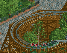
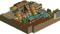
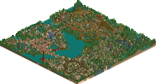
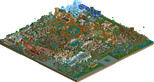
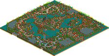
but wil it win from drc and other great things ?
FullMetal Offline
1. Great park.
2. I can't believe Zodiac said "wub."
3. I could've swore I replied to this topic already...
Now on to the comments.
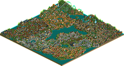
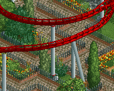
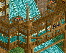
Overall, it's a great park. My personal fav was Traverse Town (all of it). I'm a Kingdom Hearts fan myself, so I have to love that area automatically. Clockwork was a great coaster too. Traverse Buggy's reminded me a lot of Roger Rabbit's Cartoon Spin at Disneyland. Secondly, I like Ironside. A wonderful inverted coaster, and I had to watch it at least three times to truly enjoy it. Matador was another nice coaster, although a bit small. Odin's Plunge was another favorite of mine. A nice water ride overall, with some interesting theming. The bull fighting arena was also a neat addition to the park. The whole idea behind the hack kind of pays for itself, there. Architecture was spot on, and I really felt immersed in the park.
On the other hand, I thought Kestral could use a bit more work. It seemed a bit open (lots of blank spots with no trees), IMO, and the layout looked a little awkward to me. The monorail at the entrance to the park seemed a little out of place. I thought it could've used a bit more space of it's own, but that's just me.
Again, great park, and I look forward to seeing more stuff from you in the future!
The rest of the park was really great stuff. The water ride in the back as well as CP6's coaster stand out as being particularly well done. One thing I didn't like was the somewhat random suspended coaster near the front of the park. I felt like I was missing something (maybe some sort of concept unknown to me), but it just didn't fit.
Overall, there's a lot of groundbreaking stuff in this one. Not ashamed to admit I've opened it up to take a look around more than just a few times.
disneylhand Offline
Theming was nice, though.
-disneylhand
Something about this park...just awesome. The pathing in the Spanish Area just does something for me and the clock is such a beautiful artistic piece.
The coaster layouts were a bit of a downside, but the theming and park layout just 'worked'.