Park / Spellbrook Shore
-
 04-September 07
-
 Spellbrook Shore
- Views 13,105
- Downloads 5,297
- Fans 2
- Comments 44
-
-
 79.38%(required: none)
 Spotlight

inthemanual 90% Austin55 85% Stoksy 85% Cocoa 80% MCI 80% Poke 80% 5dave 75% geewhzz 75% Liampie 75% Xeccah 75% 79.38% -
2 fans
 Fans of this park
-
 Full-Size Map
-
 Download Park
5,297
-
 Objects
445
-
 Tags
Tags
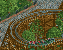
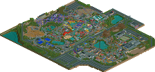
I knew you would do great one day. Seems like your day has come.
Will have a look at the park as soon as I have time for it.
Magnus
overall your pacing on the coasters was a little questionable though.
Lol i can definatly tell Kumba rushed the review as "traverse buggy's" turns into "traverse tubby's". Spelling mistakes aside thankyou so much for the review, you've done wonders for this site. Thanks to cork as well for the logo, it rocks although it's Spellbrook Shore
For people who may not read the read-me i just want to say thankyou to Geewhzz, Turtle and cedarpoint6 for their amazing guestspots. Your input certainly helped me get the drive to finish the park so thankyou. Thanks to cork and Kumba as well as Iris looking at the park. Thanks to everyone who made trainers, new objects and rides possible, you've certainly pushed the boundaires. Oh and Congrats to Magnus and geewhzz my fellow NE3 parkmakers!
All i can say is check out the park, i hope you enjoy it. Please comment as it would mean alot. Thanks
JK
Couple minor things, however. The only one I can think of atm though is that I liked the old colors for Kestral better.
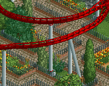
My favorite coaster was Kestrel, by far. Great idea with the GIANT butterfly inversion, that was really cool.
And my favorite section was the farm-esque area with Greyheart. I absolutely loved the architecture in and around that area.
My only big complaint would be the pacing of Matador was really bad, although the idea was good.
I also wanna say that it's beyond me how you Parkmakers are able to make these huge parks, I can't even imagine making a park more than 100*100.
For now, big congrats on winning spotlight with it
Emergo
Congrats to you. You have worked so hard and finally have won the greatest achievement for one park. I will check this out at some point. (hopefully sooner, rather than later)
I'm so happy for you. What a special release. I'm glad the spotlight was made by a friend of mine!
Some aspects of it I felt were unnecesary such as the use of the mazz as filler in one area. The coaster layouts were ok. Nice inversion placement for the invert as Posix mention, but I feel somehow the rest of the layout was kinda forced to get the inversions where you wanted them.
Anyway, a very nice park, and I look forward to your next endeavour.
I enjoyed this park a lot.
I think the best part of this park is the athmosphere. It was so warm and friendly everywhere. The architecture was simple yet brilliant, especially the Viking-area way great.
But actually I think, the coasters ar the weakest spot in the park, withouth saying they were bad.
I think the concepts were pretty brilliant, yet you did many compromises, like very large curves and such. I think the best example was the Batwing. I just didn't look aesthetical, I never saw a likable Batwing with big half loops.
In the end, it were those little things you've put in, that outdid the park for me, like the angry bull, or the clockwork ornament, or the tractor, or the sign saying "Kodak - share the moment" - thing I would have never thought of.
Congrats on getting Spotlight, and the Parkmaker page, very deserved!
Edited by Peeee, 05 September 2007 - 02:26 PM.
Congrats on the spotlight!!!
-X-
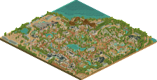
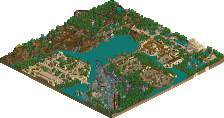
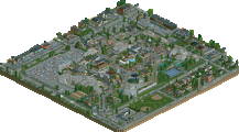
140 x140 filled to the brim is certainly something to be proud of with the present state of RCT being about uber detailing and realism and I must say you do your fair share. Impressive.
Main Street
I see the inspiration from Thorpe Park (toilets under buildings, colour schemes) and other theme parks with the inclusion of strollers and a pay per ride......ride lol, which was well executed. Overall though I didn't like the entrance and I will explain. I don't like rides in entrance areas and it's a big pet peeve of mine. I see entrance areas/main streets as the gateway to your adventures. It gets you ''in the mood' for adventuring, travelling to these magical lands, etc. When you go and put a ride in it stops being a much needed transitional space to a themed area within itself, even if it lacks a definitive 'theme'. Granted it will keep your main street busy, but unnecessarily so in my opinion. However I liked the arrangement of the main street.
Traverse Town
I've never played Kingdom hearts, always wanted to though. Clockwork was a great family Arrow and perfectly paced bar one turn. The clockwork ornament was creative and I can imagine walking underneath this huge clock with no face. The placement of rides and shops was very good too. Despite the praise though, I felt that it wasn't wacky enough. Your readme gave me such a wonderful image of what it would look like and yet in game I was presented with 2x2 archy which was good in its own right, but not what I imagined it to be. I guess that's not really your fault though but I can't help but feel disappointed somehow.
Sunshine Kingdom
I loved this area, very aesthetically pleasing. Kestrel was great IMO and the layout and pacing was spot-on however I don't understand the connection between 'Sunshine Kingdom' and 'Kestrel'. The architecture was superbly crafted with the right amount of details and texture/form variation, it certainly felt warm. Particular highlights are the grazing horse, long viewing platform near the boat ride entrance and landscaping was good. The Sky Swat is good enough but I’m disheartened that everyone has done pretty much the same version since my original but Imitation is the sincerest form of plagiarism hehe.
Bramble Cove
This quaint little area was a pleasure to walkthrough. It had a different pace to the other areas with a quirky helicopter ride and a decent side friction that didn't look out of place with all the fancy steelies. Nuff' said.
Fort Ironside
Firstly lets talk about Ironside. For me it was the best and worst coaster. It looked great and but it didn't perform too well. I imagine in real-life it would be great but confined to the limitations of RCT2 it just doesn't do it justice. Geewhzz did you a great favour and it pays off dividends for the area. Colour scheme, placement, supports, it's all good except for the questionable pacing issues. The area is probably the best IMO. The archy was well suited, the foliage complements perfectly and I love all the small forge chimneys. I also loved the custom albeit a bit clunky and the little details here and there such as the railroad crossings. Thors bumper car's sounds like a used car dealer though hehe.
Puerto Espana
Colours, Colours, Colours! Love the colours of this area. However the main focus is of course CP6 Matador which was very well done, congrats for that. I could tell what turtle did based on a certain fence he used and I must say I’m slightly disappointed with it actually compared to your other work (I hope I’m not looking at the wrong building). The bull section was well crafted and the Screamin' Swing lacked a few details but overall a decent area.
Lastly I would just like to say congrats again for completing a park; it's always a very satisfying achievement. I loved all the details like the custom Information signs, etc. Everything was spotlight worthy and it is much deserved, I look forward to the next solo.
RCTFan
P.S If you want me to go into detail about certain things just PM me
Edited by RCTFAN, 05 September 2007 - 02:05 PM.
JK
Now just don't retire
James
Very well done J_K!
I'm glad you finally got your well deserved Spotlight and parkmaker spot!
Congrats!
I really liked the park. It was charming throughout. I especially liked the area with Greyheart and the copter ride. Nice idea with that one!
The viking area was pretty cool too, although I missed something like a scandinavian curch or something like that. Ironside is very well thought out, although I'm not a fan of that boring curve over the path right after the sidewinder.
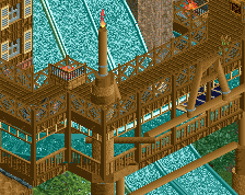
The water ride was great too, the bridge in front of the drop is a nice addition. The ride itself is a bit long, though.
I can't agree with Comet's comment about Matador's pacing issues. I thought it rode very well.
What I didn't like was that mostly all the houses had no purposes and the map was filled with houses... I'm more a fan of landscaping and such in parks rather than parks with that much architecture...
All in all it was a really nice park to look at!
Congrats again!
"MFG"
Magnus - Thanks alot. You've always been great for feedback when i showed you some early screens.
Posix - Yeah i really love Ironside as well. My favourite part i guess is the first part of the ride with the pre drop leading into the lift hill into that sweeping drop. I feel the coaster definatly came out as i imagined it.
Zodiac - I know! Kingdom hearts is like my favourite game. Just the whole of the first game blew me away. The second game was'nt as good as it was a little structured and it needed a better story but i still love the areas and the artwork etc. It's really good to hear that you think i pulled Traverse town off since you've played the game. That feels pretty awesome.
Gwazi - Wow thanks alot. I liked both version's of Kestrel but i thought the second version was different and stood out more from the area while still blending in. Glad you liked the park.
Comet - I loved every single thing about Matador but that's fair enough if you think that. Cedarpoint6 was pretty amazing how i gave him quite a strict brief then he sent me the park with this incredible coaster in. I love every single thing about it. It's my joint favourite with Ironside and Kestrel. I'm glad you liked Bramble Cove. What i like about the feedback about my park, is everyone has their favourite area or part which is different from the next person. They're all quite different so it's nice to know other parts appealed to others.
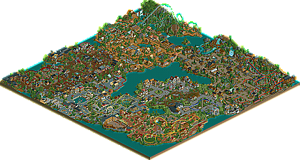
It was pretty hard finishing an 140x140 map but if you have the drive and you have the right ideas i think anyone can pull it off. I'm tempted to try 180x180 but i think my previous map size is for me.
Emergo - I can't wait to hear your comments. I'm wondering which area your'll like the most to be honest. Thanks it feels great to be a parkmaker. I always said i would'nt accept a parkmaker spot unless i got a full scale solo out. It's great that it all came in one. Hope you enjoy the park.
Postit - You always know what to say
Metropole - Thankyou very much. I really enjoyed building the river ride . I've been trying to perfect my water rides for a while, that's why i entered the water round for the prelims. I still think i can improve on them but for now i think they're ok. I kinda thought some people would think that about the maze but i think it's a really nice border. I wanted to do something different and i think it really compliments the theme.
Peeee - Thanks for your comment. Atmosphere is a MUST when it comes to any of my parks so i'm really glad you noticed it.
About the coaster's i know what you mean. I feel i could improve on them but with all my coasters i really like them in some way or another. Some people may not like my view towards coasters but i don't always build for realism at first. I build what i feel would look good, so i always go for quite simple yet effective layouts. Kestral itself was a mixture of three of my past coasters. The Batwing features from my past design Moon Mountain. It's Quite wierd to add it to a classic floorless B&M but it was different.
Thanks for the little details comment. I love adding these things although i think the park could of featured alot more. With my next solo i've planned alot so it should be packed with them.
Turtle - Yes you did tell me but i never believed you
X250 - I know i feel alot more of my buildings need to be like the bull ring. It was a real favourite of mine and the bulls head was quite hard to make but it came out really well. Thanks Si.
RCTFAN - As i said before i knew you wouldn't let me down with comments. Thanks alot for your comments and in such detail as well. 140 x 140 was certainly hard to do but it was well worth it.
It's funny because i feel exactly the same as you. I hate rides in entrances. If you look at the overview of the mainstreet it's kinda split in two. I first built the mainstreet and included everything I wanted to but felt the area was too small for the guest's to enter in. I then thought about all the coasters i wanted to add and i did'nt want to crowd an area with two coasters. Then I came to the conclusion that i should add it to the entrance and theme around it. I was aware of the fact that this may cause the park to look like six seperate designs but i worked really hard to make sure the six area's joined onto eachother and created the one park. I'm really glad that you can see the inspiration from Thorpe Park. It's one of my favourite theme parks so it would of sucked if i did'nt pull that off.
Firstly you must play Kingdom Hearts. If you like the idea of the makers of Final fantasy, adding their chracters combined with Disney characters with a stack of new ones in an Rpg format with an immense storyline, then the games for you. I did add a few things to give the "wacky" feeling but i felt like you, i could of added a bit more to go the extra mile. If i'm being honest i thought the clockwork ornament looked really messy at first so i did'nt know how people would take it. Like you i imagined walking under it and just seeing the sky above with this hollowed out Clockface above me. My guest's are pretty lucky hey.
With SK i really needed to add a sky swat. Ever since i saw it i was kinda like "holy fuck a sky swat, i love that ride" I did'nt mean to rip you off in any way but i love the ride so much. For it to be added to my park felt right but i must say your original version was the best. I could'nt come near to that. With the names of all the rides i wanted them to be inspired by nature so most of the main rides in the area are named after birds. I know what you mean about the area it does certainly have that warm kind of feeling to it. People may not like the path but i've always wanted to use it in a major area and i really like it. Plus when i used the darker brown path i feel it did'nt look as good.
Haha yeah thinking about it now Thor's bumper cars is'nt the best name. This is probebly my joint favourite area (with the other 5 lol) I love everything about the area and i feel the foliage in this park is some of my best. Tell me about Geewhzz's guestspot it rocks! Thanks again mate. The custom itself was an experiment that turned out really well. it was my first custom ride that i've ever tryed and it'll proebly feature in my next major solo. Obviously it will be themed a bit better.
Puerto Espana was certainly a fun area to do. With such a good coaster in it i felt i needed to do it justice. I loved turtle's guestspot (matadors station) and he certainly helped me out with deciding what to do with other buildings. I love the colours he nused in the building and the custom que system is really nice. Thanks alot to Cedarpoint6 for help with hacking the screaming swing. I'm kinda crap when it comes to hacking so any questions i had he was always there to answer them.
Thankyou so much! for your indepth review you've covered alot of things. I really would love to work with you in the future so if your ever interested then Pm me. I'm glad you felt everything was Spotlight quality. that makes me feel really really proud of the park.
Ole - As i said before i won't retire haha. Hope you download the park and take a look. The overview is nice but it dose'nt do it justice.
RCTNW - That sucks that you can't download the park. Hopefully you can open it soon and take a look soon.
--------------------------------------------------------------------------------------------------------
Wow well that took alot longer than i thought. Yet again i'm sounding like a broken record but Thankyou to everyone for your comments and feedback. Your'll be seeing a few screens from me soon i guess.
JK