Park / Dimensions: Realms of Creation
-
 28-May 07
- Views 25,983
- Downloads 4,528
- Fans 12
- Comments 123
-
-
 87.50%(required: none)
 Spotlight

5dave 90% no Cocoa 90% no Liampie 90% no MCI 90% no Poke 90% no Sulakke 90% no Fisch 85% no Stoksy 85% no Xeccah 80% no geewhzz 75% no 87.50% 0.00% -
12 fans
 Fans of this park
-
 Full-Size Map
-
 Download Park
4,528
-
 Tags
Tags
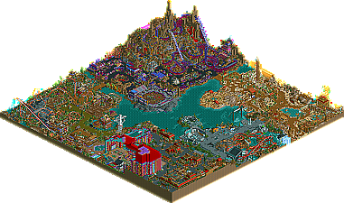
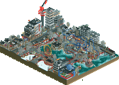
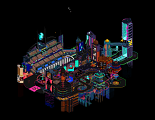
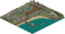
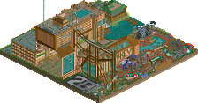

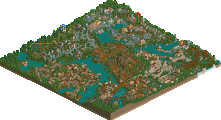
I don't usually like these fantasy things, but for some reason this really appealed to me. There were a lot of cool details to it. I know a lot has been mentioned, but I'll go by area.
Entrance Area:
- As a whole, I thought the area had a good feel, almost cozy with the darker colors and all the little stores.
- The marble store was pretty creative, especially the marble playground. It took me a minute to figure it all out, but that was very cool.
- The huge claw game off the cliff was pretty creative and a good use of the height difference you had to work with.
- The restaurant in the corner on the cliff would provide a darn good view for people to dine, again good use of the height difference.
- I think somebody may have mentioned it, but it seems like you'd run into a lot of crowd control headaches since they all funnel into 2 large people movers and a small stairwell.
- At the bottom of the cliff around the casino, I loved the miniature golf course that mirrored the themed sections. Reminded me of your PT entry from last time.
- The casino seemed a bit excessive, but since you like that stuff so much, it's a good reflection of what you do, which is cool to see in a park. (if that makes any sense)
Dino Digs Area:
- I wasn't a big fan of the green path. I think it really clashed with everything. It certainly created some nice atmosphere that I'm sure you wanted, but I think the normal brown dirt would've been a better choice.
- The dining rafts at the Dino Eatery was a nice touch... the whole structure, actually, was cool.
- For some reason, I really like the little oasis thing around the buildings close to the casino with the palm tree and stone pieces around it. Really had a nice atmosphere to it.
- Riperaptor had a pretty good layout (except for the zero-g, but that’s a personal thing), but I really didn’t like the color scheme. It really clashed I thought. Really loved the rock footers, though. Great touch with that.
- Cool mesh of the rides for the demolition derby thing
- Reptile Rally was cool. Good ride to follow around.
- Bone Runner was a pretty cool idea. I liked the fact that it didn’t try to be a really big ride, but acted well as a support ride.
Mt. Morbid Area:
- The whole area certainly achieved its purpose, but it wouldn’t be one of my top choices as a builder or guest. It’s innovative certainly, but I think I’d probably feel sick by the time I left the place.
- Cool glass wall flush with the mountain-- that was very nice.
- All the games in the area where really well done and worked great.
- I thought Nightmare’s layout could’ve flowed better, but overall it was good as a signature attraction. I wish, though, that the hill before the massive drop would’ve been taken at more speed. Imagine airtime before that drop…
- This was probably my least favorite of the areas, even though it still had a good atmosphere to it.
The Valley of Sand Area:
- Cool drop tower. That was the first thing I noticed.
- Leverage swinger was also a great custom ride. Seemed like a different style Sky Swat.
- The main coaster in the section was technically impressive with all the hacking, but again made me cringe. Realistic coasters are what I look for, although I certainly wouldn’t expect it here. It’s just not my style.
- Good atmosphere with the open air markets.
- Labrin was very cool.. incredibly extensive. You have to wonder, though, how many guests would want to spend their day at the park lost in a giant maze.
Weather Area:
-Hurricane X probably had my favorite layout in the park… it was pretty nice besides the turns into the zero-g. I liked the location as well, being out over the water and all.
- The tectonic plates were a really creative idea.
- The rapids were great how the went through all different types of weather.
- I loved the Dishes of Disaster place… cool ideas with all the different weather related foods.
- I wasn’t a huge fan of the protective barriers, I would’ve preferred a thinner fence then that.
- The pods idea was pretty cool as well, like the Robocoaster thing.
Well that’s all… there’s the review I promised.
Overall a great park. A lot of fun to spend a couple of hours looking around in.
Instead there's a resort, dino area, and all that cool stuff.
Edited by RaPiPo, 28 June 2007 - 02:14 PM.
Fatha' Offline
Just figured I'd stop by and comment on this interesting park, the first piece of RCT work that has inspired me to do so in quite some time (Kumba IMing me everyday begging me might have had something to do with it too
Secondly, it was a great trip down memory lane just reading the responses to your park, most notably from people like Posix, Fatha', WME, Jellybones, Cork, etc. It's great to look back and remember what kept this place alive for so long, the quality of work and the always interesting debates that followed. I would have almost been disappointed had posix not hated this.
Ok, enough sentimental babble, onto the park itself.
I definitely enjoyed the park for the most part, and if it were still me that was making these decisions, I'd have made this park a spotlight quite easily, even in the prime days of NE. As I stated earlier, I go into Kumba's parks with a different mindset then just about anybody else's. I've given up on trying to find art or beauty in his work, and instead I just wanna have the most fun I can, exploring the most random (and often pointless) shit that he can cram into one park. Kumba builds in the sense of a fast pace action movie, with surprises around every corner, cool details that you can't stop talking about, flashy set pieces, and an overall sense of enjoyable unbelievabilty (if that's even a word). All of the above are just not qualities someone like posix really goes for, so it's no surprise, or fault to anybody that he wouldn't enjoy this park. This park is the "Transformers" of RCT, and to those looking more for a "Citizen Kane" or "Dr. Strangelove" are going to be awfully disappointed with all the hype Dimensions gets. It's just apples and oranges, no right or wrong way about it. However, I do believe it's impossible to say there's no creativity in this park, just as I believe it was ridiculous for Kumba to ever call it realistic, in any way whatsoever lol. Adding some element of an amusement park to a fantasy park doesn't necessarily make it realistic, or even semi-realistic, it just makes it a fantasy PARK.
Anyways, onto the individual areas. The hotel, I have very mixed feelings towards. By itself, it's a very impressive structure with lots of cool details, some of which I probably didn't even catch, as it would most likely take hours to get to every hidden quirk (a testament to Kumba's parkmaking). However, after so many years of looking at RCT parks, I think slapping a huge hotel down in the middle of a park is almost entirely unnecessary at this point (with a few obvious exceptions). It just detracts from something else more meaningful and enjoyable that could have gone in that space. I would have much rather prefered another themed area or another iconic landmark more original then just a giant hotel. Not to mention the colors, but it's Kumba and he's gonna stick with that awful color combination no matter how bad it looks, and I've come to accept that lol.
Onto the dinosaur area. At first, I was very disappointed with the inclusion of this area in the park, because the overall look and theme is so redudant after almost a decade of RCT, especially in what's obviously supposed to be a new, extremely original park. "Ripperaptor" was pretty awesome though, I'll give you that. Not in the scheme of the best steel coasters of all time or anything, but it was a really enjoyable ride, a taste of semi realism (when compared to everything else) that was a breath of fresh air when surrounded by all the crazy hacks and moving scenery. I liked just about everything about the coaster, so no qualms there. I actually think this area would have benefitted more if it had simple brown pathing, which may be even more played out, but is a huge step over that horribly ugly greenish thing that I've never been a fan of, unless used perfectly. The Demolition Derby was a cool touch, only coming from a guy like you. In almost any other park I'd consider it ridiculous, but you make ridiculous work for you, so kudos there lol. The "Reptile Rally" was also pretty cool, though after years and years (or so it seems lol) it still seems to pale in comparison to the original, which is either a huge testament to Ed, or a lack of imagination and creativity on yours. Dem Bones was very cool though, I really liked that, almost as much as I liked Club Rex...very cool touches all throughout.
Mt. Morbid, I loved. Plainly. It's possibly the ugliest looking themed area I've ever seen, and somehow, that's supposed to be a compliment in this sense. It looks as it should for the theme to work. There are a few faults in it, but there are a few faults in everything you make
The sand area was probably the best of the park. I absolutely loved the 'smoke and mirrors' ride, regardless of how ridiculous it was. It was just so much fun to watch the train go through the circuit, I too had to watch it several times to really appreciate every hack that went into that ride. If I were still fooling myself into making that 'best rides ever' list, "Mirage" would be somewhere on there. It may be my favorite ride I've ever seen from you (though my RCT memory is a little shot these days, so I may be forgetting something cool). The "Leverage Swinger" was awesome, the "Labrin" was absolutely perfect IMO, just this whole area was pretty much on the ball. Easily the 'best' area you've ever done, the colors worked, the rides ruled, etc. If I were still pretending to make SLR lol, and there was an Egyptian area in it, I would have imagined it to look something like yours. Just with more refinement and a hell of lot better spelling and naming lol.
Finally, the Earth's Fury area had potential, but almost seemed like a complete afterthought. This is a shame too, because with the exception of Mt. Morbid, this area had the most potential idea wise I would think. I would have loved to see this area get a whole lot more room, and that hotel get a whole lot less. Really would have given this park an extra boost I think. In fact, losing the entire hotel area for a better Earth's Fury area could have really helped, if done well. Anyways, the coaster was nifty, nothing to totally lose my mind about, but I enjoyed it. Probably less then any other coaster in the park, but something had to come in last. There were lots of cool little theming ideas here, but the key word there is little, had they had more room to really expand and come to life, it would have been so much cooler.
Anyways, there you go Kumba. Congrats on bringing some life back into the RCT community, as I hope the Pro Tour continues the momentum that you started. It's good to see some of the same old faces around here. I am not 'back' or anything, but I probably will check in from time to time and see how everything's going. Hope all is well, take care.
I hope to see you post some from time to time, just to say 'hi' or toss a friendly opinion in the hat. You're missed.
Ride6
Corkscrewed Offline
mia.bellsouth.net
Now if im reading this right that would be Miami bellsouth.net
anybody care to guess?
as im sure you know who it was.
Can't be. He spelled everything right.
Thank you for the review iris. It is very gratifying to know that you would have made it a spotlight yourself. I agree with most of your review tho, I have always liked that grassy green path and really felt that the hotel was needed to give people a break from the themed areas.
Oh and thx CP6 for your feedback and to JJ for the less outrageous feedback post
Anymore late comments? SF? Fatha? Cork
At the bottom of the page. Adix, Ty, and iris. I am being a noob by saying this, butI've never seen them post before.
Damn I wish I knew there was a good RCT site a year and a half ago.
FK
Looking forward to getting my new rct2 disk :]