Park / Dimensions: Realms of Creation
-
 28-May 07
- Views 25,688
- Downloads 4,522
- Fans 12
- Comments 123
-
-
 87.50%(required: none)
 Spotlight

5dave 90% no Cocoa 90% no Liampie 90% no MCI 90% no Poke 90% no Sulakke 90% no Fisch 85% no Stoksy 85% no Xeccah 80% no geewhzz 75% no 87.50% 0.00% -
12 fans
 Fans of this park
-
 Full-Size Map
-
 Download Park
4,522
-
 Tags
Tags

Let's be clear please. I never said it was "the most creative park ever", all I said is what I have highlighted above. That's just part of hyping a review imo, it's just my bad luck that I wrote it and about my own park.
No, it isnt what you think... when I start the game again it gets stuck in the loading screen
I've reinstalled the game and it works now properly ut it isnt nice to do
No, we need more feedback posts... well we do if you guys ever want to see another NE spotlight
Basically, it was one of those parks that was impressive on a very shallow level. I was impressed. But I also hated it. It just looked like too much work, with no end product. There was no atmosphere. I love atmosphere. I think that's what I like most in RCT. Well done and all, but you just have far too many ideas, and no class.
It just wasn't for me.
As for the park, I will be able to take a closer look this weekend (along with certain update) as I will be home and not camping. From what I can see and remember from an earlier version, it looks interesting and should be fun to explore.
Honestly Jem I am really pissed off by you saying that. Why not tell me two weeks ago when I sent you a tester version? But no, just ignore that and tell me know when the park gets released. Out of all the testers I sent it to I honestly was looking froward to your feedback the most as I think your the most skilled with making atmospheres. So can you please expand on what gives it "No atmosphere"
I guess it did hurt that the tester version was kinda unfinished, but you still could have helped and I am not really disappointed that you did not.
in fact, there went a lot much more dedication into this than i had thought.
"Flying Jenny Garden Carriage", that was my favourite thing. its top is creative
needless to say, the park isn't so much for me, as wme has pointed out, but in the end it just matters what things a viewer puts more importance on.
my initial post; it was meant to attack Kumba, of course. he drives me insane sometimes.
Fatha' Offline
Hotel/Entry Area
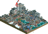
Your ideas for this area are good, some even great. You even have the details...the custom benches with gardens/trees in the middle, the custom shops with racks of marbles and racks of comics, the park map, the gold course imitating the park, the sports jersey racks, the food shops, they are all there. And you even have all these "little things" mixed in with much larger, and equally creative things, like your lifts/custom elevators and whatnot. But Kumba, I must ask you this question: How does this area interest a guest walking through this park? Let me show you an example:
Entry Sequence of Islands of Adventure
You enter the park. Directly in front of your view is the lake. Directly to your left is the large lighttower, the signature feature of the parks entrance and the park itself. Now, once you get past this 100 foot corrodor of shops, you are opened up to the park...to the left you view the Hulk roaring past the midway and onto the lake. To the left, you see the magical entrance of Suess land and all its intricacies.....
Now, your entry sequence. You enter, to the left is the enormous hotel, which does not interest me as a theme park guest. I look straight ahead, and there is your park map....which is cool, but its not enough of a feature to wow guests and make this a magical entrance. I walk past all these shops and such, and finally i get to the moment ive been wating for...I see your park. And the placement of pathing alongside the top of the cliff is successful, and its a good move. It would be a dramatic experience seeing the park from this perspective. Why not have the entrance gates right before this moment, and put all those little shops and such OUTSIDE of the gates? They really don't contribute to the park, all 20 of them, and could really be placed outside of the gates and be replaced with more exciting things.....like flatrides. The entrance needs something exciting and grande....yours just seems lifeless, even if it is filled with creative little details.
And continuing with this critique of your park, your attention to details really has led to a lack of attention to park design imo... For instance. What is your entry sequence into the dinosaur area from the entrance area? You dont have one! You have two lifts....can you imagine the logjam of people that would cause? For me, you have basically created a dead end, and disconnected the park from the entrance, at least here. Even if you have a hidden stairway or something, thats the problem....its hidden. You need to remember that these parks need to be functional, especially if you want to call it somewhat "realistic."
The hotel, its cool and all, but really I think it dominates the actual park, and thats not good. The interior of the hotel is fabulous though, good job on the casino and whatnot. The pool area looks cool too. Aside from the hotel simply existing where it exists, I actually like it. You designed the hotel well, but I dont know if you designed the hotel's relationship and interaction with the park as well.
RATINGS
Theming: 6/10 (I didn't really pick up on the theme of this area that well).
Architecture: 9/10 (Some nice building designs here).
Layout: 7/10 (Its an ok layout for an entry, but its not 'magical' like i said above).
Coasters: N/A
Guest Friendly?: 5/10 (Some areas of ur entry sequence really arent guest friendly).
OVERALL RATING: 7.9/10
Ill post my critique of the next area soon.
Kumba, this park was great I loved the details around the entrance of the park, and also the wooden coaster was insanely cool. Things I didn't like though,
1. The B&M looper didn't do it for me. Also when I opened it up after about 5 minutes it stopped to work. The layout was alright.
2. The invert also didn't seem good. the supports needed work, and that killed it for me. The station was great though. I also loved that X you had in it.
Things I loved so much were:
1. Mirage- That thing was nicely hacked and I enjoyed it so much.
2. the woodie- Of course it was great, it just had that feeling.
3. The flying jenney- Wow, that was really cool how you hacked that.
That is what I got so far.
Did everyone just ignore this?
Eh, I'm probably just being paranoid.