Park / Dimensions: Realms of Creation
-
 28-May 07
- Views 25,658
- Downloads 4,521
- Fans 12
- Comments 123
-
-
 87.50%(required: none)
 Spotlight

5dave 90% no Cocoa 90% no Liampie 90% no MCI 90% no Poke 90% no Sulakke 90% no Fisch 85% no Stoksy 85% no Xeccah 80% no geewhzz 75% no 87.50% 0.00% -
12 fans
 Fans of this park
-
 Full-Size Map
-
 Download Park
4,521
-
 Tags
Tags

Too fantasy for me
Out of all the park's areas, I have to say I really liked the disaster area the most. It seemed to be very simple in concept, but was executed perfectly. Dishes of Disaster undoubtedly showed your true genius as a parkmaker. Hell, I think it was my favorite part of the park. Hurricane X was pretty awesome too, especially with that massive station.
Overall, awesome work. I won't find the same appeal in this as others, but it's deffinitely a spotlight worthy park nonetheless.
Going back in time, first thing i did was opening up the word files. FAQ, hilarious stuff, seriously. Especially describing this park as realistic, when in fact, it is nothing of the sort. And no where.
Now, the park had its moments. Sometimes i get the feeling you're trying too hard. Creativity here, creativity there. How can you really still call it creativity then? I dunno, Posix should take a look at the park before commenting but i'm sure his stance won't change much if he actually does.
I don't mean to spoil your parade too much, because it probably is a good park. It goes against too many of the principles of parkmaking for me, it has stuff all over the place, so much that nothing holds my attention! And it's a pity, a pity, that if you're making this park in such a 'fantasy' manner, that the coasters only differ little from 'realistic coasters'. Note, they do differ, but it's the same old, same old. Hacks, just a little bit bigger, boring. Now i know i've taken the time to create 'perfect' coasters as much as anyone, maybe even not always putting them into a realistic enough setting. But hell, lately i've been enjoying making state of the art, coasters that are interesting because they feel nostalgic, crazy, stretching the limits of rct, and different from how everyone else is making them. It's a hard feeling but none of your coasters do that, albeit that they have a certain sense of 'good' in them, they don't stick apart.
The big building seems to rip the entire parks layout apart, and even though at first it seemed larger, it is in fact not even that large. I don't know why a park has to be large though, i'd prefer a smaller park with more action, and i guess this is to some extent.
I opened the park back up so i can stand by my opinion more, i think there is tons of 'creative' stuff but there really isn't much i haven't seen before. So that kind of blocks that 'omg, how creative feeling'. We've seen invisible rides all over the place, you're actually the one that took that whole trend to its extreme. We've seen all kinds of colors all over the place losing all sense of cohesion as well.
Now, again, there is some stuff i like, but when you stuff a park this full, of course there will.
Not a deserved spotlight, in my opinion, but i'm sure irsi would have given him it as well. So I have no problems with the way the spotlight was accumulated, just how it looks to me.
you need to get that sand out of your vagina, posix.
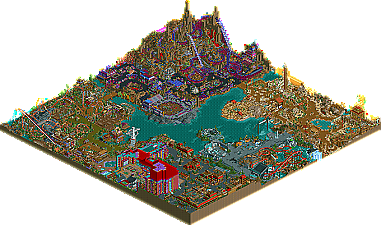
Well firstly all I can say is congratulations. I know for a fact you’ve worked your ass off on this. Obviously this has pulled off and rewarded you with your second spotlight. I’ll go through with each area and what I think about every part.
It took me nearly an hour to go through everything but it was worth it. I have three favourite areas which I can’t decide what to rank first so I’ll just go round the park as you laid it out in your read me.
Entrance area
I love how it relates to your self a lot. Not many players use hobbies or childhood memories in their work so not only does it show your personality but a lot of emphasis and influence in your work. I can now see where you get all your ideas from hopefully some of them don’t correspond to your real life though lol. I loved everything in this area to be honest, I loved the light brown and red roves I thought that colour scheme was amazing. Some of my favourite parts were the lifts and transportation methods to the other areas. I also loved . . . sorry LOVED the casino. At the end of the day I couldn’t possibly believe that you squeezed so many details in to one single area. I loved the roulettes the Texas Hold’em tables as well as the lit up signs. Moving towards the end of the area another innovative idea was the crazy golf course. I followed everyone and couldn’t believe you had the creativity to carry on the amount of ideas that went into them. I know other people may not look close enough but I bet you if you’d be writing replies as long as I’m doing. My favourite hole was where you hacked two of them together and then put a diagonal piece as if you had to shoot the ball against that to bounce to the right, into the hole. Others may not follow that but I’m sure you’ll know what I mean Darren. Oh the last amazing detail was your park map reduced and in the very centre of the entrance.
Dino digs
Right the first of my three favourite areas comes up next and in my opinion the best prehistoric theme ever and it will need something big to top it. A lot of the parks best architecture features in this park and one of my favourite buildings is the riperaptor station. The diagonal hanging planters coming off the building was lovely. Another amazing feature was the suspended track above the paths representing bones and yes it was extremely sexy. As you also said in your read-me the dinolishen derby was defiantly the best ride in the park. Well best flat ride anyway. I also loved the DJ’s area and the bone caged dancer was a nice touch. One of my favourite tiny details was the big mamma’s raptor egg patch, along with the immense atmosphere and the incredible coaster my mouth dropped. The coaster was very well done and it was really complimentary to the area. Nothing groundbreaking, but a spotlight-worthy coaster by far. Moving onto the kids ride. You made a standard aesthetically pleasing layout took a whole lot more with custom coaster track, resembling bones and a duplicated layer of wooden roller coaster track on top. You made the ride so much more and as well as the dinolishen derby that’s another favourite ride of mine. Finally the Riperaptor that I mentioned before, I actually found myself clicking rotate in RCT as fast as I could to try and follow the ride. The amount of details that went into all of it made the ride what it was. This concludes the area as well. The tar-pits, standard prehistoric scenery, incredible foliage, architecture and innovative ideas made an incredible area and if every single area in the park was up to that standard it’d be the best fantasy park ever.
Mount Morbid
Ok I’m going to be brutally honest and say this. When I first saw your park a year or so back and the above areas as well as this were complete I thought it let you down a lot. In fact, I really didn’t like it. Yet I opened it after you’re read through and heard what you had to say about it and I ultimately respect you. I think you took one of the hardest themes you could awkwardly find lol and made it into a masterpiece. Some of the ideas I cringe at like the scab that the knight mare takes a helix round as well as a few other things but that was completely your intent. I love the arena and think a lot of your details in that are top notch. I also love the queue outside the arena. It seems like a fun way to wait for a ride. The wooden coaster yet how much I didn’t agree with the colours, was really nice. I like the whole extreme layout and the landscaping is incredible. The only thing I found wrong was how much the games skipped through moving scenery, so I found it hard to follow sometimes. After that I really respect how you pulled this layout off. Other amazing thing in the area was the small custom games stalls towards the coast of the area. I also like the scare house with the rapid wolverine entertainer, chasing guests through a see-through walled maze. Basically what I thought the area that would let the park down and decide whether it would get spotlight has slapped me in the face with a wet fish and made me realise the skill that has gone into this area along with the biggest amount of creativity ever. Oh I also forgot. My favourite ride in the park was the shooting ride where the guests have to physically board a ride be shot up and down whilst still shooting at moving targets. . . . Loved it!
The valley of sand
This was the second of my three favourite areas. It was even better as I didn’t even know what to expect with this. The best thing by far was Mirage. I couldn’t believe how much time and effort went into that single ride to make it that good. I loved it and it defiantly set the tone for the rest of the area. It was an Amazing choice adding that huge inversion out of no where. I can imagine being a guest looking at that and thinking “woah, I want to go on that.” As others have mentioned the maze was incredible you even put 110% of detail and ideas into the smallest of things. Another of my favourite rides in the park and probably the best was the “flying Jenny” I was really touched after I read your read-through and it was nice that something so sentimental could feature in your park. All of your custom rides were top notch and the level of creativity that goes into them is scary. Finally another ride that was awesome was the rowing boats in the centre of the area. For a simple rowing ride you certainly pack the lake with details that “overflows”
Earths Fury
Yeah I loved it all. It was certainly the most realistic area throughout you whole park but it was still as successful as my other two favourite areas in the park. The best detail in the area was by far the cracked path on the floor. I can imagine being a guest and being awestruck by it as it’s a major influence into the areas atmosphere. I also like the safety barriers you added throughout the area. I loved the rapids ride and I thought one of the best details was the mudslide as well as the toxic spill near the start of the ride. The only thing that bugged me was the custom ride at the entrance near the valley of sand. I thought this was the weakest out of the parks custom rides. It was bearable but I feel you could have improved it a lot more. But as you said in one of your many read-me’s it does its job: D. The best feature in the area was the food court themed to different natural disasters, I mean wow. I loved every single one and it just shows they may be small but you wouldn’t let them feature in your park without a sufficient amount of amazing ideas and detailed scenery. One of my last plus’ of the area was the invert. It was simple but it did its job. I loved the rides station for it and the rides logo was amazing. I love how you did the “X” of it all. It may have been the smallest area of the park but it certainly didn’t effect the overall composition. In fact it was one of the strongest areas.
So I think I’ve just about covered the areas
My final point I’d like to make is this kind of fantasy is not my cup of tea at all. I sway a lot more to realism although I don’t produce 100% realistic work. I do however admire the skill, ideas and execution of this all and that’s why you have a spotlight and that’s why you deserve a comment of this length. I totally disagree with Posix’s comments and I feel you could have used your words in another way. At the end of the day if I’d spent two years of my time creating work to this standard, your kind of comments would be the last thing I’d want to here. I also think JJ’s comments are totally out of order even though I’ve told you this on Msn as well
Anyway Darren you’ve created a masterpiece and I can understand for several reasons why there isn’t going to be another solo from you. This is basically because no solo you could complete would ever top this. That’s how big the standard is. I hope your proud dude because you’ve worked your ass off for this and you’ve certainly proved yourself as an elite park maker.
So yeah 1,800 something words later on, and I can only say you thoroughly deserve this kind of a comment from me. It’s definitely up there with the best dude.
JK
Will edit with park comments...
-ACE
Dude please don't post a post a direct pic of posix, that calls for some warning, in this case a link ~ Kumba
hpg Offline
You even misspelled your own park name.
Dimensions: Reals of Creation was an excellent way to end your career Kumba. Although very fantasy, it was very creative. I disagree with posix - I saw some things in D:RC that I'd never have thought of. For example, using glitchy track to simulate 'Mirage'.
Sadly, I could not look through the park fully yet as I'm too tired, but it was an excellent park minus the colors. I also liked that it was a tribute park. R.I.P.
Edited by Gwazi, 29 May 2007 - 11:06 AM.
entrance sans hotel > land of sand (except for that terribly generic name) > earth, or whatever it is > dem bones 2 > mt. morbid. seriously. that is way too overdone, even for you, i'd say.
anyway, yeah, definitely a progression from your carcharodon design, and a good one at that (well, when you use more conservative colors, that is). but yeah, finish that thing with xcoaster.
That's ok, you go ahead
My favorite areas were the land of sand, the dino area, and the entrance area. Mt. Morbid was not for me. I’m not into the whole morbid, morose, gory theme on RCT… and this was a little over the top. The dramatic woodie would have done the area more justice, if it weren’t so… dramatic. I did enjoy the DRC Arena and the Fear House. Two well executed ideas here.
I also wasn’t very fond of the casino area. It was a little too gratuitous. I don’t think it needed to be so large, as it took up too much of the park. The pool area was great, though. Loved the party/concert area. This was a nice transition into the dino area, with its great colors and architecture. Really refined.
The dino area had the best architecture in the park. Wonderful foliage. I love how the pathways were green, as if you were walking on grass/mud. It made sense for the foliage to be spilling into the pathways. Riperaptor was a solid ride. It was nothing too new, but still very nice. I loved the station and the queue line. Bone Runner didn’t work for me. I don’t understand why it had LIM coaster cars. Is it a kiddie ride? Either you didn’t need this ride, or the ride could have been something entirely different… as it really did nothing for me.
The land of sand, is one of the best Egyptian themed areas I have seen. I especially loved the custom genie ride (launched free-fallers? Wow. Cannot think of the name). Mirage was fantastic, and so much fun to follow. All the little bits of scenery in this area are what really made this part of the park so much fun to look at. I just have to say that the flying device was really cool. I think the awning roofing worked really well, too. They fit really well here (not so much in the entrance area).
All in all, this was a nice solid park. Some parts were obviously stronger than others. I would really like to see some new themes from you, Kumba, as I think I’ve seen this type of stuff from you before. Good work!
this made my laugh a lot
as vengeance you trapped me in that grab game
you did a really good job on the park
btw the rain object looked good there
FullMetal Offline
The themes are great. Defenitely original, IMO.
The hacking is pulled off really well. I personally don't aprove of all hacks, but here it was excellent.
Yes, the bench is a bit flat, but there are a lot of parks out there that are flat.
The colors clash and I like that. They say beauty is in the eye of the beholder, and anyone who hates this park is either blind, or doesn't have eyes at all.
All in all, this park is defenitely worthy of Spotlight. Your Readme file on the otherhand... Sorry, I'm an ace in English class.
didn't someone clever say it's just internet? not supposed to stir up shit??
and qotsa, wtf?
guess what, this is a forum where people post their opinions.
disagree with mine, fine. why the heck is it a problem?
if you really have to know about me, read what wme posted.
damnit.