Park / Dimensions: Realms of Creation
-
 28-May 07
- Views 24,126
- Downloads 4,384
- Fans 12
- Comments 123
-
-
 87.50%(required: none)
 Spotlight

5dave 90% no Cocoa 90% no Liampie 90% no MCI 90% no Poke 90% no Sulakke 90% no Fisch 85% no Stoksy 85% no Xeccah 80% no geewhzz 75% no 87.50% 0.00% -
12 fans
 Fans of this park
-
 Full-Size Map
-
 Download Park
4,384
-
 Tags
Tags
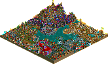

A huge thank you to Coaster Ed for writing the Spotlight review (wow was it long!) and Cork for ruling it Spotlight minutes after opening it.
I can't wait for everyones feedback and hope you all enjoy the park.
Kumba
Corkscrewed Offline
Congrats, Kumba! That quote sums it up. I loved this park, and while I think your version of your logo sucks (
This is a Spotlight easily, without technicality. And if you'd used better colors, I might even consider this my favorite RCT 2 park of all time.
I apologize for not getting this feedback to you sooner. I realize as a tester, I sort of let you down as this probably doesn't do much good considering the date you indicate the park will be released (today). Anyway, I hope this isn't too late too little.
I must say, this is quite a stunning piece of RCT work you've got here. I truly mean that as parkmaker to parkmaker, you've really done something amazing here. Its by far your best and most defining work to date. There's no question this should be a NE Spotlight and is possibly the best RCT work since RMM (
I have catagorized my review as follows:
1. Themed areas
2. Ride execution
3. Ride/Theme ideas
4. Landscaping
5. Pathing
6. Foliage
7. Colors
8. Workbench
9. Naming
10. Architecture
I've given each catagory a 1-10 rating, with 10 being the absolute best
Themed Areas
In terms of defining themed areas, this park was done very well.
I'll just jump into individual walk-thrus of the 5 themed areas:
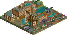
1. I start with the Entrance / Hotel & Casino. Not my favorite area of the park, but there are some nifty details here such as the Kumba's comics store cleverly nestled in the back of the plaza. The hotel is massive and I still find its footprint a bit akward. I'm also not keen on the color selection but the fact that you "cut" into the building and made an actual poker casino is really awesome.
2. Next, I headed over to Dino Digs 2, a wonderfully-themed prehistoric area that is home to my favorite coaster in the park, the steel twister Riparaptor. I just love almost everything about this coaster from design to color scheme, just a great main attraction for the park. There's tons more to see here too, from the Prehistoric Promand with its stunningly detailed shops and clubs to the crazy-hacked Dinolision Derby, not to mention some unique dining experiences; This area really caters to its guests.
3. Continuing forward, I ventured into what could be the most contraversial and highly scrutinized area, Morbid - home of Mt. Morbid. Despite what some might call distasteful ideas behind of the attractions here, I personally find it to be the best in the park. I say that because everything done here is 100% unique, maybe very Kumba-esque, but yet still innovative enough that it will not be forgotton for some time to come. I love the woody here, Nightmare, which features work from the mysterious Toon. While definitely unorthodox, I really do like the strange color scheme that accompanies the strange attractions and rides that immerse this rocky landscape. When I first saw this area being built, I didn't think it'd come together, but it did and thats very admirable. Although I don't quite understand all the attractions (what goes on at the DRC Arena?), it is still my favorite area of the park.
4. Pushing on, I found myself in Land Of The Sand, an Egyptian-inspired area that again is home to a plethera of attractions for all ages. The stand-out attraction here is Mirage, a wildly-hacked mine train adventure ride that holds surprises around every corner. I just love the subtle, yet effective use of hacking here. I had to watch the coaster go three or four cycles before I could catch all the tricks - very well done. The theming here is pretty much the standard for Egyptian in RCT and I would have liked to see more intiricate colors and architecture, but still well done by all means. The only other mentionable is the custom water channel over the pathway - very nice touch.
5. Last but not least was the smallest themed section in the park, Earth's Fury. This area features Armageddon, a B&M invert themed to all of nature's elements . The coaster circuit is quite short, but still manages to pack 3 inversions as it rips around the ravaged landscape. (By the way, you did way bang up job on that station - way better than I EVER could have
Score:
10/10
Ride Execution
I can honestly say now that you are one the best hackers to ever play the game, and this park is clear evidence of that. While there may be certain moments in some rides that you could say are over-hacked, I still think they had more character than detriment. I especially loved Mirage and Riparaptor because they showed two different sides of Kumba. The one that can still build an realistic unhacked coaster design (Riparaptor) and the one that can build a crazy-hacked adventure ride (Mirage).
Score:
9/10
Ride/Theme Ideas
I really can't complain too much about the amount of thought put into virtually every square of this park. I personally find some of the ideas (mostly in Morbid) a bit distasteful for a themepark geared towards families, but we all have to remember this is still a game and practicality has to go out the window sometimes. As for the other areas, the ideas are solid and were executed very well in most instances.
Score:
8/10
Landscaping
Other than Mt. Morbid, I found the park to be a bit flat, but I guess that goes hand-in-hand with the flooded, landlocked type of park this is. I do admit the use of quarter-tile land blocks is probably what saves this from being a mediocre landscape to a decent landscape.
Score:
6/10
Pathing
No major complaints here. All the midways were wide enough when appropriate. All single-wide paths served a specific purpose. The colors, however, are a different story
Score:
9/10
Foliage
Foliage use was conservative, if anything, in this park. It's even sparse in Dino Digs, which had a very jungle feel about it. I can't really complain about the lack of foliage because I don't think this type of park really needs a lot of it, so whats there serves the park well.
Score:
8/10
Colors
Well, you know I've had a bone to pick with the colors in this park from day one and still feel that way now. I don't what it is, but I think every color scheme in this park (with exception to Morbid) could use an overhaul, but thats just me talking. It's not that the colors you chose are bad, they are just very Kumba-esque, which at times can be ugly.
Score:
5/10
Workbench
You've really proven yourself to be quite the custom object designer with this park. What I love is how you innovate new objects from old ones to bring RCT2 to the full 1/4-tile and 1/8-tile glory it deserves these days. Lots of goodies shall be had from this park.
Score:
9/10
Architecture
My comments here sort of go along with what I said about landscaping. The park felt a bit "flat" in terms of architecture, but again, I think its focus on catering to its guests more than makes up for it. There are some highlights worth pointing out, such as some of the wonderful architecture in the Prehistoric Prominad area, not to mention all the stadiums, side shows and sculptures strewn through out the park.
Score:
8/10
Naming
Spelling aside, no complaints about the naming conventions used throughout the park. I also think you did an excellent job in making sure everything is labeled with appropriate signage. It makes so much more sense when I'm looking at something if I know what it is. Well done my friend.
Score:
9.5/10
Overall Score
81.5 / 100
Thanks again for giving me the opportunity to test the park (although not much testing now). I enjoyed looking at it. My hat goes off to you for creating such a stunning peice of RCT.
I'll re-post this on NE when the park is released.
Hit me up sometime about PT3 judging.
Later
Jeremy
anyway,
"the creatively is un-matched by just about every park out there."
look _k_umba,
just from the overview, i can tell you have no idea what creativity is to begin with. i mean you can't even spell it right.
i don't really want to argue with you about it. you're just too primitive.
not going to download the park. it's not worth it.
*
(kidding, posix
*
This makes me want to go buy RCT2 and load it up again... and I just may do that, Kumba.
Edited by Valp, 28 May 2007 - 04:13 PM.
Edit: I hate it
Edited by JJ, 28 May 2007 - 05:07 PM.
Anyways, congrats and this park was certainly deserving of spotlight.
Despite some flaws that some other members have stated, it doesn't even matter because the park had so many brilliant details and hacks that it more than made up for it. It had a truly unique atmosphere and the entrance area was awesome.
FK+Coastermind
Hold on thats like the third time I have heard that...
I did not judge the park for spotlight.
Cork did and Ed did in place of myself and iris. Hell iris even looked at it at a glance and said he thought it was a spotlight. So thats how I won, tho I will admit if it got SRU or RU id have made it a spotlight just coz I can
And Posix, im not even that mad. I find it sad you can be so pissed over this and I don't want a fight . I hope you do look at the park, heck there is a staff member with your name...
Im looking foward to more comments and will follow with my own when the time is right.
Congrats again on the achievement.
Man, what a creativity and ideas in here and so skillfully executed....
Last hours this topic did not allow me to make a reply in it (is repaired now), it now is around 02:00 am here and I am tired as I had a tough day.
So I will give a longer comment on the park tomorrow, and for now I will just quote the last sentence I wrote to you after testing the park:
(from some things I read I think you did not do the last thing.....but I'll forgive you
Emergo
inVersed Offline
I dont think any RCT park has held my attention as much as this one.
Great work man
Jesus Phil. All your posts are so boring and predictable these days. "I hate you, Kumba." I hate NE." "Why am I here?" blah blah blah
At least throw us curveball some time so you will be an entertainment again. Past work aside, you are still the most annoying little prick at this site.
Anyway, with that said, this looks like a great park Kumba. A fitting end to your rct solo career. All your best qualities seem to be put together in this project so well done with that. Sadly I won't download it either as rct2 is against my religion (actually I just took a peek at the time it would take to download on dialup lol.. it wasn't pretty