Park / Dimensions: Realms of Creation
-
 28-May 07
- Views 23,856
- Downloads 4,331
- Fans 12
- Comments 123
-
-
 87.50%(required: none)
 Spotlight

5dave 90% no Cocoa 90% no Liampie 90% no MCI 90% no Poke 90% no Sulakke 90% no Fisch 85% no Stoksy 85% no Xeccah 80% no geewhzz 75% no 87.50% 0.00% -
12 fans
 Fans of this park
-
 Full-Size Map
-
 Download Park
4,331
-
 Tags
Tags
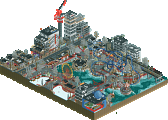

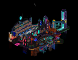
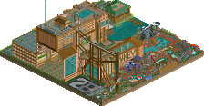
Excellent park Daz, i bet you $100 this isn't your last solo though...
oh, posix- i agree that a forum is a place to post opinions and shit, but i still find what your saying a bit sad and pathetic.
-X-
So let me just say.. WE ALL GET IT . You're unhappy with the way the site is run and much of the way rct is played these days. That doesn't mean you can bash everything here and act like a jackass. And don't insult everyone by saying you hate the site and coming back every two weeks to grace us with your sunny presence. And stop playing the victim when people call you on it.
You're very smart and can be very helpful but for god's sake... understand that you need to be a little more constructive than this. Or if not.. just leave. It's not that hard. Go back to that life you seem to find so much better than here.
Posix doesn't have to explain his opinion. If he did, he'd be saying something he already said before. That you guys read before. And by the importance you're giving the matter: You've even learned it be heart. Especially the response; what posix says is no good. Why, please tell me, should he explain it?
And if he tells you to look at my post, that puts into words in a nice, respectful manner, why to some people this park isn't all that and some more, why is that wrong? When one person posts a big, positive review, and the next says that he couldn't agree more, i've never seen a person question that. So why do you guys question it here? I've got next to nothing positive to say about this park but went out of my way to explain it, doesn't seem like a bad reference point if phil agrees, no?
As usual, you have shown that you have a large source of inspiration and
drive to build something like this. I've seen it during construction and
can say with complete confidence that towards the end of your building of
this park it was not rushed nor suffering from a comparative lack of
quality. Tons of fun little things everywhere, this park has good repeat
value. I did not observe anything I thought to be an rctypo, your
attention to details has probably been the cause of this.
However, while you have these little details all over the park and
improvise with the given materials with great finesse, in the end you
still have a park with five different lands surrounding a lake, sound
familiar? The beginning and ending of each land is signaled by a change
in path and a big sign, and all your coaster stations are basically the
same design. The park has a very standard layout that clashes with the
spirit of the delightful quirkiness of the park, and I would much prefer
you change the layout rather than your building style.
The thing that draws me to theme parks most are the rides, no question.
Your rides are like your park layout; they are standard. They've been
done before and fit much better into somebody else's park than this one.
I hate to say this but it seems as if you have improved in the detail
aspect so much that your ride designing skill and creativity have not
really progressed along with it. You have the B&M looper in the dino
section, the mine train with the intentionally glitchy track, the standard
invert with, etc. Even the woodie that toon helped on seemed just like
another over-helixed woodie around some tall steep mountains; I did
appreciate that the train came nearly to a stop before the big drop but
other than that it was a lot of helices, over and over and over again.
This comparative lack of ride and park layout creativity again clashed
with the park, and honestly because of that I would not rank this above a
super runner-up. I encourage you to work on your rides, maybe just
coaster layouts in general with no theming or supports or anything, go
back to basics. I do this myself all the time because I feel that the
rides have to be there for guest to want to come to the park.
I love it. I really think you've created something special here Kumba, every little detail i stumbled upon kept me looking at this park for some time. That's what i love about this park, the quirky details and the ideas you had. That and the fact that you had the balls to put these ideas into practice. The casino? Genius.
Love this park, probably my favourite of all time. A good way to end in my opinion.
Oh, and the spelling? Wow.
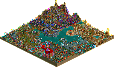
As promised yesterday, a longer comment on DRC now:
First off, as I said in my tester-review: I am not going to really comment on the quality of the coasters, as I am a nitwit on that myself and others for sure can comment much better on that. (yes I know, really time I seriously go pick up studying them.....
Entrance area:
Very attractive colourscheme here with that brown and red. And lovely little buildings with beautiful details, without being overdone.
The 3-d map of the parkmakers workshop is a real found! (I'm sooo jealous I've never thought of that myself!)
The shops here, like Kumba's Comics and the Marble Megastore are gems on its own:I have to remember there is a screen between me and this park, otherwise I would enter them right away because they are soo inviting!!
Though I love the giant poker-palace-hotel as a structure, I think in fact it is too dominating and out-of scale for the area (and may be for the whole map), but the way it is worked open at the other side to view all great games in there, as well as the other facilities up and around it, fully make up for that. Also a great way how you used the structure as one of the many ways in which the height-difference between this part and the surrounding ones can be traveled between. All the other lifts and elevators to do that are amazing also!
The way you used track-parts here -as well as throughout the park-, makes me take my hat off, sir!! I am not such a lover of "trackitecture" in general, as I rather often get the feeling it is just being used "just to be used" while it does not add at all (with some great exceptions of course!), but here I stand amazed at the subtleness and usefullness of it: look at that beautiful trellis around the food court, and the perfect lockers made out of wooden track....!
Dino/prehistoric area:
normally not exactly my favourite theme, dino's. But wow! What a surprising, believable, beautiful,consequently solid and great area you made out of this one! Again with so many amazing and fitting details like the area maps in style, the bone cage dancer, the custom made benches and lanterns (most parts have custom made benches and lanterns, all fitting to the style of that area)and, and, and........
Loved the dining rafts as well as every other ride from the Riparaptor to te Reptile Rally, icluding all their fine facitilies to whatch and enter them. If there had been some more dino's close to the Bone Runner kiddie ride, this one could even have served as a giant "wooden trim" to keep the dino's inside the area (which I first thought was the use of it, lol!)
Looking forward to eat in the rafts or at the Dino delights & bbq with its roasting spit (!), once your faq enlightened me on the use of the camera's there......first I thought we had to eat there with a camera on our heads and over our plates to watch what we where doing and I decided to never set a foot in there, LoL!, but now I know these are only handy feautures to order my food I won't hesitate to fully enjoy every corner of this great area!
Mount Morbid area:
Probably I'll be the only one, or one of the very few, but I think this is my favourite area.....though it is really hard to choose, as the other areas are so good also....
Silly, in my own parks I'm not easily tempted to use these kind of colours (though I sparsely used some in AIW as they fitted the theme), and I cannot imagine being easily tempted to do a "horror" theme or a "disgusting" theme....but I spent ages in this one.
Why?
Well, the skillfullness of course to execute ideas (but that is in the other areas as much), so I think it's because it just gave me so much FUN......I experienced every idea here like a kind of well executed caricature, like reading a comic stripbook and nearly laughing to tears as well as awing at the ideas and the way they are presented and coming to life .
The huge coaster with its landscaping and theming fits in like a glove,(again, to "judge its quality" i'll leave to others, but I would like to ride it...) and I can only think: "this is fantasy made come true" . And that, in any form of art/expression is a thing I thoroughly enjoy as well as highly admire.
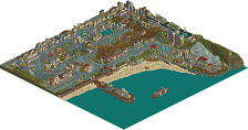
Valley of sands:
I can only agree with Coaster Ed that this is one of the nicest executions of a sand-part I have ever seen. Normally I tend to find them rather dull, whatever is tried. But this one I would linger in for hours, around te atmospheric boats, riding the free fall, bargaining at the beautiful and utmost believable shops and stalls and maybe even riding Mirage....loved the hacking of that one into such a worn and nearly broken-down ride, but as I said before, in some places it looked really broken down and I would be scared (women, yes, sorry, LoL!) if this ride could still be working so that I at least had a chance to come out alive..........
Anyway, a great and amazing area. (taught me why I never dared to do such a sandy one, as while I am not so often in lack of ideas or seeing possibilities, I have completely overseen many of the ideas and possibilities you have seen for this one and executed here with such a great result.....)
Earth's fury:
Beautiful lava, rain-and-thunder-thing, very nice and impressive station, great touch the cracks in the road, and lovely, that test-center I had not seen before on the small isle!
The food court, themed to disasters of nature, is ace again!!!
Just reading Phatages' comment somewhere above: I do agree with his saying that the layout (those different areas around a lake) is far from being spectacular and just "the old solution", which a majority of older spotlights and an endless row of other parks do have; this however does not alter my personal conclusion in any way:
Thank you for making this, congrats again on a park I so thoroughly enjoyed and imo is doubtlessly worth a spotlight.
Emergo.
I think the reason why everybody jumped on your post is because you didn't exactly just post your opinion of what was happening in NE. You made it personal - and to some degree, unnecessarily hurtful - to Kumba. There's saying you don't like something and there's also saying you don't like somebody that something came from and your post reeked of the second. You can express an opinion without having to tell someone else their work is "worthless".
For what it's worth, Kumba, I'm going to download your park and it'll be the first thing I've opened RCT for in ages. I haven't even thought twice about entering the Pro Tour, much less find the time to download all the entries, but your park made it immediately to the top of my "check-it-out" list when it comes to online stuff.
Thanks for keeping me interested in NE.
100% agreed.
This topic is about a park that won spotlight and not what Posix thinks of it. So from this point on if you want to talk about that have more to say about my park in the same post or start a new topic, otherwise your post will be deleted no questions asked.
I'll get around to my replies to everyones comments soon, I promise.
And not to nitpick or anything, but on the download page, shouldn't it be "Hyperbaric chamber", not Hyperbolic?
Also, Kumba, I realize you were super excited about your park, but you should have let Corky post the topic, so it didnt seem like you gave yourself a spotlight, even though thats old news and everyone knows you didn't do that cause that has already been talked about.
And finally I think everyone is over-reacting to the posix post. Its no big deal IMO.
Also, I fully support Posix in this matter. Viva la Resistance!1
"...wtf? Most creative ever? Conceit!"
*reads the posts in topic*
"...yyeeaaahh.... drama."
*opens up park*
"..."
*reads the readme*
"....ha, butchered english, how CREATIVE."
Cork - Colors, yeah you have bugged me about them all the way through... well I just am not to picky or sensitive when it comes to them, so I just do what I think looks ok. Thank you for the feedback you give me after seeing it, what was really cool and you had my on pins and needles for a second with all that "I guess it's time for Super, Superduper, but not a spotlight RU"
JKay - Damn thats one hell of a comprehensive review! I mainly agree with your ratings other then on naming (I would only have given that like a 7), colors I don't want to get into that much, but imo they don't matter that much and I have seen real buildings (even a casino) with the same colors as mine. Thx a bunch for that huge review, better late then never
Lucas92 - Thx, gl with your big solo if you do it
Jazz - Thank you, it's nice being able to pull ideas and hacks out of my ass
FK - Thank you for that feedback. I want to point out that with the architecture in the park I was mostly experimenting. You know how just about everyone builds a wall frame, slaps windows and roves on it and calls it a building? Well I wanted to avoid doing that and create them piece by piece with 1/4 blocks. I think I did 90% of the buildings that way with exceptions on the casino and parts of DD2. Honestly I think I might go back to walls and roves next time I build, but still add 1/4 detail around them. Oh and FYI I set out to do the land of sand with no walls or roofs at all, just canvas and poles and I was very happy with how that turned out.
Inversed - Thank you, comments like your mean a lot to me. As far as finding all the details goes I know people don't have time to get them all, so I will be making a guide with pictures sooner or later. I was going to release it with the park, but that would kinda be a spoiler imo and the park would have ran past my deadline.
JJ - Do you need to be so nasty about it? If you dislike the park thats your opinion, but I have yet to hear any real reason why you feelt that way, but I guess it's hard to see it through the puke? lol
zburns - Thank you, I am glad that you admire the park for what it is. Dishes of Disaster was a pretty simple idea that I just banged out in 2 days, but somehow turned out way better then I pictured, which for me is very rare as I hardly ever even make anything as good as the picture in my head. Also if you liked Dishes of Disaster then you should really be bugging me to finish my H2H4 park with Xcoaster as that really captures the spirit of that park... well my parts of it anyways.
WME - Time for one of my famously bad analogy's: Dimensions: Realms of Creations represents my ass. The principles of parkmaking represents toilet paper. I think you can figure out what happens next. I am just an outside the box kinda guy and make my own rules for parkmaking (or lack thereof...), so I can understand how you can dislike a park that goes this much against the grain. Don't worry, after that post we are still drunked AIM buddies Mark
J K - DAMN, thats what I call feedback, lol. You really pick up on the smallest things, yes I did add the Diagonal piece for that reason on the mini golf. I am glad you and others like the station on Riperaptor, but imo it's was just a pile of stuff I did while listening to a book on tape and flying on auto pilot, but imo my station buildings always suck so I just let it go. It does look like the morbid area slapped everyone with a big fish. I mean you want to dislike it right? but there is just so much stuff thats impressive no matter how it's done. I like giving fish slapings. Thx for the comments on mirage, but I still feel it was a bit of a let down as a classic hacked coaster. I was hoping to do at leased 3 "new hacks" with it, I may have got one with 3 cars in the same set all getting power lunched (that was tricky) and the screwing up of the track tho rarely seen is nothing new and just a trick MA told me about. Anyways im glad you and most people seemed to like it. Yeah Tsunami was kinda a letdown. I love the frame I did and how it is set on an underwater track, but I just never got a good ride out of it, just a decent frame. Thank you for all the feedback J K, I really enjoyed reading it, infact I liked it so much consider your solo a Spotlight... and all I have seen is screens
gir - Please don't submit anything for spotlight, design or an NE contest ever again. With a silly avatar like yours I won't even look at them. Now, I was joking, but the point is it's not fair to judge a book by it's cover.
ACEfanatic02 - I wish I know what you were talking about but seeing as I am effected by whatever error is not letting people open the read me I can't look at it. That's really weird considering I made the damn thing... can someone please copy the text and send me that? I would like to see it again.
Gwazi - My careers is over? news to me... Thx for the comments, I am looking forward to more when your awake :-p
tE - Shit I forget what > and < mean when the board of college of education forbid me from ever going near math again... thx for the feedback that I can't understand
Geoff - Bone Runner (sorry the name sucks, had to keep it simple coz kids are dumb, lol) is a steel tracked coaster with trim to make it look like a wooden coaster. I was inspired to do that from Gemini at CP and a few other coasters. Now one thing that has bugged me in a few comments is calling the sand area Egyptian. There really is no set theme as I avoid building after real places but I was going for an Arab look kinda from the picture in my head of how the Harad people from LotR might live (no idea what it could be and id rather my picture of it then knowing for sure). Great feedback, thx man.
Levis - Is that all you got? With feedback like that im leaving you in that game
Xin - I wish I knew if fucking was awesome... thats now higher up on my list as #1 thing to do as #2 was to win NE spotlight
X250 - Stop calling me Daz! Saz, there, how do you like it?
Phatage - One day your going to make the park to end all parks. I really enjoyed your feedback and agree with it. I should have been more adventuress with the rides and maybe the parks layout aswell. Whatever I make next (expect something, im not retied yet people) I intend on using my ideas to create a great ride that is not of the norm. I have a kinda standard layout I follow when building and this park uses it to and I am sorta in the same comfort zone I have always been in when building. I plan to try to more out of that with whatever the next thing I make is. I want to really push things and match the amazing parkmaking I can see in my minds eye, which I still don't think I have ever done.
Lloyd - Out of all the comments I have had so far this one means the most to me. I could not really say it and jinx myself, but my true goal with this park was for it to make at leased one person decide it's their favorite park ever, not best, but favorite. So thank you for... well, almost saying that
Emergo - Amazing feedback, and with 4 fingers on your "weak" hand! I have said it before your insane
Trajan - Nice to know my park will get you to open up RCT again. I am looking forward to any feedback you got.
ride_exchanger - Honestly I don't even know exactly what either are I just kinda assumed id assume I know what it is and you would all assume that I assumed right
This is the first NE Spotlight we have had since I have owned NE and just so happens to be my own park. None the less I expect all NE Spotlights to be treated with a little respect. So far I have been happy with how this topic has gone aside from the response to Posix' comments where I have made myself clear. I intend to enforce iris' old "60 posts per Spotlight talk topic" and this means that until that is met another spotlight can't be posted. This topic has 55 replies, but im gona call it 45 due to the replies to posix's mood. Don't worry we are well on our way to 60 and I don't expect another spotlight for a few weeks
So anyways that my feedback feedback. I am looking forward to more replies, especially from some of the parks testers I still have not heard back from.
Well this reply took me 3 hours... gona go passout now...
Kumba
My major problem with this park was that, while fun to look at, the themes just had no depth to them imo. Everything felt like it was meant to impress on first sight and as I finished looking at one area I always felt like it was time to move on and not linger... unless it was to find just one more small detail. It's the type of park I'll open go "that's cool... that's cool.. that's really cool" and then shut it down and open it back up a week later and go "that's cool... that's cool" etc.
And from all the screens you showed I just wasn't expecting quite so generic of a layout (as mentioned by many above). It's hard to tell how much of a difference it would have made if the layout had been different but it did throw me a little when I first opened it.
All the coasters were average and most were pretty generic as well which was kind of a bummer. A lot of thought went into the custom rides but the coasters felt like they were there because you wanted some coasters in your park. Even Nightmare just wasn't that interesting and at best felt like you were trying too hard to make it feel unique. Mirage was a sort of "hey.. look at what I can do" kinda ride and I can respect that but it still wasn't really very interesting though, because everything on it had been done before (Daemon anyone?).
Overall a very fun park and it seems like you had a great time making it, which is the most important thing in rct. The crazy colors and overload of ideas kinda make it a park to be viewed in short bursts but that's to be expected since it's made by you. I really wish you had been more adventurous with the coasters though and maybe the park layout. Would have really helped develop things.
Spotlight worthy?- yes
Most creative park ever?- no
Congrads Kumba.
Earth's Fury: Very small but unique area. I like the way it reads as kind of an exhibit, especially where you list off all the facts about different disasters and have a research facility set up. I think that makes the area significantly better than if it had just been random disaster themed rides because it makes the theme deeper. I just love the techtonic plates shifting, that is probably one of the coolest little display things in the park. The two rides in the area are fun to watch, if not a little cramped. The theming along them is top notch, particularly the mud slides. I really like how the chemical spill seems to blend right in and the broken pipe is very well done. My favorite part of the area though is the food courts. The names are cheesy as hell, but I love it for that. Just excellent job of carrying the theme out to every aspect of the area.
Valley of Sand: Far and away the best area in the park I think. Probably one of the best jobs since Erwindale of creating and developing a fictional place. It doesn't read as just another desert theme or something like that, but rather its own unique entity. The canopy structures are used very well throughout, and all the devices really complete the area. Mirage is a really nifty ride, and the fragmented track really adds to the overall aesthetic and believability of the land. The maze I am not completely sold on, just not enough stuff of real interest to hold my attention for too long. Overall just a very fun and enjoyable area to look at, it feels free from the normal constraints of rct parks and looks like you really just had a blast making it.
Mount Morbid: Just a crazy theme idea and you pull it off very well. I really actually like the color choice for the area because it is so far outside of what you would normally expect from a morbid area. That alone changes the tone from something dark and bleak to something wild and adventurous, really making the area stand out. Spiders, tapeworms, strange bugs, the little spider in the web... all the details really make it a joy to explore. The landscape even has scabs. The area as a whole feels like it was well thought out and developed very outside of the box. Blender is a great idea and very well executed. The little midway is also a nice touch, particularly the guess the number of skulls cage. Overall just a very refreshingly different area.
Dino Digs: Everything I know tells me I should absolutely hate your color choices, but for some reason I like the effect. I have a bigger problem with some of the forms, which look a little too generic and under developed. The coasters are good, but don't do a whole lot to feel particularly interesting. I think they suffer from trying to cram too many rides into too little of space, none of them seem to have enough room to breath and stand out. The derby is crazy and a lot of fun to watch, but it took me a minute to figure out what was going on. Again the little details steal the show. The jungle gym leading to the kiddie coaster is really cool, along with the bone supports on the main lift. Club Rex also has a lot of nice little details.
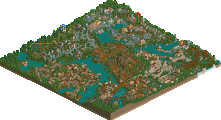
Overall, the park is definitely spotlight worthy. So congrats on that one. Looking at it you can really feel your enthusiasm for building it, and tell you really threw yourself into it. The little details everywhere make the park truly stand out, but the way they come together as a whole is what is holding you back. Each area does sort of have the feeling of being a little too random because of all the details. The themes just don't completely mesh as well as they could have. But you have a style that is incredibly fun and inventive. You probably hurt yourself a little with the whole most creative park ever, but I don't think it is a completely unfounded claim. I'm not saying it is or isn't, but off the top of my head I can't think of another park that has themes that stray so far from the norm, with the exception of maybe WOMB. It may not be a creativity in the rides, but the details more than make up for that. Anywho, a fun park to look on and a job well done Kumba.