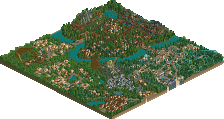
Park / Disney's Phantasia

153 Comments

  • the_legacy%s's Photo
    It is a good park, personally I do not think it is as good as tilted acres. I have no idea why that park is not near the top of most peoples lists.

    By the way why are you experimenting on your last venture into rct2?

    Anyways congrats on another well deserved ne spotlight!
  • laz0rz%s's Photo
    I don't know if I can say it deserved spotlight. The black flat roofs were very repetitive and almost all the rides were inside. I guess I just don't like Disney parks as much as other people.

    (450th post!!! :))
  • John%s's Photo
    The focus is supposed to be on the facades of the buildings - think of it as an actual park you walk through.
    You're not concentrating on the gravel roofs that you can't even see.
  • Meretrix%s's Photo
    Experimenting on my last park was kind of an "accident". My FINAL RCT2 park was supposed to be the PhantaSEA park, but because RCT3 will be out shortly, I thought it best to hold off doing that park until the 3rd game came out.
  • iPark%s's Photo

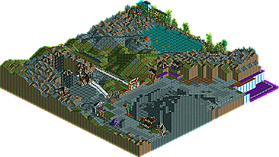
    Thanks for all the comments, good and bad. I said it before, and I'll say it again, this park was an experiment. It was intentionally darker and more brooding. It wasn't meant to emulate the "Disney Magic" that is found in Magic Kingdom parks, but rather the darker side of that magic. I am a little confused about the landscaping on Bald Mountain comments. Has anyone seen the film? That mountain is black and on fire. Oh well, can't please everyone. As for me, I think it was the perfect final RCT2 park to create in my "RCT career". Now I just have to wait until part 3 comes out, so I can begin "Walt Disney's PhantaSEA Kingdom".

    The darker side idea was kind of interesting; I just still haven't made my mind up about it..

    And I've only seen parts of the film (I really hated it). I just thought that in the park it stuck out.. A big flaming black mountain iss a bit too extreme for a Disney park, maybe?

    Anyways, still an extremely interesting park :)
  • John%s's Photo
    'Trix, I'm not sure if I would bank on RCT3 being something which a Disney park of this calibur could be pulled off in 3D. We still don't know how customizable architecture and theming are. It's a gamble either way - you could start it and find out RCT3 is customizable, or you could wait and it might not work.

    It's a 50/50. :p
  • Valp%s's Photo

    Spotlight Talk
    The coveted New Element Spotlight gets it's own discussion forum. Talk freely about what you thought of the Spotlight. Is it the best park you've ever seen? A huge disappointment? The worst spotlight ever? Or was one of the Hidden Parks better? Come in and speak your mind.


    disappointment

    Perhaps.

    Or should Phantasia be called a Hidden Park?

    Time will tell; 65 replies, 8 about the park itself.

    EDIT: Sorry, I was a little... not feeling great when I posted. Yeah...
  • Disney Freak%s's Photo

    Experimenting on my last park was kind of an "accident". My FINAL RCT2 park was supposed to be the PhantaSEA park, but because RCT3 will be out shortly, I thought it best to hold off doing that park until the 3rd game came out.

    I'm anxious for your debute RCT 3 park!


    BTW, why weren't there (themed) dark rides? That was a real let down! Not complaining, just wondering since it was such a wonderful feature in Tilted Acres!
  • yeshli2nuts%s's Photo

    im in the same situation youre in.  at first it said i needed the spider ride so i downloaded it and now it just says invalid data.  no one on this site has access to a place where you can upload a 23 MB file?  SOMEBODY has to be able to do that and then just upload the whole park and make it a hell of a lot easier for all of us.

    i guess no one read or wanted to acknowledge my last post so, here it is again. can you just post a list of all the custom rides you used? will someone please help me out? :'( :'( :'(
  • Coaster Ed%s's Photo
    I found HPSHBall.dat -- it's "HP - Belinda's 1001 Balloons Shoppe". The link to download it at RCT Depot isn't working though so somebody who has this could help some of us out by uploading it and posting a link. Thanks. :)
  • Ride6%s's Photo
    I'm one of the lucky ones who managed to get it to work after spending about two hours downloading custom flats. I must say that I love the enterence, it's better than the diagonal one on DTA and compairable to the absolute best ever made. The rest of mainstreet wasn't too shappy either. It just all begged for some music to enhanse the mood. As it is I'm not sure if I should tap into the lighter or darker emotions expressed there. The facades were perfect, the best ever made in RCT. The only other portions I really liked were Discovery Bay (Corky, why wasn't yours this good. ;)) and the 2nd enterence spot. Otherwise there were some high points here and there but for the most part it was really too dark for Disney. I didn't care for some of the custom sceanery you chose to use in those area's either. I just doesn't fit into the game, at all.

    A nice park but a dark one. Personally I can't get into it, just like I can't get into the trippy pitch black movies of Phantasia.

    ride6
  • Meretrix%s's Photo
    Anyone who can open Phantasia and would like the music files for the park, just let me know. I have the Sorcerer's Apprentice song for the entrance plaza, and the Monorail, and I have the score for Bald Mountain as well.
  • yeshli2nuts%s's Photo
    well after download EVERY SINGLE CUSTOM RIDE from that link on the first page, i got it to work. i wasnt that impressed with the park. it didnt really look like a disney park should look. i couldnt really see distinctive themed areas and i thought as a disney park, it was too small. i know many will disagree with me but i think Disneyland Resort New York by lazyboy970 (May VP winner) was a park that really looked like a disney park should. i just dont think the park was big enough. i mean by the time main street ends, its already almost at the end of the map.
  • Toon%s's Photo
    Well, it worth a try.

    If anyone who could open the park also has a good e-mail account and can send large files, could you please save it with scenery, zip it and send it to m.murchison@shaw.ca. If someone does this, I'll see if I can get it hosted. I have a blank webpage account that is probably big enough.
  • rwadams%s's Photo
    Sent

    Rog :)
  • John%s's Photo

    i know many will disagree with me but i think Disneyland Resort New York by lazyboy970 (May VP winner) was a park that really looked like a disney park should.  i just dont think the park was big enough.  i mean by the time main street ends, its already almost at the end of the map.

    I think I'd be the first to disagree.
    Disneyland Resort New York was different from Phantasia - of course a resort style RCT park would be.
    I'd agree that the resort complex itself was realistic and "Disney".
    But other than that, it was severely lacking in atmosphere, architecture, theming and rides.
  • Geoff%s's Photo
    I thought this park was excellent.

    The architecture, and facade decorations are what really created the disney atmosphere. The castle was breathtaking, and I love its dramatic effect you created using the waterfalls.

    Although your scenery selections, and architecture are amazing, the landscaping just didn't do much for me. It was way to rocky and "edgy" for me, and didn't seem to flow. For example, the tarzan ride would have been nicer if it went under waterfalls, and the landscaping was broadened out a bit more. It seemed really boring with it just swinging around trees, it seemed so bare.

    But nonetheless I thought this park was incredible. You restarted the park over and over, and to keep going just impresses me. Thanks for this wonderful addition to the site. It really is a whole new innovation to all RCT disney parks.
  • Meretrix%s's Photo
    Thanks for that dragonfly. The reality is......you will either like this park, or it will be a let down. Frankly, I think that most things truly innovative take a while to "grow on you". I'll point to Tilted Acres as an example. The response I got from the first screens I showed of that park were very negative, some of them even downright mean. It's OK, those of us that innovate (and there are some amazing innovators at NE) are bound to get beaten up now and again.

    Someone great (and I cannot for the life of me remember who at the present moment) once said, that in order to succeed in a grand fashion, you must be prepared to fail in a grand fashion (something like that, I'm paraphrasing here). So, I give you a new spin on Disney. You may take it or leave it. You may have opinions on how to improve upon it, etc. But I will say this, as my final departing thought regarding this park, and RCT2 in general....I will not be surprised to see people copying, emulating, being "inspired by" this park, in the not too distant future. After all, look what DTA started. ;)

    Peace Out.
  • Ride6%s's Photo
    Yes and if DTA hadn't sparked such a response I think this would be more impressive. You still schooled everyone on how to build facades and Disney archetecture in general. I just don't really like much of the park. I *love* Discovery Bay though, that whole area is beautiful, the colors and textures blend beautifuly. I just can't go for Holloween Town or any of the other dark bits larger than, say, Phantom Manor. If the darkness was restricted to that then it would be easier to handle. DTA had the brightest and cheerest of all RCT "Disney" parks and this has the darkest. Two very different parks on the opposite ends of the color/atmosphere range, congradulations.

    It's all good.

    ride6
  • iBrent%s's Photo
    Yes.... once again, PLEASE... SOMEBODY who has the HPSHBALL/00000000 ride file, PLEASE upload it somewhere.