Park / Baiht Oashyr Vel Thalloo
-
 06-June 05
- Views 11,208
- Downloads 2,660
- Fans 3
- Comments 53
-
-
 83.75%(required: none)
 Spotlight

][ntamin22 90% no 5dave 85% no alex 85% no csw 85% no Liampie 85% no MCI 85% no Poke 85% no Cocoa 80% no G Force 80% no trav 80% no 83.75% 0.00% -
3 fans
 Fans of this park
-
 Full-Size Map
-
 Download Park
2,660
-
 Tags
Tags
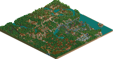
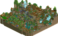
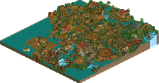
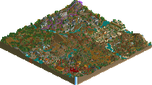
Very nice ideas...the Cronk Luma area was spectacular.
The War of Worlds area was a great idea that was well executed...although being slightly unrealistic for my tastes. The trackitecture was good, but there was almost TOO much of it, but I know thats been ur style forever, so I'll leave that alone. The Breeding Grounds and Galastro areas were nice, and I especially liked the foliage in Galastro.
Nice entrance as well...reminded me of Audrix but brighter.
There is such a revival of LL at this site! I love it! Fatha's park is coming, Prince's park... Tracid's that is looking nice... I'm really liking it.
Oh and for you guys who don't have LL...go buy it right now. Or just download it from bt.
It has nothing to do with other parks. If the park is Spotlight quality, it will get Spotlight, regardless of what other parks were submitted, that has nothing to do with it. We don't get enough parks nowadays to turn down Spotlight parks because of what week they were sent in. Quality comes first, and if need be we'll line Spotlights up. Twisted's park fully deserved it. Regardless of what other parks were or weren't submitted.
The amount of detailed put into this was amazing and the bridges and invert really had my jaw dropping, spotlight for sure.
Congrats, wish i could give a better comment but im not too "clued" up in the rct1 side of things.[/font]
Maybe I'll post more in-depth comments about it later, but i really must say i'm not as impressed as most other people with the park. I thought the coaster layouts were mediocre, and old fashioned. That's how i felt about the whole park, really, old fashioned. Sure, some of what irsi calls trackitecture is nice, but the feel of a dark park with dense foliage reminds me of the days natelox churned out one ugly park after another (thank god he's not doing that anymore, but a release would be nice) It never felt immersive, and i never had a clue towards what the area was trying to be before looking at it very very closely. That's why the middle area is the best, because its themed. The rest is just so, not themed. I don't know, i'm blabbering, but i was just not impressed by any of it. I did enjoy looking at a spotlight, again. Congrats Twisted!
I really loved the invert area. Beautiful ride, and atmsohphere.
Nice job.
Unfortunately, the park wasn't quite as jaw-dropping as I had hoped. Compared to some other spotlights, like CoD and WOMB, it felt way under par. Still though, I couldn't see this park being a SRU, as its got that old school spotlight feel to, so I really do think it was showcased properly.
Pros:
-Amazing themes. Each theme was incredibly unique and executed with extreme skill. I mean who would ever think of a Tyrant breeding ground? Really imaginative and creative. Great stuff.
-The obvious, trackitecture, was stellar and shows great resourcefulness to what LL offers for tools.
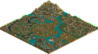
-Map organization. You did a great job at evenly distributing your themed areas proportionally and making good use of space. It really made the park flow well.
-Lots of neat details. I like all the bridges linking the areas. I also loved New Age Ninja's lift hill. That was brilliant.
Cons:
-Coaster designs. They seemed forced and mostly secondary to the theming which really took my focus away from the rides. To me, the coasters should be superior over the theming, and this park was the opposite, but is a common problem I have too. Oh, and some of the coasters were hard to follow, especially New Age Ninja and parts of Lumo Run. I think they ran underground too much and had some really slow parts.
-Foliage. Some of the tree/foliage selection and placement seemed shotty in areas. I mean, it wasn't terrible, but it wasn't great either and a lot of trees appeared randomly chosen to me. Could just be me though.
-There wasn't really a standout or really innovative area imo. Don't get me wrong; All the areas were great, but I couldn't pick a favorite one, which is a con imo.
Overall, I have to agree that this was a weaker spotlight, but I still think its worthy. IMO, the themes and composition made this a spotlight, with everything else at SRU level.
Its a good start to another year at NE and this has now set a good bar for the next LL spotlight. Congrats Twisted!
Basically from the little (15 mins) I looked I can say the trackitecture is amazing, some of the best ever and very interesting. However the park lacks in coaster count imo. I love and will inspect in-depth: Cronk Luma, The Breeding Grounds and Galastro. Frankly I think you need to lighten up a bit. Maybe that's why Cronk Luma just pulls me in. And I like to where hats in summer to,
Excellent park and I'm looking forward to brighter
ride6
Cronk Luma is the best section.
Corkscrewed Offline
LOL at JKay comparing it to arguably two of the greatest LL Spotlights of all time and using that to say it was disappointing.
I know that's not what you meant, but I'm just being facetious. (sp?)
Twisted Offline
Thanks very much for the spotlight and all of the comments.
I'll explain some stuff later as I should be doing some sort of revision right now
And Twisted, I'm intrigued now, what language is this name. And what does it mean?
Corkscrewed Offline
That's what you get for a ridiculous name.
Fatha' Offline
Twisted Offline
Well firstly the name is supposed to be Baiht Oashyr Veg Thalloo (one letter wrong, not bad) which is in manx and means Soggy Sock Land.
Any other names throughout the park I either found on google somehow or just plain made up, apart from cronk which is hill in manx.
Half of this park was built in 2003 as Tyrant Breeding Grounds, Galasro and War Of The Worlds were all either completed or nearlly completed when i first put the park down and left it at the end of 2003. I then picked up the park again a few months ago and finished those areas of and added the new areas.
With parts of the park being that old I definetly feel if I were to re-do those older areas they would be much better but I was too lazy to do that
Something being brought up here is my coasters which I know arn't anywhere near amazing, they've never been something that iv'e been to good at so I concentrated more on other areas of my parkmaking but I'll definetly work on them for my next park.
Fatha: I definetly agree on the coasters as mentioned above and using water to seperate areas, It'll be different next time I assure you.
d4rkj4nu5: I do somewhat agree on what you said about the "future ninja" area. There is a lot packed in especially with foliage. Also it was advertised back in December 2003.
Leighx: yup.
GigaForce: The war of the worlds area was more of an area for me to mess around with after seeing Battlefield RCT, but I liked it and kept it although it is quite unrealistic.
WME: Not quite sure on what you mean on some areas not being themed. About the rest maybe I am just old-fashioned I don't know, we'll see if my next park is any different I guess. It will hopefully be brighter though.
JKay: I think with the trees it may just be that I kind of have favourite trees that I just feel like including in an area which may give you that idea, not sure.
ride6: Brighter things shall be seen one day. I'm glad i'm not the only person who likes to where hats in summer.....where exactly did I put that message? I found my others but not that one
Corky: Bah, I coulda made it worse trust me. Bovernment.....hmmm...fair enough.
Thanks Everyone else for all of the great comments.
Oh, and i'm with Fatha' on that one
Upon looking again I found the only area I didn't really like was the one with New Age Ninja. It's alright but it just has an odd disjointed atmosphere where the other areas seemed better organized and put together. The central ruins area with the inverted is my favorite, it just has a magical atmsophere. Again I didn't look at the park long, only 15 minutes or so but it was enjoyible. What I really want to see is the organized, intellegent, bright colors of Cronk Luma mixed with the amazing trackitecture of say Tyrant Breeding Grounds, for example. Then again I might just be trying to steer you into becoming another Mantis
ride6