Park / Watkins Woods Amusement Park
-
 01-July 07
- Views 32,763
- Downloads 7,101
- Fans 12
- Comments 75
-

-
 86.88%(required: none)
 Spotlight

Coupon 95% no Liampie 95% no robbie92 95% no MCI 90% no 5dave 85% no Sulakke 85% no Xeccah 85% no Cocoa 80% no geewhzz 80% no Poke 70% no 86.88% 0.00% -
12 fans
 Fans of this park
-
 Full-Size Map 1
-
 Download Park
7,101
-
 Objects
412
-
 Tags
Tags
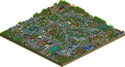
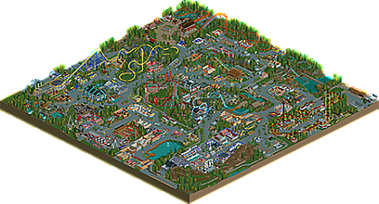
![park_2390 [H2H6] R2 - The Replacements - Tivoli Gardens](https://www.nedesigns.com/uploads/parks/2390/aerialt2133.png)
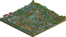
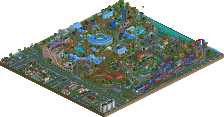
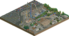
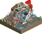
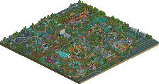
-------------------------------------------------------------------------------
EDIT: I just checked the park out. I thought it was amazing. Everything was very well put together and nothing seemed shy of greatness. I pictured myself actually inside the park and enjoying it. The detail was stright up sick. I never seen a park with sooo much detail and creativity. Another reason why I loved the park is because for once people, there was not ONE B&M coaster. I give you props for that. The insides of the buildings were pointless but yet amazing (It just seemed that there was no need for it but yet it has not really been done before; dont take that in a bad way tho). I thought the Ruby Tuesday was a nice touch as well. I want to say so much about the park but only a little is coming out. I really thought that SF:WoE would be my favorite park ever but now... maybe WWAP (Idk its really close). The CP6 era has begun!
9.5/10.
-JDP
Edited by JDP, 02 July 2007 - 12:50 AM.
inVersed Offline
In all serious though, I thought there was really nothing you could have done better, although I found Airboat Chaser to be a little strange, but that's just me.
And I know a lot of people are going to say "Oh man, no B&M's, that's so realistic!" But still, screw realism, that area around Cottonmouth falls was begging for a floorless haha.
Overall, amazing work man. I know I'll go through this one for at least another hour tomorrow.
-Theming; I understand the style you were trying to achieve didn't contain highly themed rides, but there's almost no theming on the coasters.. Basically what you had was a pretty flawless layout on most coasters (although I prefer higher pacing at some points on some coasters, and smoother bunny humps), but then it was placed in a rather boring landscape.. Parks like RoB, IC DisneyAir and Disney's Shadowlands all had nicely themed rides/coasters that just held my attention longer..
-Atmosphere: Again I guess it's the style you were going for that left no room for more atmosphere.. If you look at Slob's work you'll notice he managed to combine flawless layouts, realistic details and atmosphere in his parks that made it all more interesting and refreshing..
-Peepfriendlyness: I understand there's no point in having peeps in a park where all entrances/exits are unreachable and there are a couple of custom rides, but it just takes away a lot of the fun in viewing a park when there are no peeps at all..
On the other hand there were lots of things I enjoyed and were really refreshing..
-Coasters; With the side note above in account, I did like the layouts... While the Intamin Mega Coaster was pretty reminiscent of Solaris, as Kumba stated, I liked that layout most of all layouts; Smooth, great pacing, awesome support work, good colour-scheme, realistic and a lot of air time.. This area is definitely Spotlight worthy!
-Detailing: When you load up the roofless version you'll notice all those little details that are really what sets a new style in parkmaking here.. Nice use of Kumba's small map things to create the shop interiors.. What I thought was the most awesome 'big little thing' was the arcade hall with all that arcade machinery.. Also all those little details on the rides are great, such as the bobsled part on the flume ride's last turn, and all the transfer tracks (even on the ghost train!)..
-Architecture: Really nice use of the miniature 1/16 tile blocks to create these elaborate architecture forms throughout the park.. Some things like the arches reminded me RFan's style, but it all suited in perfectly and still contained your own style and personal touches..
In the end I think Spotlight is still the pinnacle of RCT parks and the bar must be extremely high in order to say you're the best RCT site out there.. With this park, like I stated, there were a few things that kept it from the upper level imho, but it's just on the edge of SRU/Spotlight..
Maybe if there was more quantity it would've wow'ed me more, but still this is a pretty awesome park and I certainly enjoyed watching it!
Congrats CP6 and I hope to see more of you in the future and don't become cursed now you're a NE Parkmaker
SF
unless a park such as disney or something designed by sa was theming a coaster, it would not be a worthwhile addition to a fast moving ride. nice 'little touches' in theming on coasters do not benefit the riders because they are going by too fast to notice, those details are for the people in the park, on the lines, etc. even then the easiest thing to do and the best decision for most parks is just to have attractive landscaping around the ride. you have to keep in mind that the guests that the coasters attract are there to ride the rides, not to look at the from offride, and the less money spent on extraneous theming on a ride can be put to the next ride, which increases guests and so the endless beneficial cycle has hopefully overcome its 2nd moment
although i do have to agree with you that there was something that didn't keep the attention of the outside viewer, which should also be taken into consideration to some extent, but i'll explain this theory that i've already told the park's creator in my next post
Fatha' Offline
Your best two coasters are probably Fusion, Blaze, and Lightning, simply because they are the only rides that seem to have any kind of soul.... What I mean is, they engage their environment really well...There are a few ways you can do this:
Have a coaster be very highly themed (which you didnt do a lot of)...
Have a coaster have incredible terrain interaction (which you didnt do at all)
Have the coaster engage the peeps and draw them in (which you did).
Have the coaster's layout just be unreal (Which u didn't necesarilly do that much).
Have the coaster be unique and one-of-a-kind (And none of yours are like this, but then again, its extremely extremely hard to make a coaster in RCT one-of-a-kind).
Why is Lightning so great even though its just a shuttle loop? You themed it really well! The stands work, the station theme is neat, and the ride as a while is just fun and exciting. Why was Fusion good? The views you created with portions of the coaster are pretty neat, and i could imagine sitting on a bench and watching the coaster run through its course. And why was Blaze good? Despite its layout being cookie-cutter, its peep interaction is great, and I love the corkscrews over the midway, verry classy.
Now, why were your other coasters so bad? The suspended....well...hmmm....it just has no life, whatsoever...and second it really wouldnt be fun to ride. There arent any real near misses, and some of the treeing and theming seems patchy (that doesnt bother me as much). it also has a poor finale, and I think coasters need great finales. It also prolly would have helped if you made the suspended coaster be more terrain interactive....Go see Ninja at SFMM, that is a phenomenal ride and its not because of its layout, but because of its setting. The Siege? Its good, and i love the barrel roll over the pathway, and its refreshing to see an SLC built in a park....this one i dont really have that many gripes about, but its just didnt really stand out like the others, and it should since it would prolly be a premier attraction in your park. Avalanche? Um, get that out of here. I mean it looks cool and all, but put a real attraction there. I would be pissed if I waited two hours to ride that. Your Miller wooden coaster? Definitely a coaster of two halves....and thats bad for woodies. They are suppose to make you feel outta control, and this one just seems like it teases you in the first half....then lets you catch your breath for waaaaaaaaaaaaay to long on its turnaround, and then just mildly finishes out its course. I understand its old, but the Coney Island Cyclone would scare you to death despite its age....this ride? Its a kiddie coaster. Go look up some of the great old woodies (especially if you want realism) and youll see that despite their short size, they were intense. I can name many...Crystal beach Cyclone, Revere Cyclone, etc etc....the Aeroplane coaster, blah blah blah. I think you failed here, unfortunately.
All ive looked at tonight are the coasters, because really its the first and foremost important thing in regards to parkmaking. If you ain't got rides, you ain't got shit, doesnt matter if the buildings are pretty. If i were to rate your entire coaster lineup, id prolly say its below average. Out of your 8 coasters only about 3-4 of them are good, and in addition some of the three to four aren't custom made rides. Lots of clones in this park, and the ones that werent clones, well most of them werent that good. Prolly give the coasters a as a whole a 5/10, so for starters THAT is what you need to improve on. Theming is easy....its really simple to please people with pretty buildings....making great coasters, thats what separates good parks (like yours) from great ones (like RoB).
Fusion: 8/10
Lightning: 9/10
Rustler: 5/10
Avalanche: 1/10
Miller Woodie: 4/10
Kiddie Coaster: 8/10
Blaze: 7/10
Siege: 7/10
Venom: 6/10
Listen to Fatha' on the Miller coaster. He pretty much summed up everything. Another coaster I would suggest looking at is the Puritas Springs Cyclone (another Miller). And along this line is another big gripe with the park... it's flatness. This detracts from any park, realistic or not. Now I'm not asking you to try to build a park on a mountain chain or anything but I think some sort of shallow ravine would have broken up the monotony of the landscape that makes up this park. Plus it's a perfect place to build an early Miller ravine coaster! (better than a straight out and back which never look good in rct imo) Win-win right?
The suspended was just so flat and boring. What it really needed was some little dog leg out into the forest with near misses with trees and stuff like that. That would make for a fun suspended. And yes, another coaster that badly needed some landscaping interaction.
Siege was a good coaster but felt kinda tucked away in an awkward corner of the park. A coaster like that needs to be more in the open imo.. flying over main paths and such. Still... it was fun to look at.
Avalanche was ok for what it was and I know it's only got so much space to be in but god damn it was short. With a small footprint like that it seems like a Screaming Squirrel custom ride or another launched coaster would have fit the bill better. It was fun to look at... just not much longer than 30 seconds or so.
The themeing was impressive and the interior of the buildings make me able to almost picture myself in that park (a quality of building I love) but as others have said it just doesn't hold attention for long.
My verdict- SRU. It's a fun park and groundbreaking in the realism department but I agree with Phatage... even in realism the outside viewer needs to be considered. I also think you need to consider some landscaping (however limited) for your next works. It would help so much I think.
-JDP
disneylhand Offline
I do see how some people would call that realism, but an X-Car coaster built in a park before a B&M? To me, that's that's just the opposite.
But really, this is of little relevance. Your details made up for it. =)
-disneylhand
Actual none of the 5 parks with X-car coasters has a B&M. The closest would be Drayton Manor which has an Intamin Stand Up Coaster (Plus a Pinfari kiddie coaster and a Zamperla Powered Coaster). Of the others, Dreivliet has a Launched X-car, two Maurer Sohne coasters and a Mack Powered Coaster, Magic Springs has a woodie, Zamperla Wild Mouse, a Miler Kiddie coaster, an Arrow Mine Train and a SLC, Parque de Atracciones de Madrid has an Intamin Invert, a Maurer Sohne Spinning Coaster and a couple of Zamperla kiddie coasters and Skyline Park has a Caripro Gyroflyer, a couple of kiddie Butterflies, and a Schwarzkopf Wildcat.
I've download the park and I'll hopefully have a look at it later today.
Edited by Leonardofury, 02 July 2007 - 04:22 AM.
To the comments, now...
I was hoping some people would talk about the coasters so I could defend some of my decisions. But I'll go through one by one.
JDP: Thanks, glad you liked the park so much. Yes, the no B&M thing was very intentional. Like I said in the readme, I was going for a smaller park that just seems to be getting larger coasters each year. As I mentioned, it's based off Geauga Lake, which has a large amount of coasters, but all smaller in size except for Dominator, the park's large signature coaster. That's Fusion in this case. They also two other large, more technical rides (Steel Venom and X-Flight before they got the ax), which come to my park as Avalanche and Siege.
inVersed: Thanks very much.
zburrns999: What about Airboat Chaser did you find strange? I'm just interested to see your takes on it as that was more of a ride just shoved in that space to be there then anything else. It was kind of a mesh of ideas. And I did consider putting a floorless or flying in the park just as I was finishing the thing, but decided against it. There was a chance I'd do a '2008' update and add one, but in that case it would've been an accelerator, I think. But B&Ms are my favorite coasters to do (and my design strength), so hopefully you'll be seeing one soon!
Six Frags: The only one of those first things I can really comment on is Theming, I suppose. If I had to do it all over again, I think I'd stick with the same kind of open layouts like this... and here's my reasoning: All those parks that you mentioned were built at a higher level of theming then mine. As I've said, a lot of this park is based from Geauga Lake and Six Flags over Georgia, which does little in the way of theming around a coaster besides the station. If you look at something like Dominator, you can see that there's a station, a small amount of path interaction and the rest is just track above a swamp. I think a lot of it comes from personal experience as well. If you look at my favorite steel coasters I've ridden, you can see why I build like this. Millennium Force, Goliath (SFOG), Storm Runner, Raptor, and Top Gun at Carowinds (to name a few) are some of my favorites and have not theming besides around the station. Each has a small bit of path interaction or queue interaction, but that's all you get. The rest is just a ride in a landscape (which in pretty much all those cases is flat).
To the peep-friendliness... I can understand that. In the end, it's just something I chose not to do. I considered going back later and making a friendly version with queues and stuff as guest can still enter this map. By that time, though, I just wanted to get it released and chose not too.
Glad you liked the coasters and the interiors. The arcade is probably my favorite interior as well, even though that was really an afterthought while I was building, haha. As for the transfers tracks, I just wanted to keep it realistic! I've actually noticed since I turned it in that I forgot to finish off the ghost train's one that you mentioned. I don't know how many people will pick up on it, but there are also transfer/storage areas on both the tracked water rides and the rapids.
Thanks for the comments! Glad to hear some other views on things so I can correct and improve for next time (and yes, I'm hoping there will be a next time!)
Phatage: Thanks, and yes, that was a consideration with this style of park, so yeah, that's definitely something I thought about. As for the outside viewer thing, I'll wait till your post, but I can sort of agree at the moment. It's not as exciting to look at from the general viewer, but for someone strange like me that's really into coasters, layout, and stuff, it's enough to really hold my attention.
Fatha: I think this will probably come down to difference of opinions, but I thought the coasters were put together rather well. I'll explain...
The suspended: The landscape was pretty much there first. While I could've altered it, I figured with the generally flat sections of my park that it wouldn't really fit the bill to have any large terrain stuff on there. When you look at the suspendeds of the world, you really have the terrained and the unterrained. And while I love seeing terrained stuff like Eagle Fortress or to a lesser extent Ninja and Big Bad Wolf, this coaster was more along the lines of Hayabusa, Iron Dragon and Top Gun at Kings Island. If you look at this from the standpoint of a park manager, you're trying to put a good ride on a boring landscape. Also, I was planning on adding more trees, but stopped myself in that I wanted to give a clear visual of a lot of the track from the path (like the first dive and turnaround). For this, I'm thinking along the lines of the finale section of Top Gun where it's mainly underbrush. I wanted a cleaner version of that. For the ending, I actually think this sort of does the job. There's the drop before the queue bridge on the topple tower that pushes the ride's speed to the a pretty good clip. There's a final partial helix in a trench, over water as well. When you look at the rides I mentioned earlier, you have Hayabusa with a figure 8 finish. Iron Dragon does have the signature lagoon twists at it's end, but it's nothing any more superior then the first sections. Top Gun finishes with a some turns similar to the first half of mine, which turns out to be a little slower and not as exciting as the rest of the ride. There's also the view from the path and queue line there of this swinging just feet above the water.
Siege: I can understand that's it's not particularly tall (it's about the same as the others), but I designed this for the experience of the inversions. If you look at a park like Six Flags over Georgia, they debuted their Batman clone in 1997. At 105ft, it was only as tall as their wooden coaster from 1973, and shorter then a lot of the other things at the park. What sold the ride was the experience of the inversions and a new style of seating on a coaster. I can understand where you're coming from on this and I gotta say if I had to do a section over, this would be it.
Avalanche: If we take a look at all the X-cars (all 5), the best looking one in terms of layout would be Abismo. This uses the signature piece of this ride type: the Sky Loop, and a little extra layout. I wanted the Sky Loop piece, which on 3 real life coasters have. 2 of them just stop right there. Abismo does more, but not enough to give it a real full-fledged coaster layout. Once again, see this from the view of the park management. "We're running out of room and we need a big signature attraction." The don't have the room/it's not feasible to do B&M or an accelerator or any of the popular trends out there. From the reviews of the Screaming Squirrel, they're nothing special. A mouse is small and not what the park needs. With the space they have in that area, the Maurer X-car is the right choice.
The Miller: This one I'm going to have to completely disagree with you. First, have a look at the inspiration for this ride: Pictures 2 and 3 in particular. Some could say this is a mirror copy of that (and you'd be pretty much right). I wasn't trying to do scare the crap out of people like the Cyclone did, but rather offer a major thrill that will draw families out of the city on the weekends and spend money on the trolley. It's a simple ride that is supposed to appeal to the whole family. The turnaround would have been tighter as well, but I wanted to keep the G-Force down and actually to give a small breather between the airtime. I see your point about great woodies, but look at how many other woodies were built during that time. Not every coaster needs to be incredibly groundbreaking and innovative to be a popular ride (why are there so many clones?).
I'd like to know your thought as to why you rated Venom so low. That has the path interaction, but is still set away from people like intended. There would be more trees, but according to my history, the other coaster used to occupy the same place and when it was taken out, they would've needed to get the crane in there to rip out the track, therby killing some of those trees. That open space was also originally intended to be a fireworks site as well. For the most part, my inspiration for this came from SFOG's MindBender, although on a bit flatter ground.
Anyway, I'm glad to hear a contrary opinion like this so I can see how other people view these rides. All my coasters have a reason and a real life base for them so I'm able to spend a lot of time talking about them.
OLE: I think I hit a lot of this in my response to Fatha's, but I'll touch on some things.
The flatness is an issue with the park and something I wish I had changed as well. If you look at near any other of my parks, there's some sort of land change in it. The ridge where Blaze sits was initially intended to be taller and more dramatic, but by the time I got there, so much of the flat parts had been covered that I wanted to shy away from a huge change to the landscape.
With Siege, I envisioned people looking at it from the sides, not from above. While I do like coasters that do that (see Top Gun at Carowinds), I felt that this needed to be next to the path in its own space. And yes, the area is more tucked away then I'd like. As I mentioned earlier, this would be the one section I'd like to redo and change some stuff around.
With Avalanche, see my comments to Fatha. Anything longer and I'm getting away from my goal for the ride.
I'm glad you liked the interiors, and I can agree that they will get a bit repetitive after awhile. You can only do so much with a shelf, I suppose. Although the park sure does sell a lot of colored boxes.
Also, do you have any layout pictures of the Puritas Springs Cyclone? I can only ever find pics of it's current state, which doesn't tell me too much about the ride, haha.
Disneylhand: Thanks for your comments! I think Leonardofury summed up why the X-car before a B&M is ok. Glad you liked the details!
Leonardofury: Thanks, that's just what I would've had to dig up myself! You saved me some time!
Jazz: Thanks
JK: I really can't thank you enough for all the help you've been while I've been building this. I'm glad you liked the park so much! Thanks for your feedback all the way through...
-------------------
And that concludes what's probably my longest post ever here....
Thanks very much for the comments so far, I'm interested to hear more!
Sorry, I should have explained this one better. Anyway, from my experience, there are two basic types of shoot-the-chutes (I know Intamin makes some, I'm not sure about the rest though). The simple one's are like Timberwolf Falls at Canada's Wonderland, or Tidal Wave at Magic Mountain. They simply go up a moderate hill, turn around 180 degrees, and come down. Due to the limits of RCT, these ones are usually what you'll see in most realistic style parks. The other type of shoot-the-chutes (I believe its the Intamin version), has a figure eight footprint. The drop crosses under the lift on the way down. The best example of these are Snake River Falls at Cedar Point and White Water Landing at Dorney. From what I could tell, you tried to do the figure eight version, which, again, due to the limits of RCT ended up looking strange because of how much straight track there had to be in order to have the figure eight layout work.
But, if you were trying to do something else and I'm just not getting it, then ignore this completely.
Besides your park, how much else have you done that got your parkmaker? I mean you deserved it, but I haven't seen anything else of yours.
As far as the Intamin Chute goes, my problem was the flimsy supportwork on it. It just looked like you were trying to balancing a anvil on a straw stick. Two other things that I noticed was that the entrance was relatively poor and I would have liked a good darkride in the park. My favorite coasters: Fusion, Big Dipper and Speedway.
Great job!
btw what did you ever do with that oldstyle park you were doing?
this is possibly the last park i want to say something negative about, yet i must say i had expected a little more of it judging from the screens you had shown beforehand.
i think mostly everything is pretty nicely done. some things are totally extra-ordinary, in fact.
but the more i looked, the more i had this feeling that the park has no personality whatsoever ...
somehow, i don't "feel" it. your landscaping is way too simple. in fact it looks like you didn't enjoy it much at all. the only moment where you get a little more into it is for the rapids.
my biggest problem are your arrangements. what does this weird ride do inside the second half of the suspended? why aren't things given their own place and "entity". i get the feeling as if the park was made with structure and order and then mixed alltogether. i don't know.
also the entrance was really poor. did you see rctnw's entrance to his marriot park? and i had hoped for a parking lot. in fact, i took me a while before i found the entrance. as with anything in the park. i had no map orientation at all. "oh whoops, there's the edge, where actually am i?!".
i'm honestly sorry if this sounds a little negative. especially because i am really fond of this park in a "realistic style parkmaking must be encouraged and supported at all time!" kind of way.
The details--both interior and exterior--are simply incredible. You've just set the bar for realism again; the last park to do that was SF:WoE.
I actually like that there are no B&Ms in the park. The smaller, less common coasters are a lot more fun to see, especially done this well. Fusion is easily the best Intamin I've seen since Solaris (and it shares less with slob's design than people seem to think.)
Siege seems a little unrealistic to me, though. I would expect a smaller park to go with a cloned SLC, rather than a custom layout.
10/10
-ACE