A1[insert number jumble here]'s Entry -Intersting theming, architecture, and name
-Ride's chain lift could have been set at 7mph, whihc would have made it slightly faster and not killed the pacing completely
- Ride went much too slow for me
- I enjoyed that random turnaround thing infront of the station
-Extra not needed chain lifts like the one at the end are VERY bad
- You have excellent potential, and the rediculous creativity will be a strong point in the future
Kumba's Entry
- Theming was very well done
- I like the loops with the track going thru them
- Ride had good pacing until the very end
- It seemed you planned to have the ride be longer, but you had to hurridly push it back to where the station was. That one last curve at 23 mph could have been unbanked as an excuse to produce laterals or something
- The beginning part was very well done and I loved the ferocity and speed that the trains had as they hammered thru the beginning.
- Good luck with the park!
Dantheman's Entry
- Not showing up in my rct2 saved games folder, I'm guessing this is an RCT1 track?
Kumba's was pretty good, but had there been better competition, he very well could have been sittin' in 2nd again. Anyway, good job Kumba, the layout was solid, and welcome to the Pro Tour.
1: congrates Kumba, I just hope it isn't all brown
2: it A14504, not A414504
3: Please don't take this as my best work. I really didn't get it the way I wanted it to be, and I wasn't expecting to win anything, but just for the heck, I sent it in.
Kumba: wow, i totally expected another second place here, but this was pretty cool, and maybe your best work. but for some reason, it didnt really grow on me as your others did...it just didnt say "Kumba" to me imo...but either way, you still won. congrats man, bout time you got in, three is always a charm...
A1: hmmm...sorry man, i did not really enjoy this. the coaster was quite good, but otherwise, not your best, but i know you didnt try either...to bad you got last place twice...your dark ride should be better...
i cant download mightymouse's cuz it dont work...and i didnt see dantheman's...sorry...
Nice touch at the beginning Kumba to let me drown..
I´ll get ya back in the actual Pro-Tour
The Zodiac was looking good, although I didn't like the colors much... but at least you tried to use colors....
A14504´s entry was fun really, I was partyin' all the ride, but I take it that you could do better....
I have yet to look at the others...
Your entry was really good. I liked the theme and was not upset by it at all. This was a good entry cause it wasn't all hacks, it was your good arcitechture in the entry, which is what i wanted to see all along. Nice job.
YaY thank god. oh... i will never make another fucking mini park again....man i hate them, lol.
A14504 - I liked this entry, the coaster was nice, and i know it was odd but i loved that archy, just so weird but cool.
Dan - Not bad, I liked the entrance area, and altho a bit slow the coaster was good to, but i could tell it was unfinished, and that was a letdown.
Mighty Mouse - awsome entry, i like the idea to use islands like that on the ride, i liked the second island the best, the waves are a very nice touch, great ride.
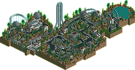
Me - No rushing this time, i took about 10 days to do this and made sure to fill it up and make it one of the biggest entrys, im sure the size helped alot, its almost half of a 110x110 map. I think the landscapeing was probly the best part of this park, it was very tall and detailed, my best yet imo. The coaster itself i had to bump the lift speed on to keep it from being slow like my last entry. also i am sick of my "kumbaish" sterotype so i mixed up the colers on the coaster, used NONE of my famous dull brown, and made the archy bigger. so i hope i have showd that i can change, and do it for the better. and im not sure if the name bugs anyone, coz its comes from a serail Killer, (also i was hinting on the name/theme by useing the in my posts) but i just liked the name alot and even almost used it on my invert in Dimensions, Im glad to be on the tour, and i think i won cleanly, C-ya guys on the tour.
I've only looked at Kumba's so far, but I'll post my thoughts on the rest soon (probably). Kumba, first of all, I loved the piles of skulls, they were very well executed. There was much to like about this entry and I'm glad you finally won, cuz you deserve to go on the Tour. Just a couple of things I didn't like. First of all, what's with everyone overusing the smoke puff...stop already it really doesn't add anything and just gets annoying for the most part. Also, the landscaping was good, but not great in my opinion...I'd continue to work on that aspect of your parks. Lastly the bluish hedges placed all over didn't work for me at all. But that's mostly nitpicking, the rest was very nice. Good on you to add the Zodiac symbol near the entrance. You do know the Zodiac was never caught tho, you may not want to draw attention to yourself.
Well, just like your hacks, the "lets drown voodoo" trick has been done before.
Coaster layout was ok, colours were..... erm, not my faviorate to say the least. Your still throwing in needless hacks though, such as the loops, I mean they didnt add anything to the ride, if anything they made it look bad. The architecture was better than your normal style, but was still nothing to rave about. Overall I'd say it was an ok entry, but still I think that is one of the best entries you'll ever build.
Finally you've made it. Now you only need to learn not to use my name in your work.
Oh, and I'll kick your ass in the main competition.
You certainly have something against Kumba. lol!
The park was average, kumbas. Nothing new really, still nice though.
Wow, Kumba's entry really surprised me. Good and detailed architecture, nice colours and a good coaster. The theming, especially those piles of skulls were very cool and a bit scary...
Keep up this new style!
1,433 Comments
CoasterkidMWM Offline
-Intersting theming, architecture, and name
-Ride's chain lift could have been set at 7mph, whihc would have made it slightly faster and not killed the pacing completely
- Ride went much too slow for me
- I enjoyed that random turnaround thing infront of the station
-Extra not needed chain lifts like the one at the end are VERY bad
- You have excellent potential, and the rediculous creativity will be a strong point in the future
Kumba's Entry
- Theming was very well done
- I like the loops with the track going thru them
- Ride had good pacing until the very end
- It seemed you planned to have the ride be longer, but you had to hurridly push it back to where the station was. That one last curve at 23 mph could have been unbanked as an excuse to produce laterals or something
- The beginning part was very well done and I loved the ferocity and speed that the trains had as they hammered thru the beginning.
- Good luck with the park!
Dantheman's Entry
- Not showing up in my rct2 saved games folder, I'm guessing this is an RCT1 track?
- I'm sorry I can't view it
Mightymouse's Entry
- RCT1 again, sorry man.
sloB Offline
Critic Offline
I take it back just as soon as your ego grows so large that you can't have any decency though.
A14504 Offline
2: it A14504, not A414504
3: Please don't take this as my best work. I really didn't get it the way I wanted it to be, and I wasn't expecting to win anything, but just for the heck, I sent it in.
I'll look at the others tommrow
Jacko Shanty Offline
Steve Offline
A1: hmmm...sorry man, i did not really enjoy this. the coaster was quite good, but otherwise, not your best, but i know you didnt try either...to bad you got last place twice...your dark ride should be better...
i cant download mightymouse's cuz it dont work...and i didnt see dantheman's...sorry...
congrats Kumba, you earned it...
Six Frags Offline
I´ll get ya back in the actual Pro-Tour
The Zodiac was looking good, although I didn't like the colors much... but at least you tried to use colors....
A14504´s entry was fun really, I was partyin' all the ride, but I take it that you could do better....
I have yet to look at the others...
SF
AustinPowers Offline
Finally you won! It looked really good, a nice new style from you...I loved the 1k skull too...I have not looked at the others yet...
Tech Artist Offline
Your entry was really good. I liked the theme and was not upset by it at all. This was a good entry cause it wasn't all hacks, it was your good arcitechture in the entry, which is what i wanted to see all along. Nice job.
P.s. I really like the catacomb and 1k skull
Kumba Offline
A14504 - I liked this entry, the coaster was nice, and i know it was odd but i loved that archy, just so weird but cool.
Dan - Not bad, I liked the entrance area, and altho a bit slow the coaster was good to, but i could tell it was unfinished, and that was a letdown.
Mighty Mouse - awsome entry, i like the idea to use islands like that on the ride, i liked the second island the best, the waves are a very nice touch, great ride.
Me - No rushing this time, i took about 10 days to do this and made sure to fill it up and make it one of the biggest entrys, im sure the size helped alot, its almost half of a 110x110 map. I think the landscapeing was probly the best part of this park, it was very tall and detailed, my best yet imo. The coaster itself i had to bump the lift speed on to keep it from being slow like my last entry. also i am sick of my "kumbaish" sterotype so i mixed up the colers on the coaster, used NONE of my famous dull brown, and made the archy bigger. so i hope i have showd that i can change, and do it for the better. and im not sure if the name bugs anyone, coz its comes from a serail Killer, (also i was hinting on the name/theme by useing the in my posts) but i just liked the name alot and even almost used it on my invert in Dimensions, Im glad to be on the tour, and i think i won cleanly, C-ya guys on the tour.
And may VooDoo, Six Fragz and Ride6 R.I.P.
Kumba
gymkid dude Offline
Toon Offline
Corkscrewed Offline
Congrats and welcome aboard! You definitely deserved it!
Dixi Offline
Well, just like your hacks, the "lets drown voodoo" trick has been done before.
Coaster layout was ok, colours were..... erm, not my faviorate to say the least. Your still throwing in needless hacks though, such as the loops, I mean they didnt add anything to the ride, if anything they made it look bad. The architecture was better than your normal style, but was still nothing to rave about. Overall I'd say it was an ok entry, but still I think that is one of the best entries you'll ever build.
Finally you've made it. Now you only need to learn not to use my name in your work.
Oh, and I'll kick your ass in the main competition.
Marshy Offline
Meh, I cant wait for the Pro Tour, things are stirring up already!
\/\/33/\/\an Offline
The park was average, kumbas. Nothing new really, still nice though.
Janus Offline
Keep up this new style!
artist Offline
Well done Kumba you definetly deserve it.
Your entry was great a big change from what you
usualy do.
I will look at the other entrys later.
~NC~
Leighx Offline
im goin to look at the entrys now so i post on them later on.
Ride6 Offline
ride6