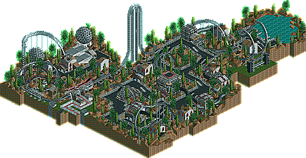
1. Hacienda Resort Mexico by deanosrs - Wow. This simply blew me away. I LOVED every inch of this. The detail of the building was fantastic There's just so much stuff here, I could look at it for hours. The rocks, while not particularly well done (well done rocks: see vTd and Schuessler) had a great effect on the atmosphere. The bare look fitted in perfectly. A few well placed flower rows (see Harakiri) wouldn't have gone amiss though, and the beach cutom scenery was tacky. Other than that, this was my favourite of the bunch. Great job dean, and I look forward to seeing more from you.
2. Imperial Riyadh Resort by John - Umm, I'm dizzy. Seriously, this is the most detailed work I have ever seen in either version of the game.Another hotel I could stare at for hours. This seems like an RCT2 interpretation of the so-called "NE style" and whether that's a good thing or not, it will inspire many. There could be a bit of room for improvement, but this was pretty flawless. I would have loved to see the small village though, that would have easily made it my #1.
The realism was fantasic though... nicely done, but I'd like to see you do something more fantasy-orientated. Realism isn't the only outlet in RCT2.
Thanks. I've tried to do fantasy, but nothing ever turns out any good. I keep trying but until I get better your unlikely to see anything released. Till then I'll keep buiding what I can see. LOL
wow i was blown away by all the entries, amazing work
the level of competition is really high, i hope the entries arent as good in the weeks that im gonna try
I am definetly not entering. I would get beat so badly. But i will watch this contest progress, just like hi rollers.
pick your catogory carefully, and anybody can win, really.
then to the hotels, i viewed all of them. I was (1st of all) surprised by the scenery i didn´t have.. lol.
i don´t remember which was which other than John´s. Which wasn´t my favorite, more likely the cool fountain one, or the "boring dull" one as it was aestethically pleasing non the less. And John´s ... well umm.. it´s big, it´s frightningly detailed and stuff. But the colors are ugly, and the building took no thought whatsoever. It´s nice to build and build and build and build and get a building blob but that´s not what rct is about, for me. Anywho, congratulations John. I´ll whoop your ass someday ... =P .... =/ ....
I can't wait until the winners for this category are announced, there should be some real quality entries in, if people try as hard as the hotel makers did...
There is one person who is entering, who will prolly be inventing a whole new genre of water ride. IMO he has a good chance of winning, solely off the idea.
I've dropped all other entries I was working on and decided to concentrate solely on my Best Movie themed ride. I got an idea, its been done once I know of way back in RCT, but not to a movie before. If I can pull it off the way I imagine it, it'll turn out fantastic. But, however, pulling it off the way I imagine is one of the things I'm NOT very good at.
1,433 Comments
sircursealot Offline
2. Imperial Riyadh Resort by John - Umm, I'm dizzy. Seriously, this is the most detailed work I have ever seen in either version of the game.Another hotel I could stare at for hours. This seems like an RCT2 interpretation of the so-called "NE style" and whether that's a good thing or not, it will inspire many. There could be a bit of room for improvement, but this was pretty flawless. I would have loved to see the small village though, that would have easily made it my #1.
To be edited...
rwadams Offline
John
Thanks. I've tried to do fantasy, but nothing ever turns out any good. I keep trying but until I get better your unlikely to see anything released. Till then I'll keep buiding what I can see. LOL
Rog
shameless Offline
the level of competition is really high, i hope the entries arent as good in the weeks that im gonna try
Evil WME Offline
then to the hotels, i viewed all of them. I was (1st of all) surprised by the scenery i didn´t have.. lol.
i don´t remember which was which other than John´s. Which wasn´t my favorite, more likely the cool fountain one, or the "boring dull" one as it was aestethically pleasing non the less. And John´s ... well umm.. it´s big, it´s frightningly detailed and stuff. But the colors are ugly, and the building took no thought whatsoever. It´s nice to build and build and build and build and get a building blob but that´s not what rct is about, for me. Anywho, congratulations John. I´ll whoop your ass someday ... =P .... =/ ....
Kumba Offline
mantis Offline
I'm looking forward to seeing these rapids rides - I want to see what innovations people come up with.
Dixi Offline
Does it have to be in tonight, or tommorow night?
Its not turned out half as good as I was hoping, mainly because my SOB decided to die on me.
Dixi Offline
A lil rushed.
Still good.
artist Offline
Critic Offline
Dixi Offline
artist Offline
Marshy Offline
Dixi Offline
Filaldo isnt making an appearance in this round, but maybe in a future RCTU park.
Oh and Im affraid I cant say who the person is yet, because Im not certain that they are still entering, but if they do, you'll know about it.
EDIT: BTW, my entry isnt for slow PC's.
John Offline
Ride6 Offline
Prepare to be dominatated by my Adventure Ride! Pwahahaha
ride6
Outlaw Offline
rctfreak2000 Offline
Hmmmmmm...
And ride6, shut up.
BigFoot Offline
gymkid dude Offline
If voodoo your talkin about mine, it isnt anything amazing. You had the same idea simultaneously, which is funny. Mine just works.
And I added a second new kinda element to mine.
It probably won't win, but I had fun hacking and playing around with some new ideas that I wanted to RCT-ify.