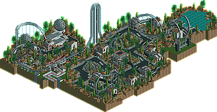
I think I'll give the video game themed ride and movie themed ride contests a go, I think I'll pull off some of my best work...even though it probably won't win.
Round 1 has come to an end. I'd like to thank Foozy for helping me out with the judging.
We have a winner, although I must admit...all six entries were TERIFFIC quality. I'd like to thank those that entered: deanosrs, John, RWAdams, RCTNW, Outlaw, and Micool.
The winner of this contest is.... JOHN Welcome John to the NE Pro Tour.
RWAdams and deanosrs came in second and third place respectively with their beautiful hotels. Not one bad one in the lot though, great round, and really appreciated to those that entered.
After looking at all the RCT2 versions, I can see it was a very tough call to make.
Outlaw - I love the unique features you pulled off on your hotel. The Lights and barrel crossing were briallant just to name a few.
Rog and Deano - Both of yours really captured the feel for what you were going after and I tip my hat to you both.
John - I can just image how long that took. The various details (allbeit I don't understand it) really looks good. The one thing I will never understand is the use of doors with no balconies. I assume that is a carry over from RCT1. With that being said, I also tip my hat to you and now go back to hiding in my corner.
Congrats to all and if this is the quality of what future weeks are in store for us, everyone better step up to the plate and really but your heart into it because it's going to take your best to take the next step.
I found Deanosrs' entry to be way more impressive than John's. I can definatly see that John took a long time doing all that, but to me it just looked like a big mess. The colors didn't quite work for me either. Deanosrs however, had a wonderfuly done submission. The flat roofs made the buildings look good, and good colors were chosen. This was indeed my favorite. RWadam's entry was very impressive as well. I would get lost trying to build that high. Good job everyone, and congrats to John.
I loved all of the top 3, but I thought John's was a bit disorganized architecturally. The South Beach Hotel was just so damned realistic, I could see this place really existing exactly as I saw it on screen. You've just mastered that look imo. Deanosrs was really a brilliant surprise.
If all the weekly comps prove this high quality this should prove to be an amazing series!
John easily deserved this. I spent more on the landscaping than the actual hotel. Big mistake I guess. Oh well, good luck to everyone else in the weeks ahead.
RCT-wise, John's and Dean's were the best use of RCT.
However, Architecturally, RWadam's was amazing. It was realisitc, yet not ugly. Detailed. Bright. Fantastic. I loved the ceiling fans and AC vents. I think this should have won, although they are so close its unbeleivable.
This is a tough one to call for me. I could easily go with either rwadams or deanosrs. I thought deanosrs' hotel resort was the most imaginative with great use of cliffs and varied architecture. Definately the best use of theme out of the RCT2 parks.
rwadams showed us more of his brilliant realistic style and it's so different from everybody else. It's uncanny how realistic your buildings look. I would be hard pressed to choose between those two because they both impressed me a lot and in totally different ways.
John's hotel was third for me because like some of the others I thought it was a bit too cluttered. I can understand why it won though. If you go room to room, there is a seperate story for each room and the subtle variations really give the building character. I didn't like how simple the overall structure was though. You could have varied the shape of the hotel more and that would have helped to alleviate some of the clutter problem. I also thought the landscaping around it looked pretty bad. Just rocks and trees, eh. But it was a hotel competition so that is understandable.
Micool was at a huge disadvantage entering an architecture competion using RCT1 but he obviously had a lot of fun with it and I had the most fun looking at the Everglades hotel. Half the fun with LL parks is guessing how people made certain things. I don't think you realistically stood a chance at winning with a LL park, but I appreciated your entry nonetheless.
RCTNW's hotel was elaborate but it was just a little too dull. The arches instead of balconies/windows was a mistake as the sides of the building just didn't have anything to keep my attention. There was some nice detail on the balconies and roof though and you put more time into the landscaping than most did.
Outlaw's hotel I didn't like because it was square. I did like the colors and you did some nice layering patterns on the roof but three big squares just won't get you very far. It did have a basic appeal to it though, so it was certainly a worthy effort.
1,433 Comments
rwadams Offline
Rog
mantis Offline
rwadams Offline
Rog
mantis Offline
*hides*
RCTNW Offline
KaiBueno Offline
Kai
MightyMouse Offline
John Offline
I think I'll start on my liquid coaster now... y'all got me scared.
rwadams Offline
Rog
Outlaw Offline
iris Offline
I'd like to thank Foozy for helping me out with the judging.
We have a winner, although I must admit...all six entries were TERIFFIC quality.
I'd like to thank those that entered: deanosrs, John, RWAdams, RCTNW, Outlaw, and Micool.
The winner of this contest is....
JOHN
Welcome John to the NE Pro Tour.
RWAdams and deanosrs came in second and third place respectively with their beautiful hotels.
Not one bad one in the lot though, great round, and really appreciated to those that entered.
1. Imperial Riyadha Resort by John
2. Ritz-Carlton South Beach by RWAdams
3. Hacienda Resort Mexico by deanosrs
Port Royal Bay Hotel & Resort by Outlaw
The Everglades Majest by Micool
Pacific Island Grand Hotel by RCTNW
RCTNW Offline
After looking at all the RCT2 versions, I can see it was a very tough call to make.
Outlaw - I love the unique features you pulled off on your hotel. The Lights and barrel crossing were briallant just to name a few.
Rog and Deano - Both of yours really captured the feel for what you were going after and I tip my hat to you both.
John - I can just image how long that took. The various details (allbeit I don't understand it) really looks good. The one thing I will never understand is the use of doors with no balconies. I assume that is a carry over from RCT1. With that being said, I also tip my hat to you and now go back to hiding in my corner.
Congrats to all and if this is the quality of what future weeks are in store for us, everyone better step up to the plate and really but your heart into it because it's going to take your best to take the next step.
rctnw
thorpedo Offline
Micool's was definetely second best, followed by deansors.
sloB Offline
I was, however, very surprised at Deanosrs'. It was fucking awesome.
Ozone Offline
Toon Offline
1) rwadams
2) Deanosrs
3) John
I loved all of the top 3, but I thought John's was a bit disorganized architecturally. The South Beach Hotel was just so damned realistic, I could see this place really existing exactly as I saw it on screen. You've just mastered that look imo. Deanosrs was really a brilliant surprise.
If all the weekly comps prove this high quality this should prove to be an amazing series!
Outlaw Offline
gymkid dude Offline
All of them were amazing.
RCT-wise, John's and Dean's were the best use of RCT.
However, Architecturally, RWadam's was amazing. It was realisitc, yet not ugly. Detailed. Bright. Fantastic. I loved the ceiling fans and AC vents. I think this should have won, although they are so close its unbeleivable.
rctfreak2000 Offline
Congrats John! I told you that you'd win. You gotta start believing in what you build.
Coaster Ed Offline
rwadams showed us more of his brilliant realistic style and it's so different from everybody else. It's uncanny how realistic your buildings look. I would be hard pressed to choose between those two because they both impressed me a lot and in totally different ways.
John's hotel was third for me because like some of the others I thought it was a bit too cluttered. I can understand why it won though. If you go room to room, there is a seperate story for each room and the subtle variations really give the building character. I didn't like how simple the overall structure was though. You could have varied the shape of the hotel more and that would have helped to alleviate some of the clutter problem. I also thought the landscaping around it looked pretty bad. Just rocks and trees, eh. But it was a hotel competition so that is understandable.
Micool was at a huge disadvantage entering an architecture competion using RCT1 but he obviously had a lot of fun with it and I had the most fun looking at the Everglades hotel. Half the fun with LL parks is guessing how people made certain things. I don't think you realistically stood a chance at winning with a LL park, but I appreciated your entry nonetheless.
RCTNW's hotel was elaborate but it was just a little too dull. The arches instead of balconies/windows was a mistake as the sides of the building just didn't have anything to keep my attention. There was some nice detail on the balconies and roof though and you put more time into the landscaping than most did.
Outlaw's hotel I didn't like because it was square. I did like the colors and you did some nice layering patterns on the roof but three big squares just won't get you very far. It did have a basic appeal to it though, so it was certainly a worthy effort.
Nice job all of you. And congratulations John.