Park / Return of the King
-
 02-January 04
- Views 2,148,300
- Downloads 652
- Fans 0
- Comments 1,433
-
 No fans of this park
-
 Download Park
652
-
 Objects
152
-
 Tags
Tags
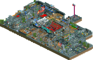
![park_2455 [H2H6] SF - Hurricanes - Rowling Versus Tolkien](https://www.nedesigns.com/uploads/parks/2455/aerialt2205.png)
Purple Power - I dunno. I liked the colours of the ride, but I didn't like the way you used grey wall textures in that context. The first half of the ride was fun, but it then dived underground in a vain attempt to get back to that station without too much hassle....and failed. That lift at the end hurt it a lot. I don't think this is your best by a long shot.
Umbongo Congo - lovely ideas like the arches and the mushrooms, but lacking in 'togetherness' IMO. It was like a few buildings lumped in between a few trees on a few rocks...it needed more paths in between more buildings with more emphasis on interaction - if that waterfall had had a stream going down through the ride it would have been cool. And the double lift didn't need to be there IMO. I tend to think that double lifts shouldn't be used unless they are functioning. Fun to look at though.
Congrats nemesis chris and everyone else that entered. I'll get back to you rct2 guys as soon as I get the chance to look at the parks.
Lost Idol Temple Place
- The first curve directly out of the station was banked when the car was going under 7mph. That's a no-no
- The lift could have been set up to highest speed, your ride still functioned correctly and believe it or not that 2 MPH does make a large difference visually. It might have boosted your stats, I'm not entirely sure b/c I don't pay attention to them except fot if the intensity rating is over 10.
- The turn after the final brakes (turn before station) was banked when the ride was only going 15 mph. This isn't a major issue to me, but I think you could have been able to make the curve a larger radius and have it be unbanked. It you then take up the same amount of space.
- I thought this was an excellent ride and I hope you top it. I really enjoyed the theming! My favorite part of the ride was the reverse double dip (hill immediately after the first drop). Great job!
Journey Thru Mikrat Springs
- My only real complaint is that the rides momentum was completely killed at the end. I made the ride's lift two tiles taller, keeping your original 180 degree drop, but rasing that up as well, and your ride looked alot better speedwise at the end.
- The water interaction was a very good idea. I also heavily enjoyed your path bridges.
Really this was a wonderful entry. Excellent job!
Rctfan1556's Place
- You have some serious banking and pacing issues
- The brake right after the drop was a SERIOUS no-no
- Lift before brake run was a serous no-no
- Work on your coasters
- Architecture was pretty good, however I would mix it up, and throw in some of your own elements/ideas
- Keep at it!
Pirates
- Very unique
- I didn't like the whole stop then launch thing midway thru the ride, however I would suggest next time just making the launch a little bit later on in the ride so you don't have to brake the train.
- Lot's O' merging, I like how the ride was on the train tracks. A nifty idea that is
- I think the ride would have been better with maybe one launch instead of I think the 3 that ou had.
- Overall, nice entry. It was very entertaining.
Silver Streak
- Someone likes custom scenary!
- Anywho, I liked how it was in a builiding for some of the ride, it was a unique quality.
- No real banking or pacing problems, could have been a wee bit faster at the end, otherwise a great ride.
- Very nice railroad yard thingy.
- I'd to see more stuff from you.
The Lost Valley Fernas Place
- Great near miss intersection thingy!
- I was going to say you have a pacing problem, but I see why it was slow at that part
- A very intriguing ride, It was well built with some wonderful hacks and stuff
- I'm terribly sorry I have nothing else to say about it.
They were all good rides, and I jope to see something more from all of you.
Silenced Offline
knuckles
if ya want to see something neat test the train there hidden in the station, very interesting
NC- nice, I really liked the lift
bender- I'd sugest more color, cause the bricks made my eyes sore, but good ride!
The landscaping was okay, but looked a bit lazy and random in some places. The architecture was pretty bad, brown 2x2... I also don't like how you left the ride entrance out in the open, totally unthemed.
Nor did I like the treeing very much.
However, the mine train itself was nice, good interaction with both landscape and theming. Those bridges were neat.
Bender902 - Hmm. This one looked a bit bad in some places which brought down the general impression, but it was still pretty nice.
Major overuse of brick though. The landscape looked a bit chaotic with all those mixed land styles. The actual ride was cool though.
rwadams - Should've won. The treeing and landscaping was bad at some places, like just by the entrance, but the great architecture, nice mine train, impressing realism and the little details pretty much made up for it.
I can see why NC won though, a pretty "safe" entry and a good mine train, which really was the point.
i wasnt to kean on benders, the whole temple thing didnt look rite?.
but rwadams was i spose realistic?. but i didnt really like the train thingy?.
and all the others i still have to look at.
well done to everyone. maybe i will do better in the next round i enter??.
great work nc
Silenced Offline
and my entry may not be the best in all of these PT's, but it mite just end up being the biggest
Silenced Offline
knuckles