Park / Blizzard
-
 25-December 07
- Views 5,724
- Downloads 1,006
- Fans 0
- Comments 13
-

-
 68.75%(required: none)
 Design

inthemanual 75% 5dave 70% Liampie 70% Louis! 70% MCI 70% Poke 70% ][ntamin22 70% Cocoa 65% FredD 65% geewhzz 65% 68.75% -
 No fans of this park
-
 Full-Size Map
-
 Download Park
1,006
-
 Objects
208
-
 Tags
Tags
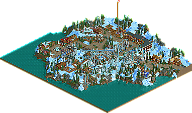
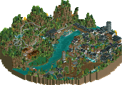
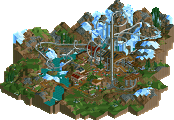

Anyone remember last Christmas at NE? We had two good Parkmakers win Runner-Up with small park maps and one of them was an impressive young Parkmaker called CedarPoint6 who captured his RU with a pirate theme called “The Black Lagoon”. Who would have guessed that now exactly a year later I would be posting another park by that guy we have now come to know as “CP6”? Well an NE Spotlight, Parkmaker spot and design later he is back with a wonderful winter design called Blizzard!
Please post your comments below.
The Design looks quite nice though, more comments when I see it in game.
disneylhand Offline
I thought the same thing when I first looked at it in the thread, but the one available in the download looks much, much better.
-disneylhand
cp6, thanks for this contribution. i agree to pretty much all of the "forewarnings" you gave in the readme, but i love the fact that you went on and finished this. finishing projects, and especially those that you have laid aside at some earlier point, is something that takes a lot of patience and self-awareness, considering one's own parkmaking. sure, this didn't quite impress me as your recent work does, but meh, not everything has to.
i liked the coaster. and usually i never like 4ds. what i also liked was how the design seemed chopped off from a real life place with the ski lift station and the end of the ski piste.
the best part however was the peep-friendliness. especially the way how they entered from a building. very nicely done. due to the peeps, i spent a good while in your design watching them explore the rides. when i heard the sounds of their voices and overall chit chat i kinda got nostalgic and reminded of the days when i used to play ...
one thing; when a ride is too intense for people, they usually do that "whoa, omg" animation at the beginning of the queue and turn around. as blizzard had no queue but just a regular path, they did this after walking all the way to the entrance hut. now i agree that, the way you design queues, they look very sweet with "normal" paths instead of rct-game-sense queues. but isn't there some kind of way, using the nastiness of rct2 custom scenery, to like have invisible queue line and just build real path over it to have it look the same but keep the functionality of a queue?
like that, they could also actually ride blizzard, because with no queue at all like you had it, if one person actually decided to ride it, he would have to wait for at least another person to join him for them to board. yet, when he waited, he blocked the entrance hut, which made it impossible for other peeps to kind of like "access" the ride and decide whether to go on it or not. so in the end, no one ever got to ride it ... heh, i got into this a little.
another thing that made me smile is how, in rct2, if peeps think the scenery here is nice, they stop for a while at the side of the path and take pictures. kinda adorable. and he was watching the part that i personally liked the most, looks-wise. that is the very last helix of blizzard before the final brake.
so, you can see i had a good time watching this.
thanks for doing this and keep us updated about your projects. speaking of which, what is now going to be your active project? this micro madness thing?
^ I still have not checked out the park,(christmas,
And though of course CP6 himself can better answer this question about choices for his own park than I can do: yes, in RCT2 you can build a regular entrance-path over something else, or just use the "invisible path" to keep the looks and still keep it optimal peep-friendly and working for RCT-peeps.
^ that always makes me laugh too...
In original RCT2 there are just a few multi-tile objects that are declared "photogenic", the ones that RCT-guests stop for and start staring at and make pictures of.
Making (multi-tile)objects yourself ( not all of them I think, but I am not an experienced object-maker) you can choose if you want to make them "photogenic".
Or, if you modify/convert other objects, you can forget to stop them being photogenic......
In my thread of MM (Music Masters) you can see some examples of how RCT-guests are taking pictures of scenery they normally would never take a picture of ( as RCT-peeps really are not interested in landscaping or archy....
After I showed that, Geewhzz apologized for having forgotten to do so, for which there really is no need to apologize for, because it just is lovely to see those peeps being hypnotized by something (a tree!) while it looks like they are staring at your -incredibly
Anyway, CP6, many thanks for & congrats!!
will be checking it out and commenting on it later.
Emergo
yea you're right... that one does look better
anyway I checked it out and I liked it a lot... I loved the peeps (except with your ques they couldn't ride anything) and overall the theming was very nice. I really liked the que bridges and that quarter tile rock arch and other little details. The coaster was very nice and one of the only good 4ds I've ever seen so kudos for that.
I didn't really care for the station building as it didn't fit in with the rest but I liked everything else despite being a little outdated. Nice Design and I look forward to your next release.
disneylhand- What did you think of the ride since I take it you downloaded the thing?
posix- Thanks very much for taking the time to write such a detailed review. I really appreciate it. Anyway, I'm glad you enjoyed spending some time in the park and looking around it. I see what you mean about the queue line. I think that comes down to my not really doing the whole peep thing a lot. It never really crossed my mind, since the only time I opened this map to the peeps was right before sending it out. Opening the thing to peeps has never been a huge priority to me, although I can agree that it is fun watching them run around and take pictures of stuff and all that. When I do my next park, I already know that it'll quarter tile queues, but hopefully I'll go back and through some invisible paths in there and make the park peep friendly.
As for the coaster itself, I'm glad you liked the layout. I've never liked the limited features of the 4-D type as my building style often revolves around the angled turns. In regards to the intensity, I think I may have screwed that up with the seat rotations... cause I'm pretty sure there's some prolonged upside down sections. That whole rotation system is just a pain to control and get right. Oh well... it's generally moving too fast to notice much anyways.
For my next project, I suppose it's the Micro thing as much as I dislike doing those little things. That mountain park I had going is more or less stopped after college happened. I still have my snow park going with 5dave, although that's back to him now. But pretty much right now I just want to do another big solo... but I need a concrete idea. I have a lot of little things, but I know it'll be along the lines of Watkins Woods, just more terrain variation. The bench is getting built now.
Emergo-Thanks! I'll be interested to see what you have to say when you get to check it out.
OLE- Glad you liked the coaster-- I was pleased with how the coaster came out. The station just kind of happened-- I'm not really sure where the idea came from. I kind of liked the open roof idea, but I suppose I could've executed it a little better.
FK
disneylhand Offline
I actually found the coaster to be one the poorer side. It was both too long and too fast in some places, but I guess you can attribute that to RCT for not giving us the most realistic track pieces when it comes to 4th Dimension coasters.
The surrounding areas were nice... I liked the location a lot. I'm having mixed feelings about the ice on the supports though. It was probably for the best that you included them.
Overall, not my favorite design, but well worthy of the title.
Congratulations.
-disneylhand
FullMetal Offline
Over at DeviantArt.com they have a little barfing smiley. I think it's funny, and it would go well with the logo of this design. My appologies to 5Dave, but my god! *insert barfing smiley here*
The design was much better, though. The layout was elegant, and well planned. The pacing was perfect, and the theme was quaint. Those snow covered rocks look like they came from Zoo Tycoon, but they really look good around the paths. The station actually looked nice, despite being a slightly different theme than the rest of the map.
Seriously though, you're on fire man! Two Designs, a Spotlight, and a Parkmaker spot? There is no stopping you! At least, I hope not. Definitely looking foreward to more! Especially that thing you told me about on AIM! Woops? Did I say that out loud?
CP asked me after a logo. I did that one as fast as I could, in like 5 mins. or something and he was happy with it.
Not that I'm happy with that logo, though
"MFG"
I really live the initial drop under the path and then the second one coming up from under the path. Both of these look to be a blast to observe from a peep perspective and from a rider on the coaster itself!
Overall, a very solid design and congrats.
James - rctnw